Three weeks on the island of Martha's Vineyard in May.
Is Martha's Vineyard heaven on earth?
Not in early May.
Let me explain.
My family's home is in Chilmark, close to the western end of the island. Rural, some farms, the fishing village of Menemsha, the cliffs at Gay Head at Aquinnah close by and a couple of world class beaches.
What's not to like?
In early May, the weather. When I arrived, it was cold, wet and windy. Nothing was green, the trees were bare. Only by the middle of the month do things start to pick up and then there were only a few days that were almost warm. I find the island tough when the weather is bad. Surrounded by such beauty without being able to be in it beats you down.
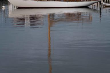
I photographed right through it all, no big surprise, and got into some sets and subsets of things both new and visited before. One was is a stream running across the south beach and into the ocean, runoff from the marsh at Moshup Trail.
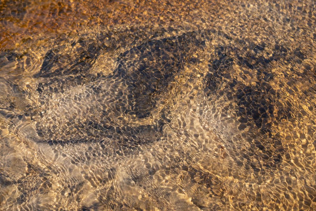
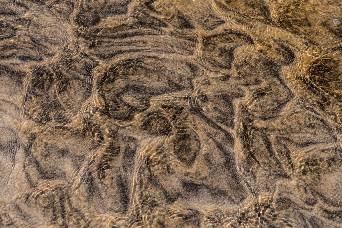
Patterns in the sand from the water and reflections on the surface. Remarkable.
Are these something? I don't really know yet as I will need to work the files and make a few prints to be able to tell.
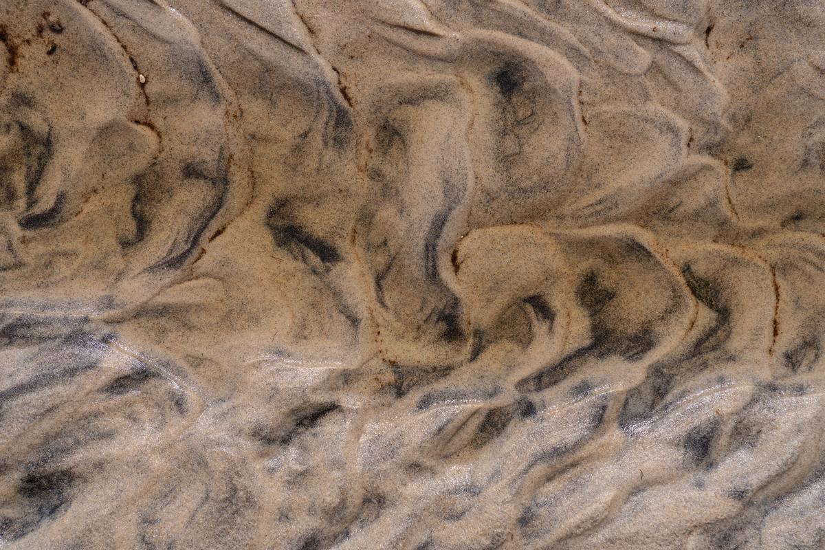 Being compulsive means I trekked up there six different days, a considerable hike a mile or so down the beach at Philbin to get to it. I tried photographing this with a tripod and without, used a PC lens to get the planes more parallel, went on diferent days with a long lens and a wide lens and with Sony and Nikon cameras, with flat light and contrasty days. I learned to go after it had rained as two or three days of no rain and the stream trickled off to almost nothing.
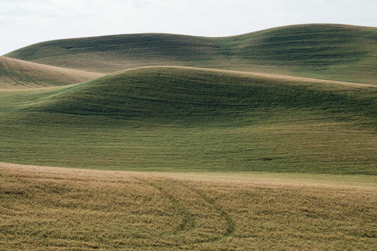
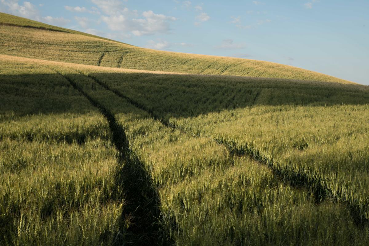
I went up in a plane this past week for an hour flight with good light and the leaves just coming out on the trees. We went up about 3 pm, late for me, but one of the pilots I work with flies over from Nantucket. In the morning it was far too windy so we waited and the wind calmed somewhat.
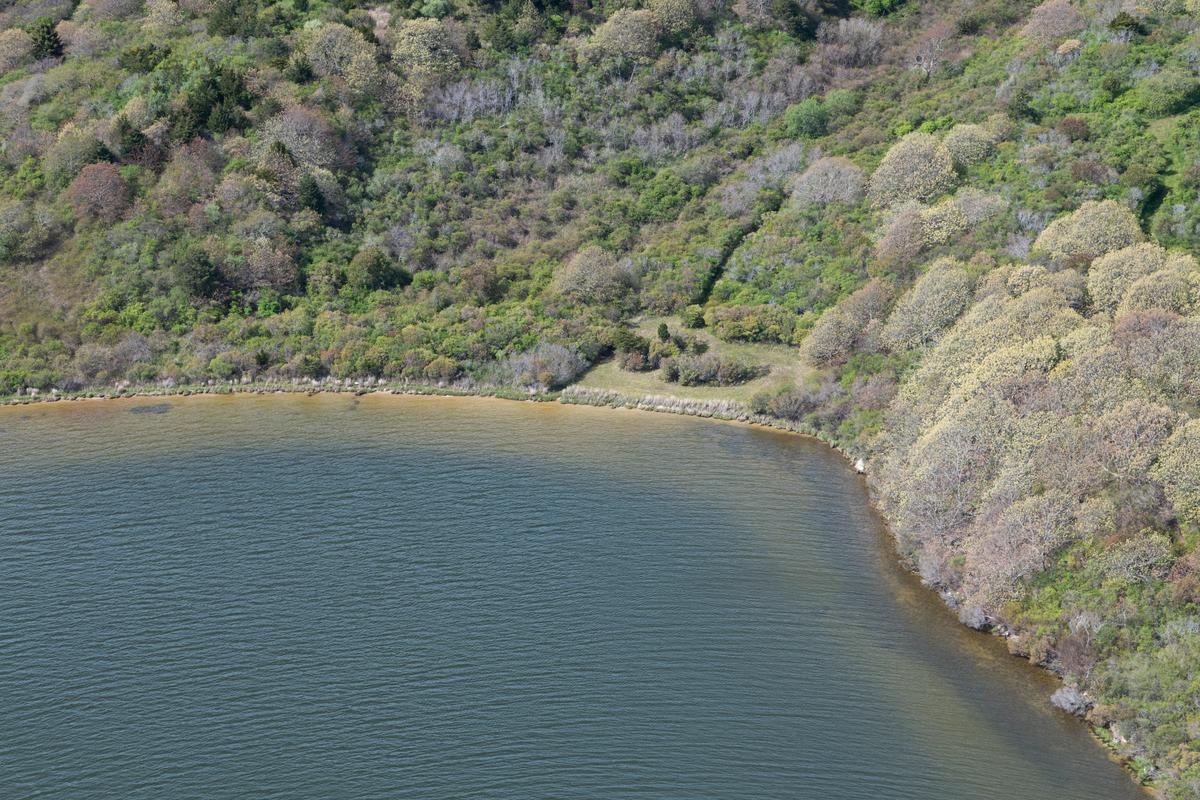
Note: these are not finished files, but pretty much as they come out of the camera as RAWS.
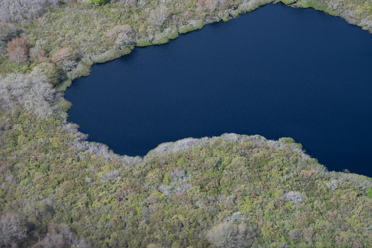
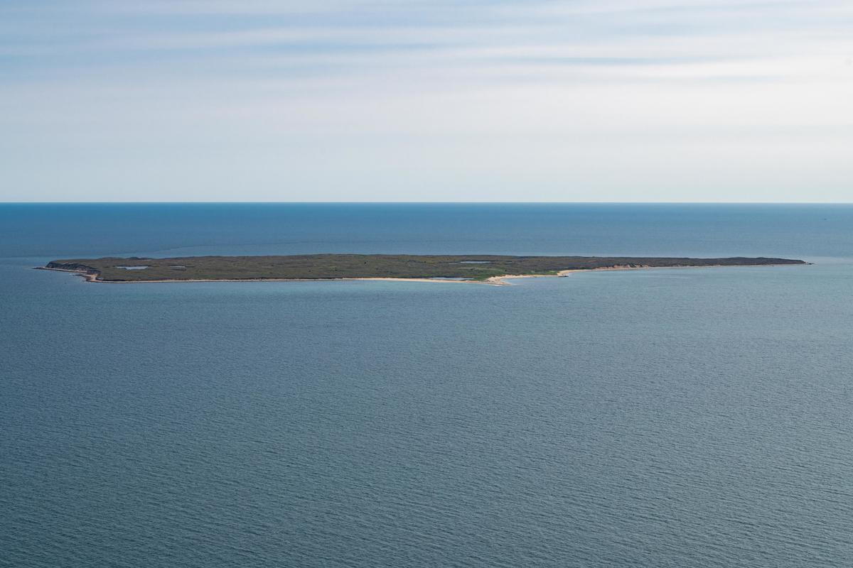
We flew from the Aquinnah end of the island over to Noman's Land, a small restricted-access island a couple of miles off the south shore. The island was used for bombing practice by the military for many years and there is unexploded ordnance scattered around, hence the prominent"No Trespassing " signs.
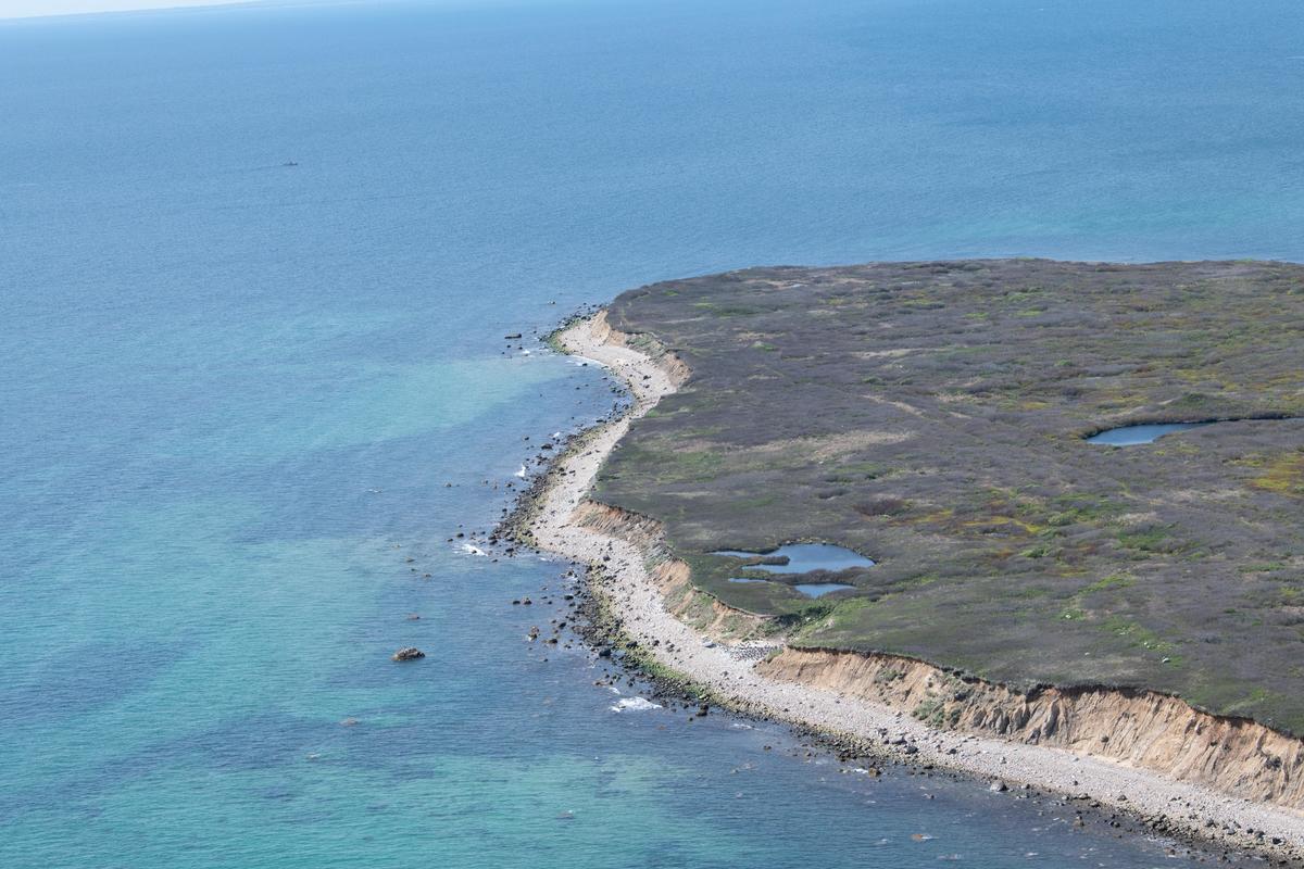
I first made aerials here ten years ago and, in fact, it was the first of the Massachusetts islands I made pictures of.
Why go again? The technology has changed. The files I am making now are leaps above the files I made back then. Higher resolution, greater dynamic range and a color engine far more subtle and nuanced. In optics, the 70-200mm f2.8 Nikkor lens I use now for aerials is two generations improved from ten years ago and it shows. These are excellent files.
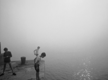
What else? I tried to mimic the series of the fishing village Menemsha I had made last year but couldn't pull it off. Perhaps someone else could work to make good pictures here offseason. But for me it seemed disrespectful and cruel. Menemsha is not a pretty sight in early May in the rain and the wind and the cold.
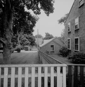
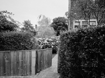
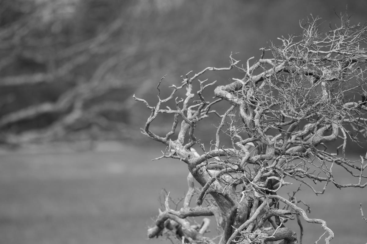
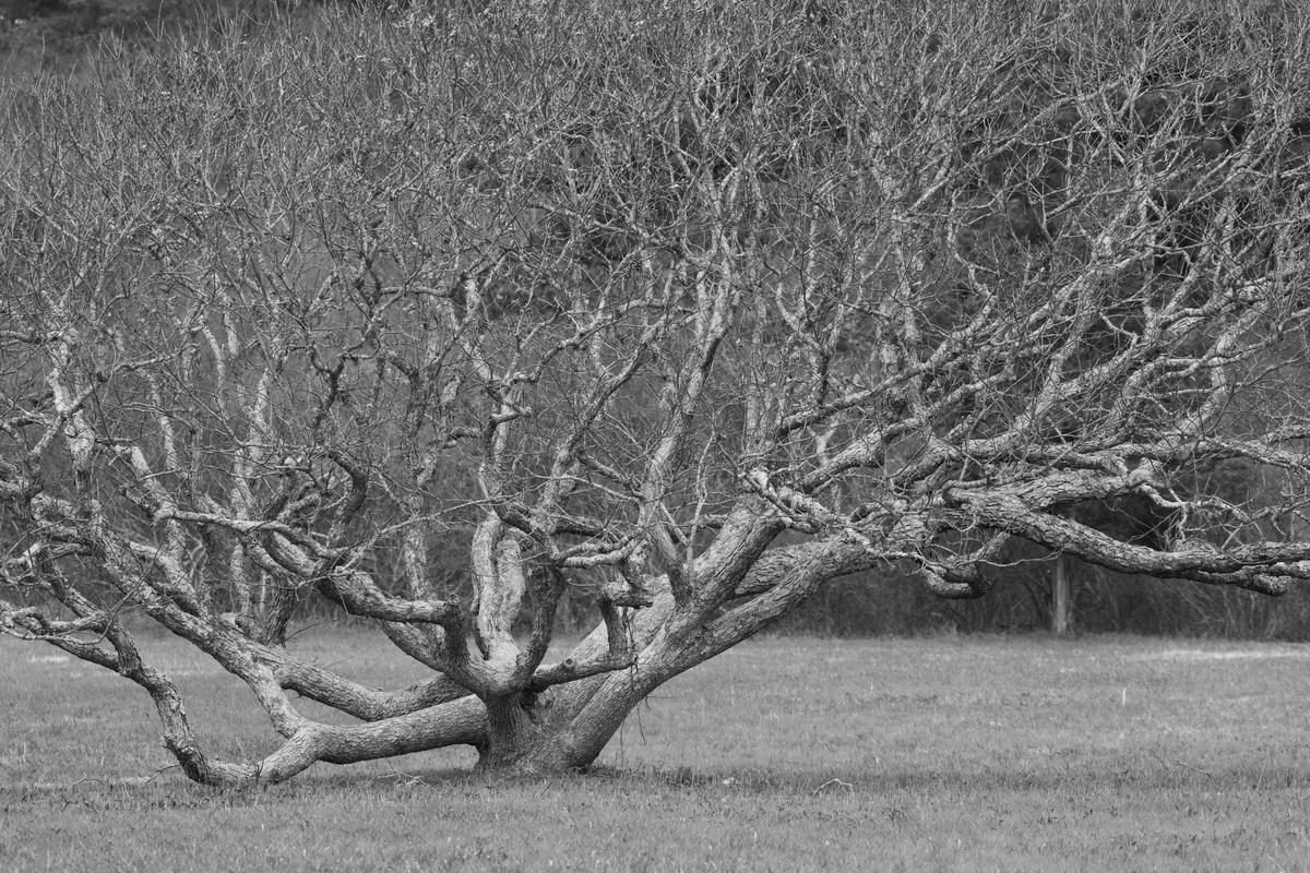
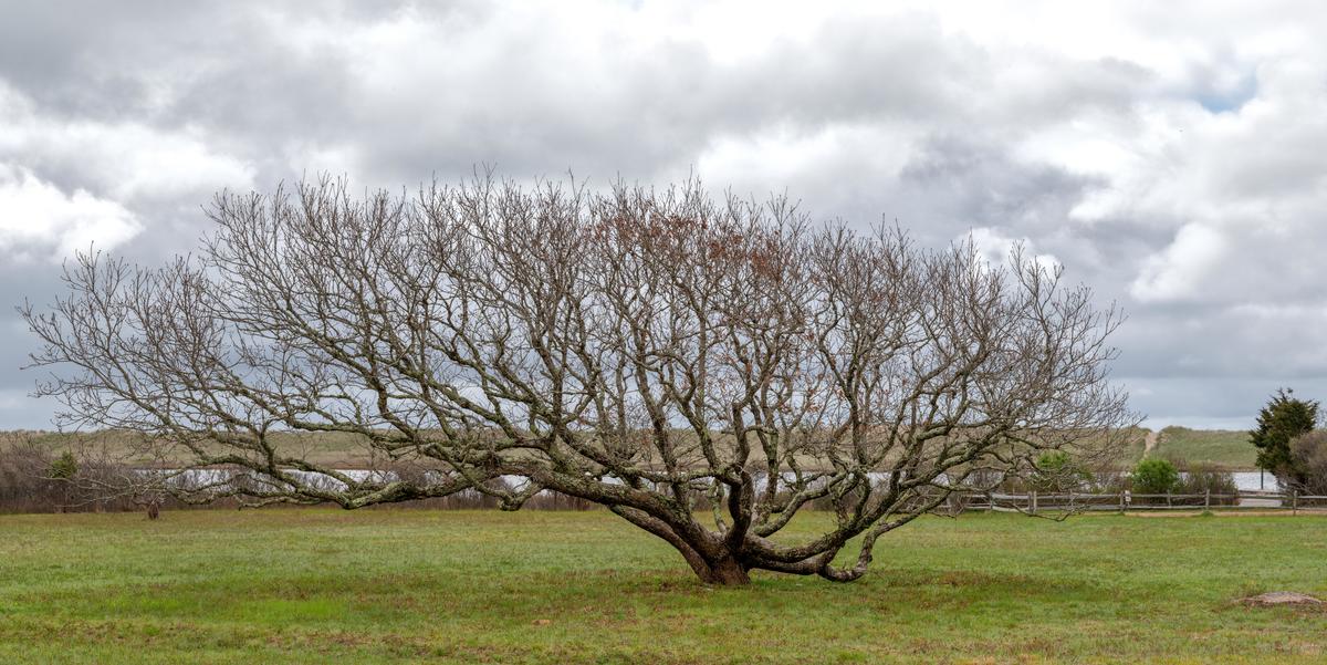
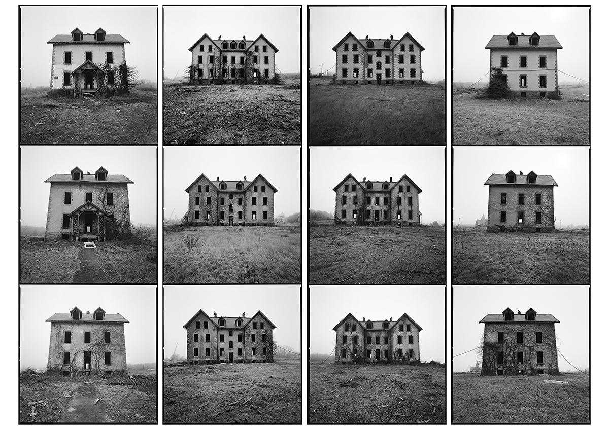
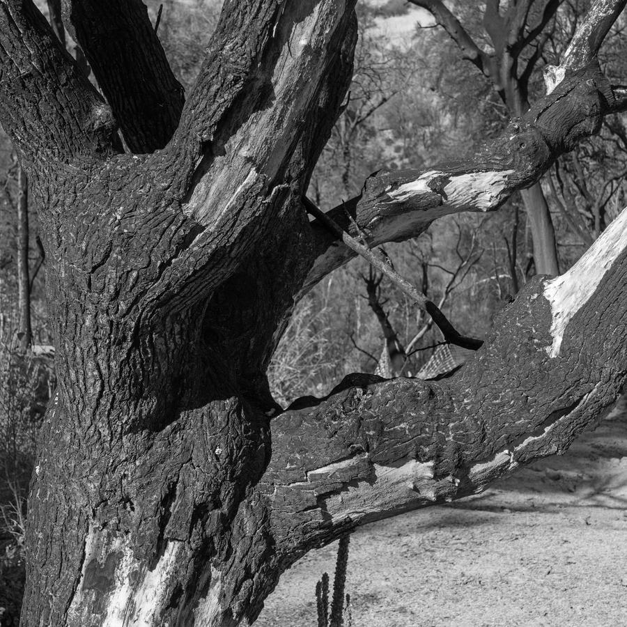
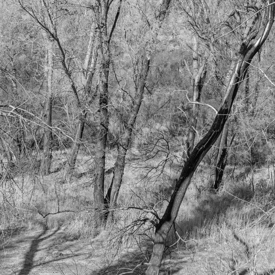
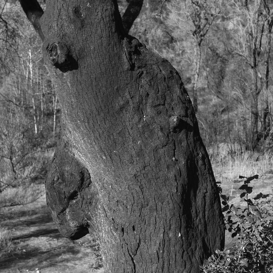
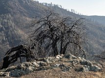
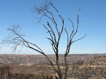
There are a couple of trees I photograph each time I go to the island. They are in Chilmark and are old friends.
As we are now in production for the next show at the Harvard Ed Portal opening in late June, the new Martha's Vineyard pictures will have to be put aside for now.
But let me make this statement and challenge: the body of photographs of mine from Martha's Vineyard over a long career begun in the late 60's is significant and important and should be looked at by curators and/or editors for increased exposure. Not only does the work encompass a survey of some of the massive changes to the island over the past 50 years it also tracks the evolving aesthetic, comprehension and refinement of this career artist. What better place to work over a whole career than an island? 20 or so miles of land surrounded by water means finite content, a place that is a microcosm divorced from much of the rest of the world but also part of it.
Any takers?
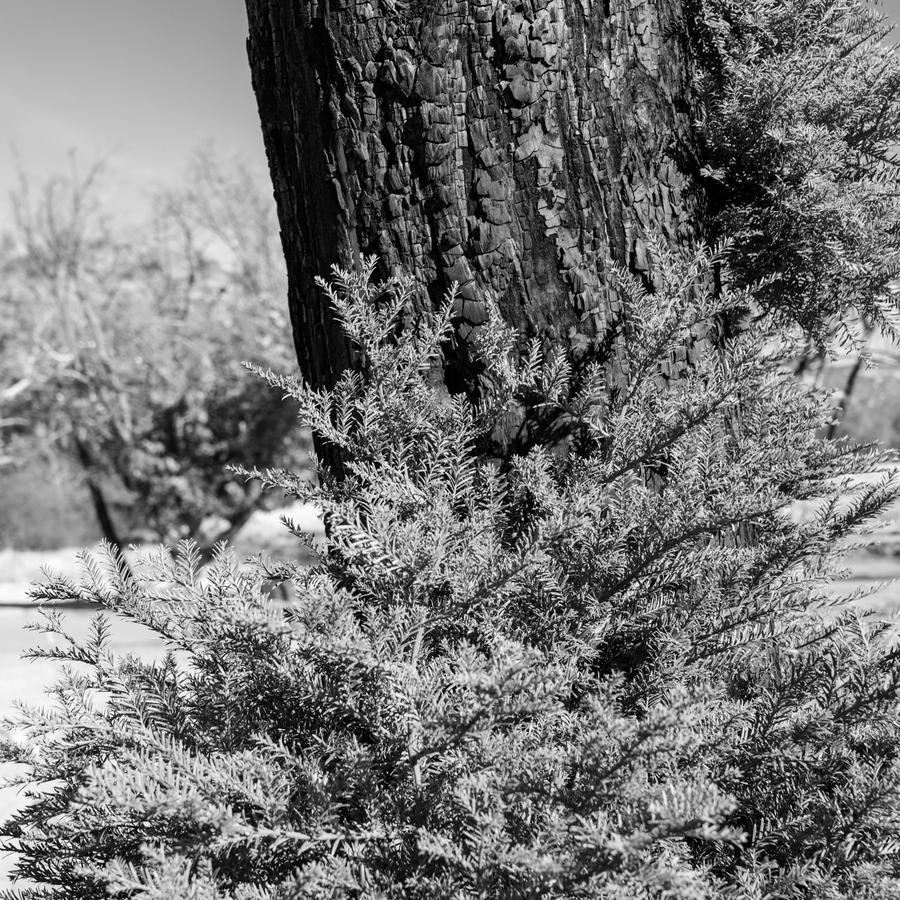
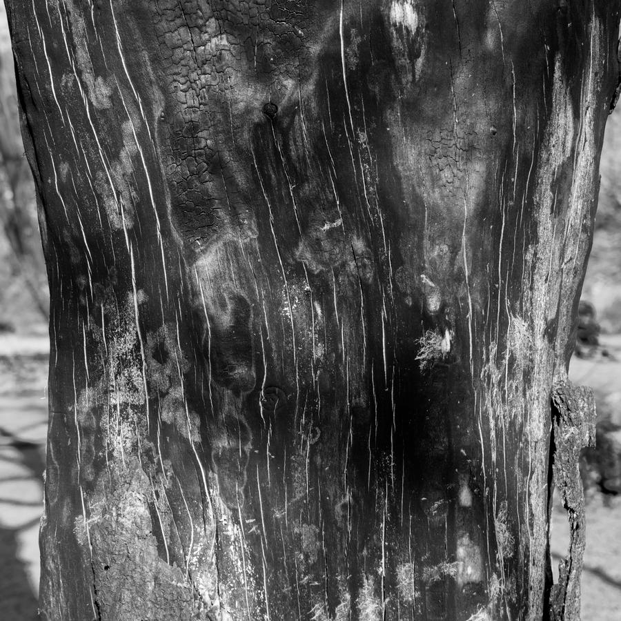
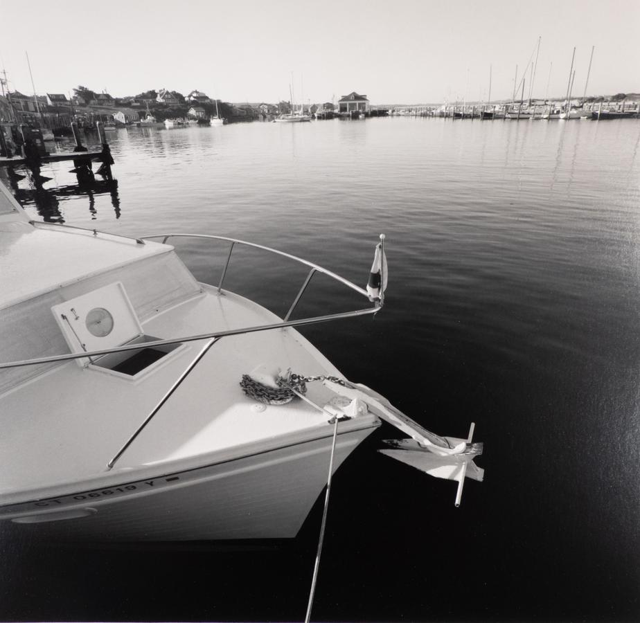
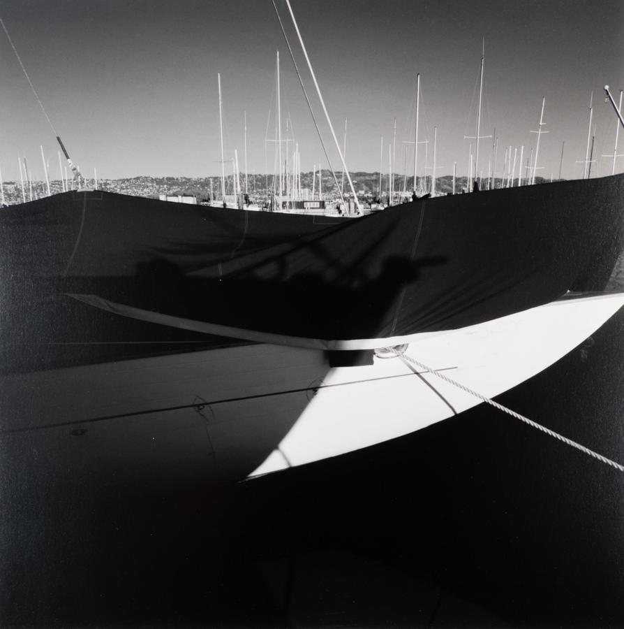
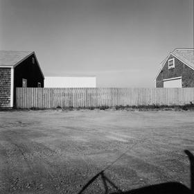
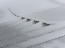
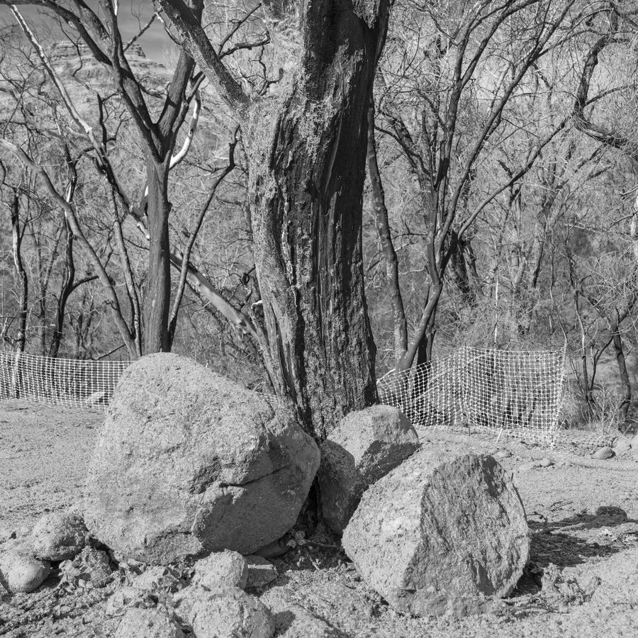 This career artist doesn't always know why he's doing things. That sounds bizarre I know, but it is true. I discover things from the pictures I make. Yes, I made some conscious decisions here: convert the camera to 1:1, make the files in post into black and whites. So, I was working towards higher specificity in these pictures.
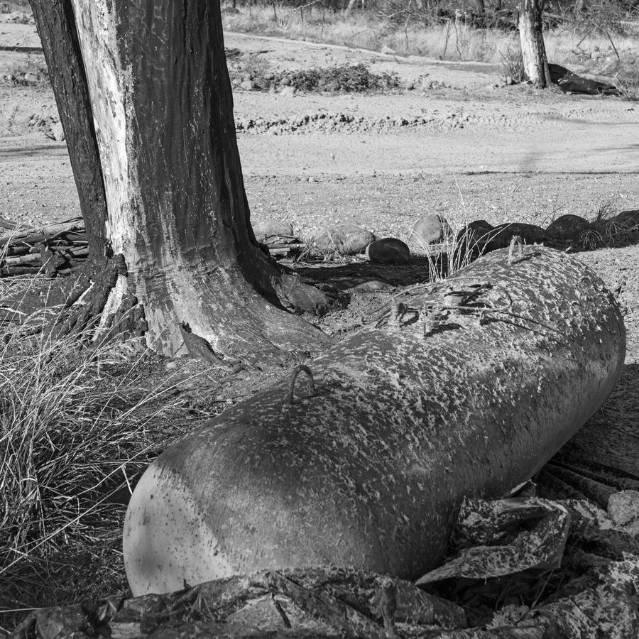
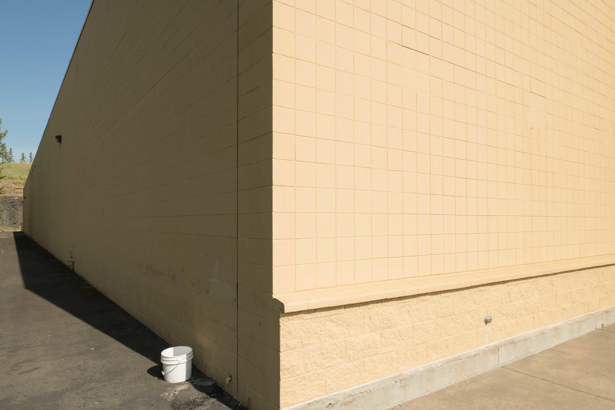
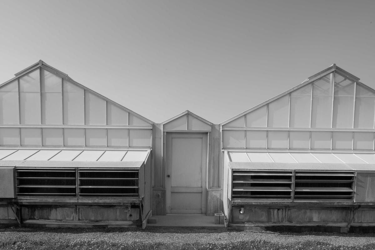
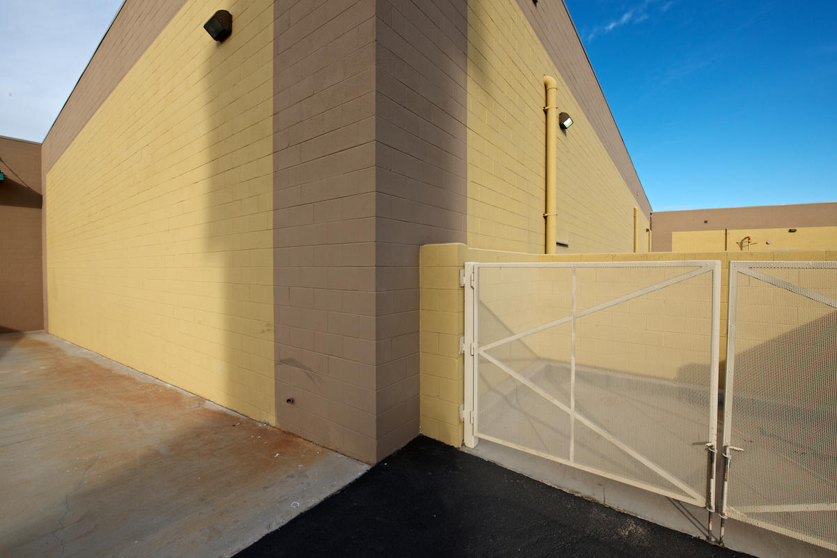 2011 Yuma Palms Mall, AZ
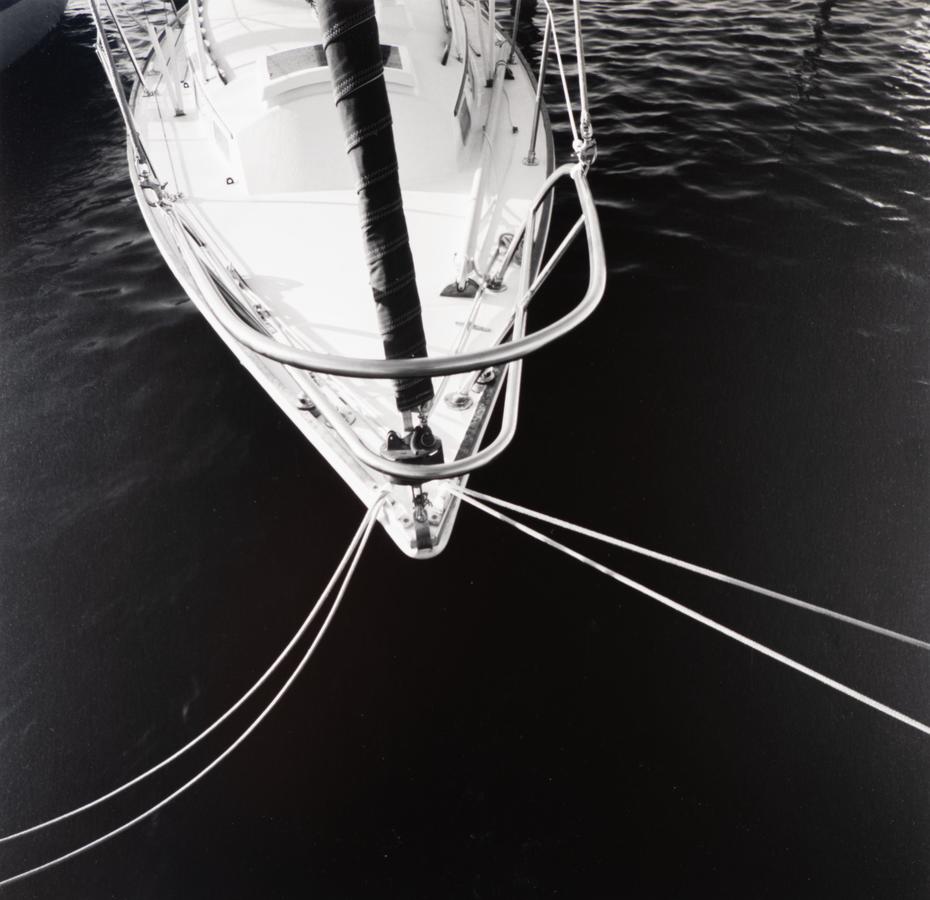
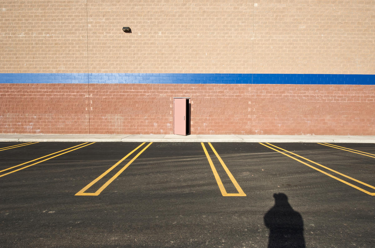 Rhode Island, 2009