Topic: Commentary (201 posts) Page 11 of 41

Photography's Hard

Photography's easy, right? Your phone makes great pictures. You don't really need a real camera anymore.

But photography's really hard if you want to use it knowledgeably, substantively, if you want to make art, if you want to extend it beyond the everyday concerns we all have to record our lives and share them with others. It is particularly difficult now that photographs are universal, infused into our lives in every aspect, filling every nook and cranny of our existence with their presence. Photography is now ubiquitous. 

When I studied photography in the early 70's, photography as a means of creative expression was fairly new and certainly not universally understood. That meant that innovation was relatively easy. There was much to explore. Double expose, turn pictures upside down,  superimpose, juxtapose, blur and scratch an emulsion, etc. Making statements that hadn't been made before wasn't so hard.

But if you want to make art with your camera now. If you want to avoid the insignificant, trite, banal, done-to-death and cliche, it is harder.  If you want to innovate, make things never seen before, to rock the world with imagery that is breathtaking, aggressive, beautiful, and extraordinary.

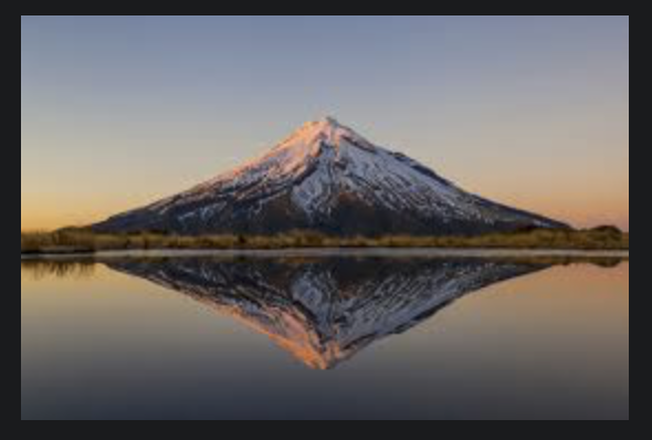
Well, you're screwed, my friends, for photography as an art has somehow become something else, well over the era of being a new and exciting form of expression. Take landscape: impeccable and exquisite pictures of faraway lands glorified with the perfect time of day, the perfect light and the perfect resolution? Irrelevant and done to death. Why would a beautiful image shot in the mountains of, say, New Zealand have any possible relevance in today's world except in a "National Geographic" kind of way? When a "Google Images" search produces literally hundreds of the same kinds of pictures as yours, or worse, better than yours.
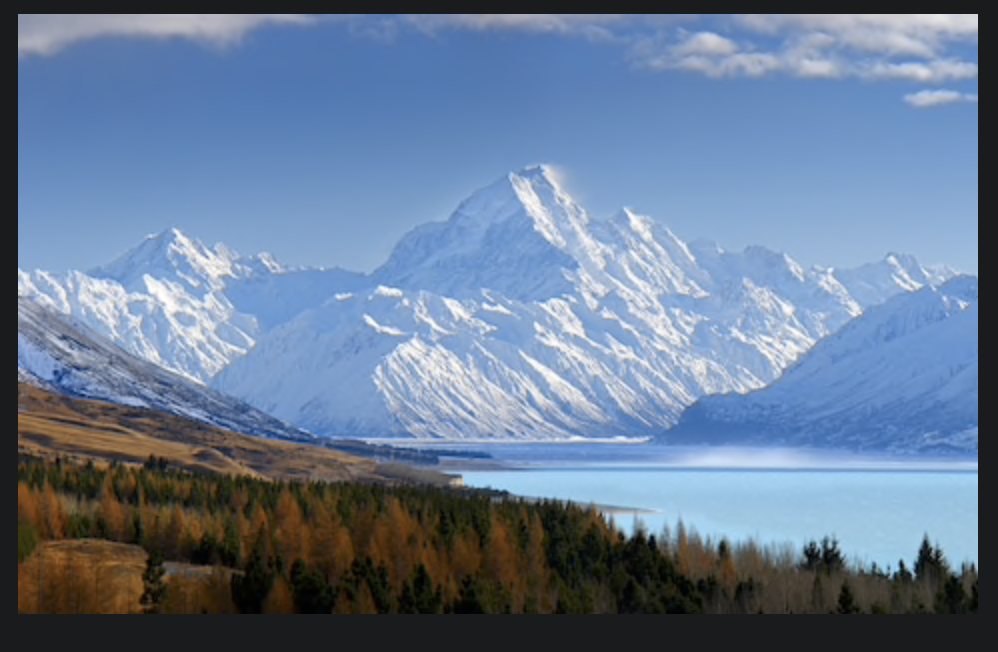
Let me remind you that these examples, obtained through a Google Images search, are usually anonymous, free for the taking. The only possible reason I can see for this kind of photography is to "put one in your quiver", to take the photograph yourself, to make a photograph that is right up there with the competition, to call it your own, to bask in the accomplishment that you went there, captured that with your camera, had the print made or made the print yourself, framed it or had it framed and hung it over your mantle in your living room for your family and friends to see with predictable oohs and aahs.

But art? I don't think so. Something else entirely. 
I know this might provoke some controversy around the definition of "art" for art is used in all kinds of contexts, most of them making art more pedestrian. I also know I have opened the door to push back for there are many who believe
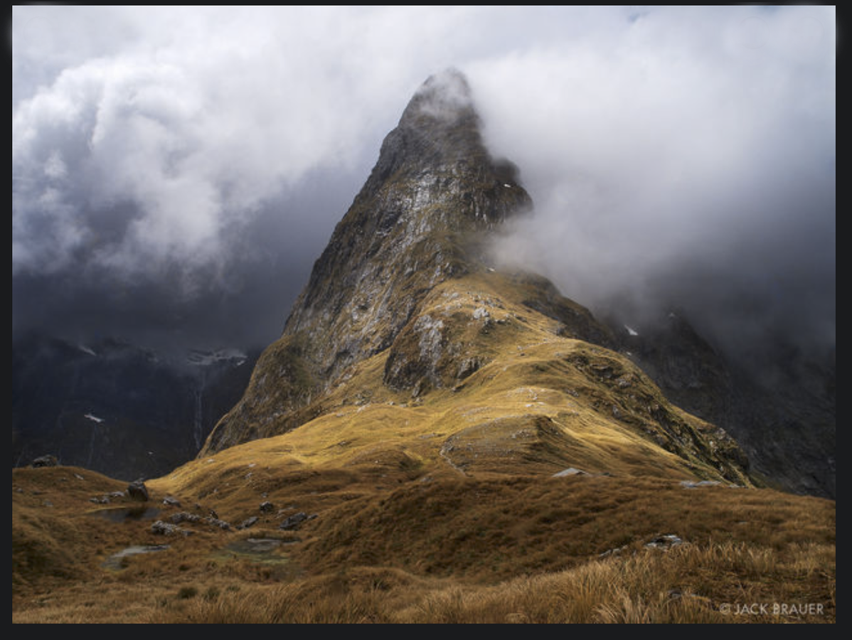
(Source: Google Images)

there is a place in art for this kind of photography. And no doubt, there are some very beautiful images being made in this way. But art? More like elegant description, enhanced documentation or interpretation.

So photography is hard because this is is simply not enough, to record our surroundings with fidelity. Yes, there's a place for this but real art, art that says something, that propels us forward, that does not confine itself to convention, that becomes significant historically, that is far more difficult and daunting and entails a higher level of responsibility.

The big mistake, of course, is this: assuming, because you like it and are proud of it, your friends and family like it and have urged you to enter the contest, to meet with the gallery director, the book editor, the museum curator, that these professionals will be impressed and moved to purchase your work, show it, publish it. But, from their point of view, please, tell me, what are they to do with your pictures? 

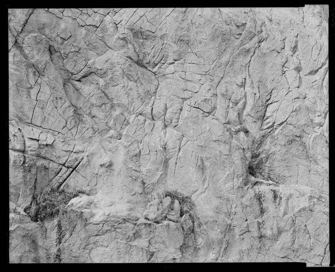
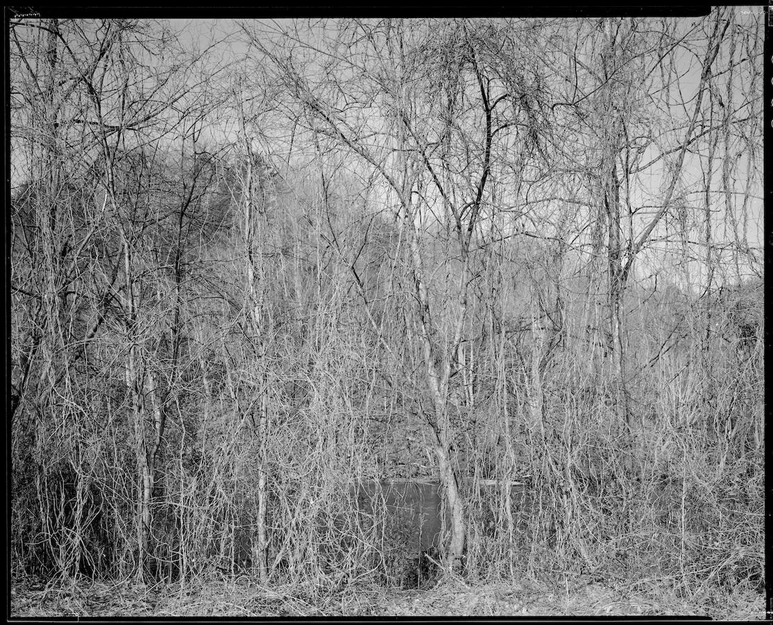
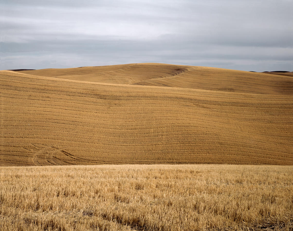
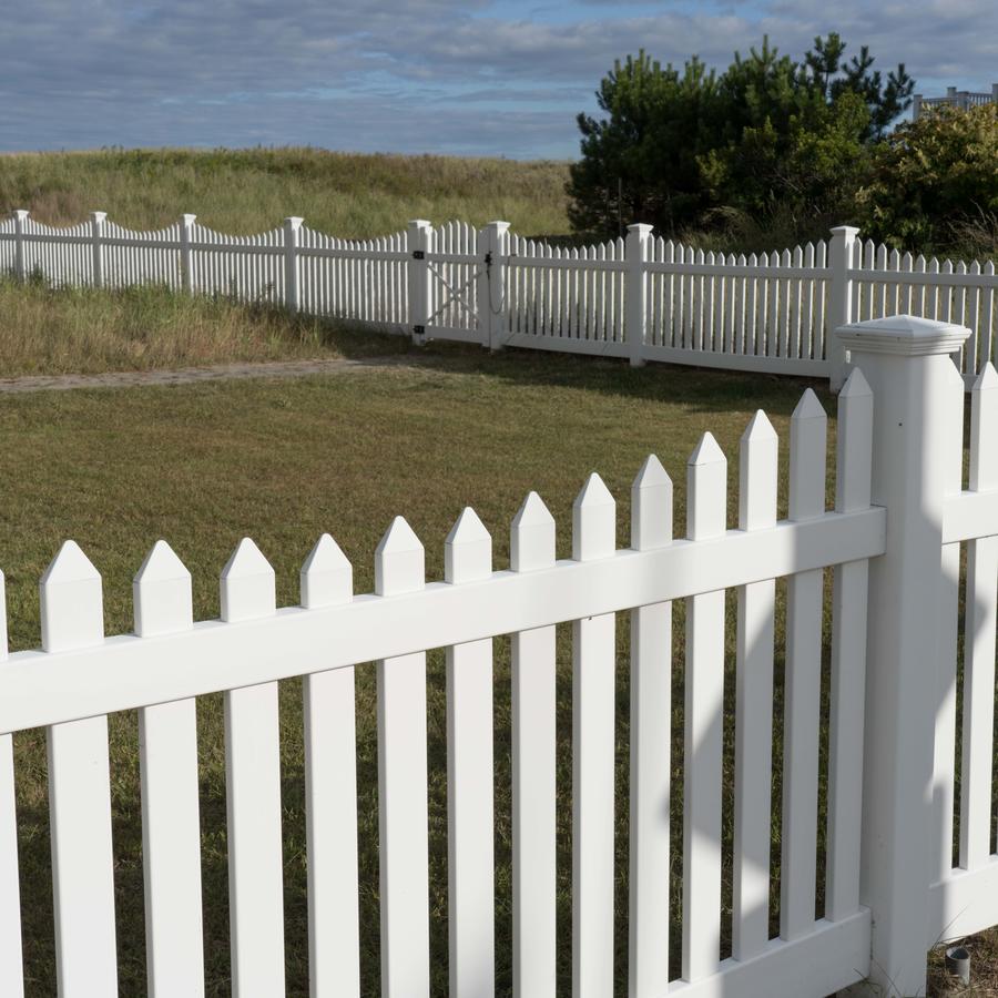
In earlier times, perhaps as a holdover from the era of Edward Curtis and William Jackson that showed us the frontier of the American West in the late 1800s for the first time, you could get away with impressing this way. But not now, not when these below are right there for the taking:
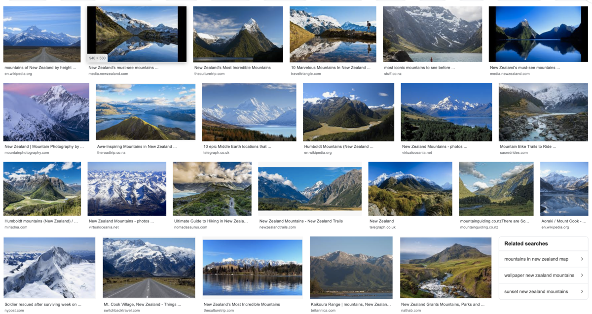
Endless blue-sky landscapes, glorifications of existing places, postcard-perfect, idealized and beautifully rendered. Is that what you aspire to? Or do you want to go deeper, share your unique take on the world, use what is in front of your camera to comment, display and render with heart and intellect, to use photography's amazing abilities to convey with relevance, timeliness, and perspective? 

What do you think? What do you want to say? What do you believe? 

What's key here is this: it is all too easy to make pictures that are generic, cookie-cutter photographs that simply meet the norm, the contemporary conventional. Our job as artists is to go farther, to push our medium into forms of expression that extend ours and our audiences' understanding of this medium we choose and to signify our unique place in the world.
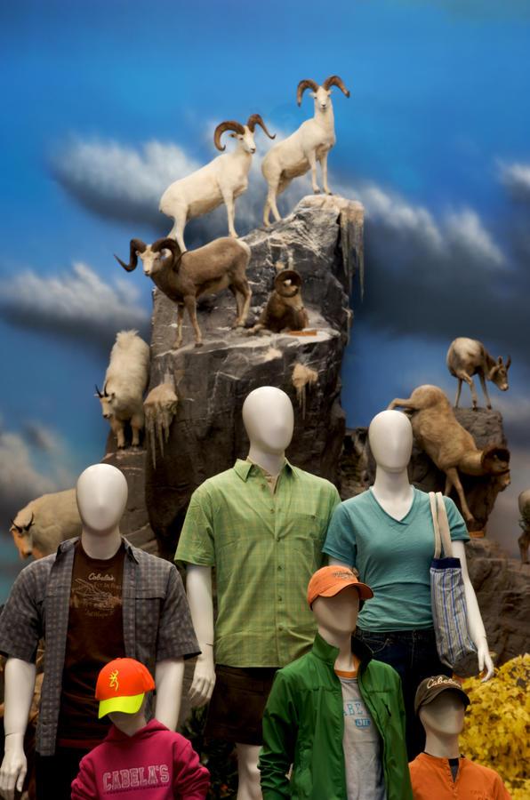
Cabela's, Nebraska, 2005

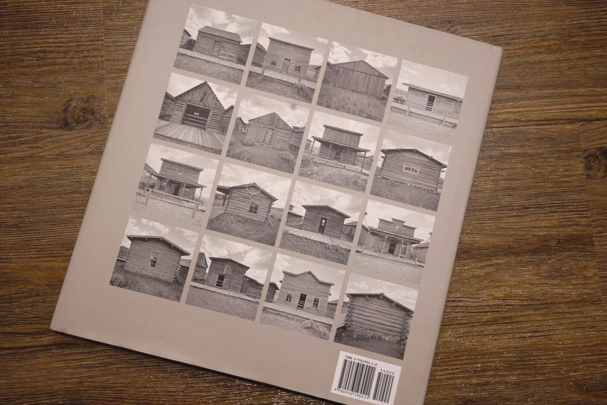
back cover American Series, Cody Wyoming, photographs by Neal Rantoul 2005
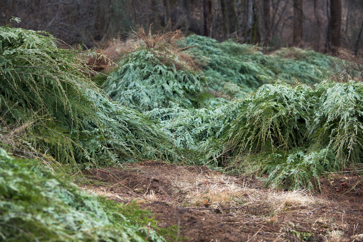
cut Xmas trees, Spruce Pine, NC

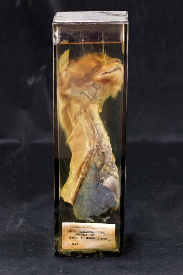
Museum of Health and Medicine, Bethesda, MD
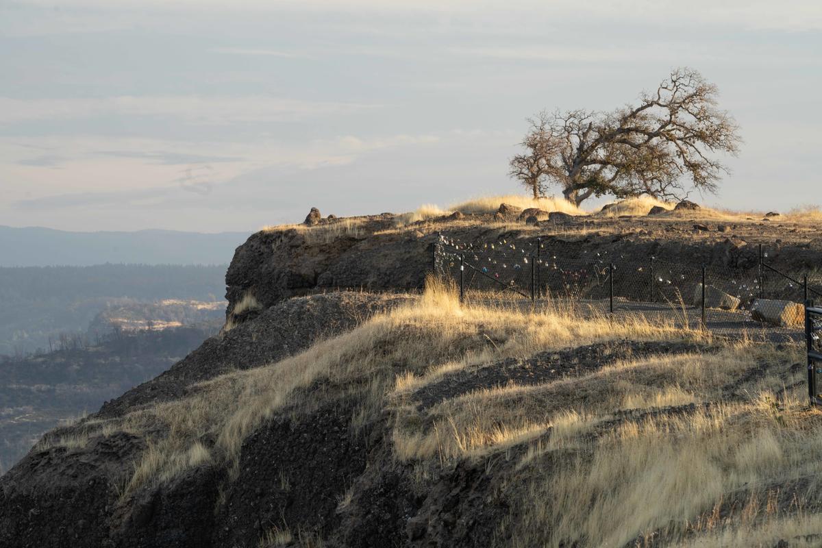
Paradise, CA 11/2019

More reading: This article references my work circa 2011 and hits on some of the same themes:

MV Arts and Ideas

Topics: Commentary,Digital

Permalink | Posted December 14, 2019

Big Change

This is a blog post about the big change that has taken place in photography. After now a long career as a photographer and a photography educator I can now say that craft matters very little and that the age of making beautiful photographic prints is over.

Let's go back a few years, to students studying film-based photography at the university level. Craft was king then, as it was hard to learn to shoot film, to know how to adjust various settings on the camera, to make pictures that conveyed things beautifully. Hell, even after learning to load film in the tank and develop, it took weeks to learn how to make a good black and white print, often a whole semester. Good craft was the foundation of making pictures that looked good, conveyed intent, communicated a certain emphasis or point of view that was expressive and intelligent. All gone now, of course. The advancement of technology has eliminated all that. A good analogy is learning to drive a car. This is a skill, learned over time with the necessary training and discipline to become good at it. Same with photography, or used to be. Autonomous cars are coming and you'll no longer need skill behind the wheel to get someplace.  With photography to some extent we are already in an age of autonomous photography, for the devices are really doing just fine on their own, making well-exposed files of pictures that practically print themselves at very high quality. Look at the sheer quality of smartphone photos today. Great skills at the helm of the computer, the conduit to the inkjet printer, are no longer required. The process has become so highly automated that a great intellect combined with years of experience is no longer needed. The people who are truly great printers have been obsolesced by great advances in automatic everything. Of course, there are lapses in all this. People still do make terrible prints. Through some brain fart or no knowledge whatsoever really terrible photographs are made every day. But with a modicum of knowledge, great prints are easy and can be practically assumed. 

It's tough to be obsolesced.

This makes looking back to a Stieglitz, or a Weston or even an early color street photograph from the early 70s by Joel Meyerwitz look like they were making a bloody miracle. And they were. Spend some time with some original Adams or Weston prints and they will blow you away, as for them to be making prints of that high a quality in the time they were making them was unbelievable.

Now, shoot RAW, let the camera make the focus and exposure settings, load the file into Lightroom, adjust it with sliders to your liking, export it as a TIFF, send it off to be printed or print it yourself and what have you got?  A well exposed and excellent print.

Did I at times rely upon my technical skills in analog days to outweigh anything else? 

Yes.

 Many of us did that. Point an 8 x 10 camera at something inane and inconsequential, develop the film and make the print with consummate skill, frame it beautifully and show it with the presumption that it is hugely important. Great significance and weight based on the device that made the picture, often nothing else. Paul Krot, a teacher of mine at RISD and the inventor of Sprint Chemistry, once said to me that anything was fantastic if shot with an 8 x 10 camera and its true. The format seduced me for 25years.

Now, I am shooting with a 61 MP mirrorless camera that handheld can do very well when compared to the 8 x 10, maybe even better. Making a big print 40 or 50 inches across is easy these days, you just need a big printer.
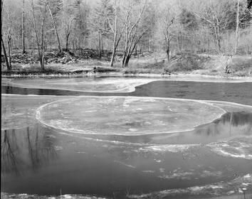
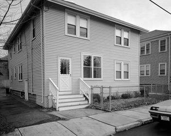
All of those technical concerns, the skill of printing and handling the materials knowledgeably, being practiced and respectful of what could be done are now, for the most part, over. 

When working with analog materials my objective was always to make the perfect print; the widest tonal range, the best sharpness, the deepest blacks and the most luminous highlights that I could. Remember Ansel Adam's adage that the "negative was the composition but the print was the performance"? This took great skill, years of experience and yes, often some luck to succeed. It was very difficult to do. Now, these things are easy, almost assumed. Those very values and high standards are often lost on those younger, brought up in a digital era. This is partly progress but also makes me a little sad too. The idea, now, of spending a whole day in the darkroom going through many sheets of paper to make one consummate print seems laughable. 

To quote Kurt Vonnegut once again, 

"and so it goes."


(All images reproduced here are ©Neal Rantoul and are from 8 x 10 negatives and transparencies and may not be reproduced without specific permission by the photographer.)

Topics: black and white and color,Commentary,8 x 10

Permalink | Posted October 20, 2019

JURIED

Last month I juried a photography competition. Since I know many of you submit to these I thought I would share with you how it works.

The one I judged was an "open call" meaning simply that there was no theme or  definition, you could submit anything you wanted. The structure was set up through the Cafe system:

This allowed me to see each submitted image as a jpeg on screen, along with an artist statement and the size of the photograph. The use of Cafe is ubiquitous across the industry. This is important as you will be lumped together with everyone else's submission in each competition with no way for your photographs to stand out, be regarded individually or regarded as something special in any way. It matters little whether you make platinum prints, print on the best of water color papers, or emboss your photographs so they have actual depth. The Cafe system democratizes all submissions, universalizing all applications into one thing and one thing only: the image. Work in large format, make prints of excrutiating quality 5 feet across? It doesn't matter. Gold-tone your analog prints with a proprietary formula that adds spacial depth and a haunting hue to your prints? It doesn't matter.

As a judge, I got fatigued and sloppy after a long session looking at hundreds submissions. It became difficult to value each one, to regard it separately from others, to respect the artist's intent, to judge on its own merits, to avoid categorizing it as another portrait, landscape, collage, night picture, wildlife, etc. I found I needed to take a break, go do something else and come back to the task fresh. It would be easy just to blow off the job, pick images randomly and disregard any effort to determine a hierarchy of photographs, from superior to inferior.

In the past, I have judged many photography competitions, but always in an actual space or a gallery with framed prints unwrapped and leaning up against the wall or sitting on tables. This allowed me to position them, to basically curate a show with photographs I'd chosen.

Looking at real prints allows a judge to see the quality of the image, to evaluate the artists' craft. With the Cafe system that is effectively gone. Grainy, unintentionally blurry, streaked or camera shaken, poorly printed, oversaturated or over sharpened? It would be difficult to tell using Cafe. 

Let me make this statement so I am not misunderstood. It is clear there is a need for judging to be streamlined but the Cafe system (or any other that reduces your work down to a jpeg file) is terrible. To take a process whose very core is individuality and universalize it is just plain wrong. You aren't making your art to become anonymous, are you? The expressive medium of photography reduced  to just a jpeg representation on a display is a travesty. This is art, being boiled down and  smoothed over by digital means to 72 dpi on your screen. This is no way to determine the inherent quality of photographs.

As an applicant I understand your predicament, either conform to the system or do not submit. Photography has become very big, hundreds or thousands of applicants, many competitions to submit to and prestigious judges reviewing your work. The Cafe system is a poor substitute for actual eyes viewing your prints. This makes portfolio reviews stand out as being far better.

Topics: Commentary

Permalink | Posted October 11, 2019

Harry Callahan 2

I am struck these days, as I age, how little history people know or care about.

In my own field of photography as an art this is often born out by how important someone's work was while they were alive and how insignificant it seems now that they are gone.

Isn't history how we learn from past mistakes? Isn't history to see what precedents there have been?

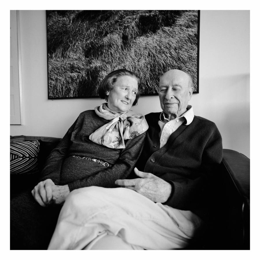
A couple of years ago I posted a story about the photographer Harry Callahan who'd been a teacher of mine in graduate school.

     Harry and Eleanor Callahan, Atlanta, Georgia


This is another story about Harry.

Harry was invited to Martha's Vineyard in the summer of 1995 by Carl Mastandrea of the Boston Photo Collaborative to give a presentation on his work. I was on the island for part of that summer and had a show of island landscapes at the MV Museum up at the same time. The day for his talk arrived and as the afternoon faded into evening the sky was darkening, a storm approaching. It was hot and humid, the air lifeless. As the crowd arrived at the Chilmark Community Center where Harry was to talk, the sky had turned very black and we could hear thunder in the distance.

Harry began his talk, standing up front at a lectern, speaking into a microphone.The house was packed with the overflow standing in back, kids crossed legged on the floor in front, Harry talking about his work in the darkened room, slides thrown up on a big screen. Crack! Came the thunder, the wind picking up as the storm approached. Harry continued, now his voice was competing with branches thrashing outside. The windows were open, the wind blowing things around, the audience was getting concerned and edgy while Harry continued. All of sudden lightning stuck the building, the power went out- Bam! - and Harry was standing there in the dark hall, the lightning having arced up the microphone cable and right to where Harry was standing. For an instant the crowd was in shock, immobile in surprise. Was Harry hit by lightining? Was he all right? For several  minutes the power was out, the battery powered emergency lights were on and people were fussing over Harry to see if he was okay, the room bathed in a dim glow. Harry was standing there seemingly all right but very quiet, appearing to be wrestling with what just happened.  A few minutes later the power went back on but, as the microphone was toast, people were asked to come forward to be able to hear Harry speak. The whole dynamic of the presentation changed then, Harry loosened up and the crowd was now experiencing something warmer and more intimate, as though in a conversation between friends rather than in a formal lecture. 

Harry and Eleanor flew to New York the following day to visit with Eleanor's sister.  Harry had a massive stroke a few days later in NY that knocked him back  and that he never fully recovered from.

Harry was in his eighties that summer and we never did know if he'd been struck by lightning or not. I always felt there was a connection between the lightning storm that night in Martha's Vineyard and Harry's stroke, but I never knew for sure. 

Harry was a very big ideal in 1995, his work shown and collected universally all over the world. He had been awarded the Presidential Medal of Freedom earlier and was the US representative to the Venice Biennali as well. He had major shows at the National Gallery in DC, MOMA in New York and on and on. 

Time holds still for no one and Harry's work is now seen in the light of present times. Few seem to go back to look, to learn from him. It's a shame.

Topics: Commentary,Northeast

Permalink | Posted October 1, 2019

Does It Matter?

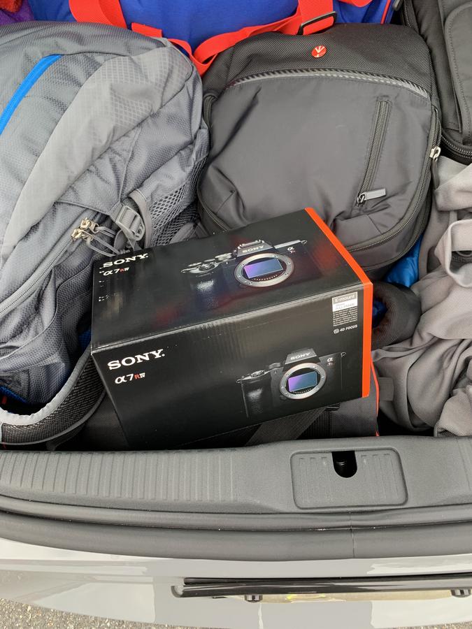
Heading out of town a couple of weeks ago on another shooting trip this time to Maine I picked up one of these, the new Sony A7R MK IV that I ordered a couple of months ago. Thank you, Hunt Photo.

I know, you either don't know the significance of this or don't care but please, bear with me. This is a unique camera, which will most likely not be a general purpose, do everything kind of camera. 

Some will buy it because they want the most up to date, buzz-worthy camera, as a sort of fashion accessory, to impress. Others will use it to make pictures.

Shoot your kids soccer game, take it on vacation, use it to take pictures of the stationary rower you bought years ago that you're now selling on Craigs List? Not so much. Although it will do all this and more, this camera, at 61 mp, is a huge overkill for much of what photography is needed for. With a new sensor that sits in the camera the same size as one frame of 35mm film (about 1 inch x 1.5 inches), this thing is recording so much sheer information it is staggering.

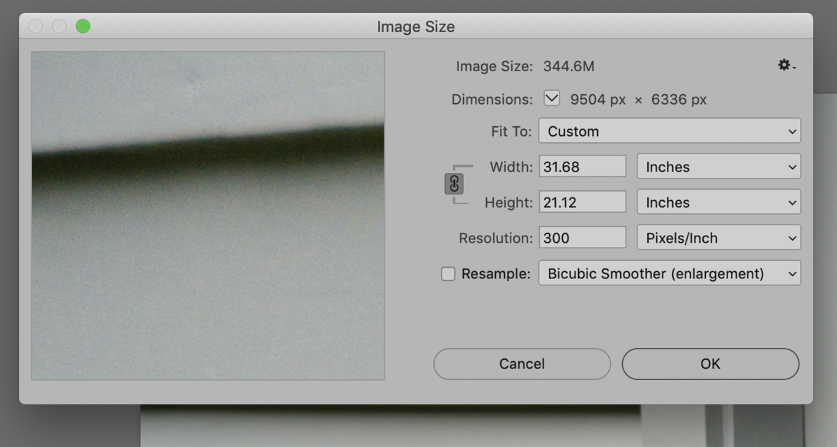
Looking at its file, it opens in Photoshop looking like this:

At 300 pixels/inch this makes a 344 MB file that is 31 inches! Put another way this would mean a 50 inch print would come in at 190 PPI. Great, right?

Hold on, though. How often do you want to be making such a huge print? And what if you just want to make a print, say 14 inches or so? Again, way too much file than is needed. This becomes an issue when you start thinking about storing these huge files.

More is better, right? Not necessarily.

Now that I've had the camera for a bit and walked around Rockland, Rockport and up on top of Mt Battie with it I can conclude a few things. This is a more mature and refined camera than its predecessor the MK lll. It feels solid and substantial, its bigger grip aiding in holding it comfortably. Buttons and settings have been reworked slightly, the shutter, although not instantaneous, is fast and very solid feeling. But, and it is a big one, as this file is now so very large, hand holding the camera sharp becomes a challenge. I set my shutter at 250/sec and 500/sec and still got unsharp images. Holding it out at arms length and looking at the back screen and then tripping the shutter is asking for trouble as this just isn't stable enough. I suspect many users will find themselves using a tripod more often with the mk IV.

Something else: As we're getting up there in the rarified range of medium and large format cameras, the quality of the lenses we're using becomes increasingly important. Think that kit f4 zoom lens is good enough? Probably not. 

My whole career has been spent on a pursuit of high quality. Early on, I rejected much of 35 mm photography as I couldn't resolve the issue of grain and lack of sharpness. Most of my work in analog photography was with 120 mm cameras or 4 x 5 and 8 x 10 inch sheet film. I wanted to be able to make larger prints of high quality. This was true in the earlier days of working digitally too, as I made many changes to larger sensors as they become available: Nikon D3 to D3x, to 800E to D810 to D850. About 4 years ago I dove into the Sony mirrorless cameras first  with the A7R MK ll, then the lll and now the lV.

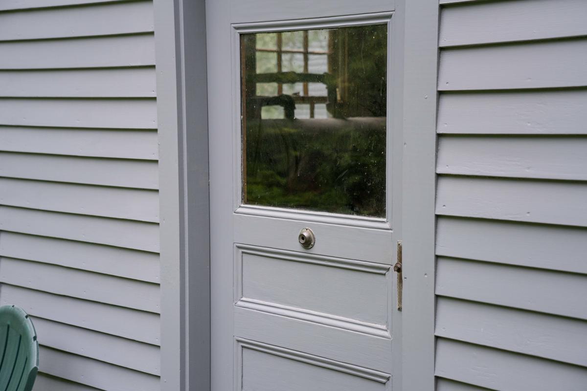
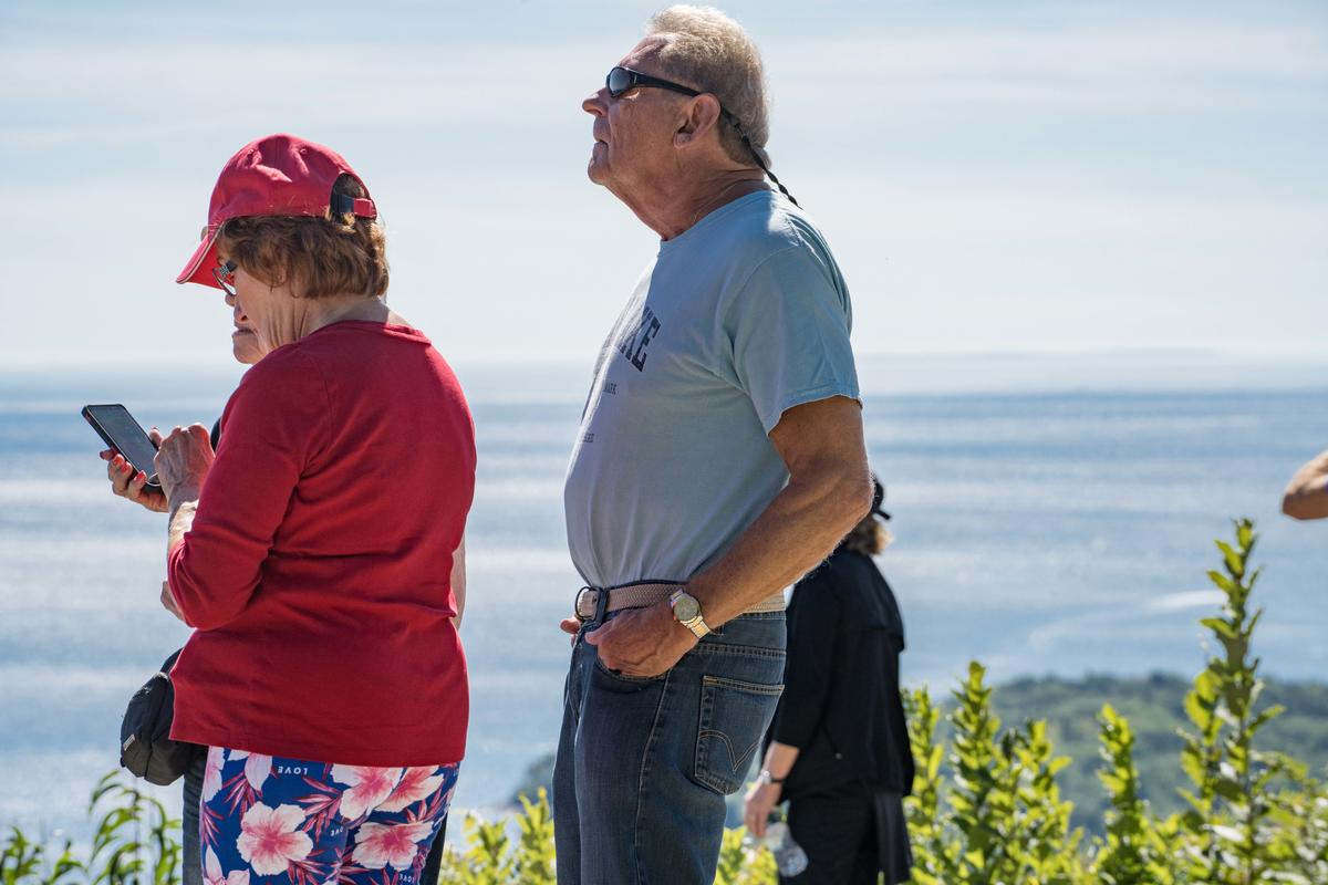
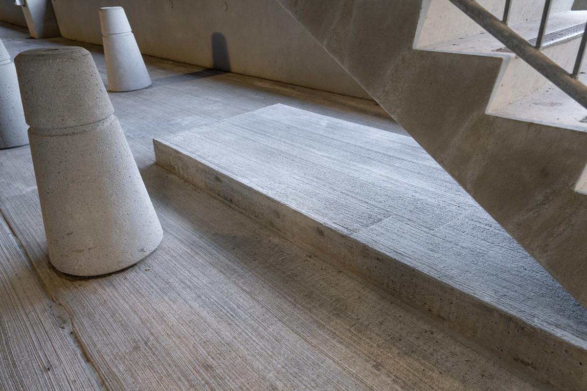
Let me post a few pictures made with the camera:

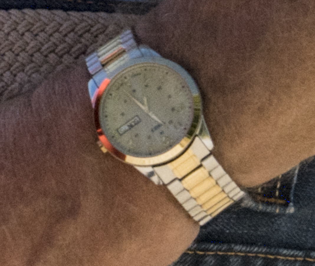
Let me add that you wouldn't see any perceivable differences here on line between this camera and most others. The file is too small and the reproduction is too little. The difference between this Sony and cameras with fewer megapixels would only be apparent when making larger prints.

and his wristwatch at 4:1

Impressive, yes?

Let me conclude with this: make pictures with a digital camera that has a smaller sensor and you limit the size prints you can make.  Make pictures with a digital camera with a large sensor and you have the ability to make big prints. The downside is that you need more computing power, more and larger storage, from the cards in the camera to the hard drives in your computer as well as the  RAIDs you use as back up. 

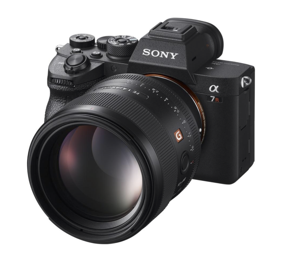
The Sony A7R MK lV

Topics: Camera,Commentary

Permalink | Posted September 30, 2019