CRIT 2
In Crit 1 we dug into a photograph a little and looked at its structure as well as asked questions about intention versus outcome.
In Crit 2 we're going to contextualize an image, referencing other works as precedent as well as see if we can make sense of an image beyond its surface.
But first, let's use a new image:
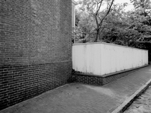
This is one of mine from 2018 from San Jose, CA from the series called San Jose Squares, and written about here. While critiquing your own image may be a little risky, it is, after all, something we should be doing all the time anyway. Let's see how it goes.
Again, as a start, stating the obvious means we have covered it, announces that we are paying attention and perhaps points out some things we may have missed.
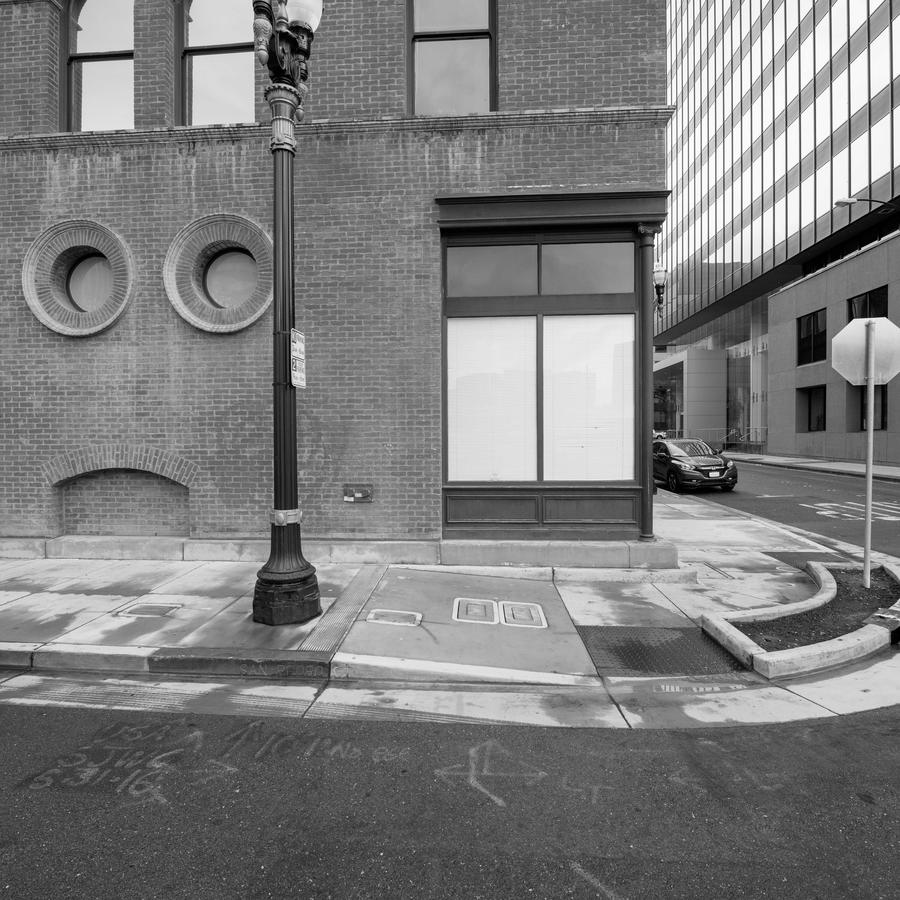
The photograph is in black and white and relatively flat with no distinct shadows or highlights. It looks as though it has rained recently, as parts of the pavement and sidewalk are wet The image is a study in grays. The depiction on first look is relatively normal. It is slightly deceiving, however, in that it is shot close up and yet spreads across a wide area. Look how the building in front of us tilts left. Is that right? That tells you that we are looking at this scene through a very wide-angle lens that distorts. This is a "face" picture in that the two "eyes" on the left combined with the brick "mouth" below form a caricature of a face, with the pole to their right splitting the frame and establishing that this is one of those photographs where there are other photographs contained within it.
This style of things touching the edge of the frame, the stop sign on the right (forming another eye shape to counter the two on the left) and even the light pole slipping out of the frame on the top is an irritant. It makes me question if the photographer is doing this deliberately (he is). We are on a side street in the city of San Jose at a time where there are no people. You can't help but notice the frontal and two-dimensional rendering of the side of the building facing us contrasted with the incredible speed and dynamic of the right office building facade, all glass and high tech looking.
Last, and importantly, is the car midway down the street. This is a known object for we are familiar with its heft and size and can say that it is about so many feet long and high and yet here, in this frame, it's been reduced to some sort of model car as it seems all wrong, placed there out of context and foreign to our eyes. Again, the acute wide-angle lens is messing with our sense of what is right and wrong, where things reside spatially.
This photograph sits firmly in a long-standing tradition of photography that began most likely in the 1950s with a few notable exceptions. Eugene Atget comes to mind, photographing in Paris on the streets in the early 1900s. One of my teachers, Harry Callahan, could have made this picture and indeed, if it weren't for Harry I probably would not have been aware that there was a photograph to make here. Lewis Baltz (New Industrial Parks Near Irvine California) rocked my world when I was younger and is clearly a precedent here. As I think about it, some of the wonderful images Walker Evans made in the early 1900s from places like Pennsylvania and Virginia are made a little like this one. Presumptuous company to keep? Just saying.
The approach in this photograph, the overriding aesthetic, is to present this subject in seemingly relative neutrality, for it to appear conventional or normal and yet in going a little deeper the photographer imposed a good deal of structure and control over his subject, as well as alteration of what was in front of his camera.
Finally, look at the number of pairs of things in the frame. Is that what caught the photographer? Is it the two eyes with two windows above them, the two white windows, the two covers in the sidewalk concrete and even the two headlights in our diminutive car back there, is that the framework for this picture? Maybe.
In a print critique, the teacher might, in concluding, seek to provide a takeaway to a particular photograph or body of work. Some teachers might try to provide an "answer" but I think that makes all this too rigid. And, after all, this isn't like there is a lesson plan or a finite answer to a specific question for this is art here, creativity expressed through the medium of photography of a place in California. Were I critiquing this photograph in a class I would remind the students that photography is its own special thing. That it renders our world through its own filter, that, while it may look like those objects described above, in this rendering it is in no way factual and certainly not accurate. Is this the artist using the tools as his disposal to comment on the medium of photography? You tell me.
In conclusion, while a good print crit will help you become more aware of what goes on in a picture, it can also lend perspective too. One that is very important is this: photography is its own language and has its own way of showing us our world. It isn't particularly truthful but it has a way of looking like it is. This photograph is that kind of deception, looking normal but not being normal at all. One of this photograph's basic tenets is that if you can find how things are skewed in it, perhaps you'll look at other photographs with the same critical eye. I hope so. Too many take photography for granted, assuming that it actually looks in realty just like the photographic rendering of it.
Related series
San Jose Squares
These were made in late February 2018 in San Jose. CA
They are digital in that they were made using a setting on the camera that allows photographing in a 1:1 proportion.
I wrote a blog about these, and the unique way they are made into square pictures.
Related blog posts
Nantucket 1980 Part 1
Nantucket 1980 Part 2
Nantucket 1980 Part 3