Crit 1
Critique: a detailed analysis and assessment of something, especially a literary, philosophical, or political theory.
In art school, students will prepare to have their work critiqued. In the photo lab at school you'll hear, "how'd the crit go?"
Put your work up on the wall in class and the teacher will critique it.
While many know this system and the way it works, many do not so I thought that I would critique a photograph in the blog. I spent my teaching career critiquing photographs so feel qualified to write how it works.
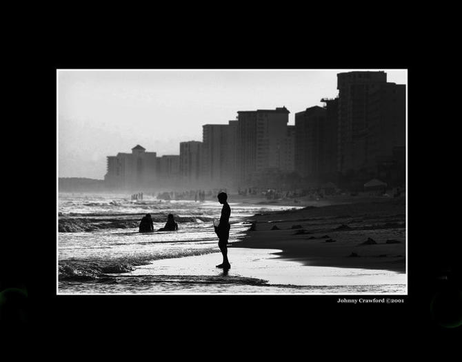
This is an image I found online by Johnny Crawford, with thanks. (source Google Images)
Many teachers will state the obvious first. The two paragraphs below are mostly statements of fact, establishing indisputably the foundation for the teacher's interpretation, which comes next.
Since we know nothing about this photograph, where it was made, what the photographer would say about it or who it is, we start from a place that is highly democratic. That can be a good thing as it levels the playing field. Of course, being critiqued one-on-one or in a class can be harder. Also, these days, making a black and white photograph is an artistic statement, removing the subject from reality and counter to the historical precedent of photojournalism in an earlier era before color prevailed.
The photograph is dark, backlit, with deep shadows. It is in black and white and the main subject, the person in the middle ground in the lower center is silhouetted. By pushing the tonalities dark and printing the image high contrast, the photographer has made it more dramatic.
Here comes the evaluation part. It is not unusual for a teacher to appear or to actually be bored with all this. Good ones will remember that the student is in effect putting it all out there, exposed and vulnerable. On the other hand, being able to absorb criticism and become a better photographer is the goal. Finally, what does it say about your work if the person critiquing it is bored by it?
For me, part of the problem lies with where our subject is placed. I find myself thinking, "what if the photographer had moved a little to the right, to isolate the figure differently?"There is something about his head blending into the shadowed background of the beach back there in the dark that bothers me. Tall buildings right on the beach: Miami or perhaps Rio in Brazil? Not sure. It makes me think that climate change will alter that, the relationship of the ocean to the buildings.
Often we present an image, hoping that it will go over well, be liked, that perhaps someone will really love it, even if we don't. That's tentative and can't be a good sign or way to present your work. That's what strikes me about this photograph, that it doesn't present to me as being emphatic or visceral. That it is ambivalent. It is a little passive and then drama's been added by using strong blacks and adding contrast. Inexperienced photographers usually take the picture as they see it, not taking the time to move low, to move left or right, to move in or out. Photography is not a direct translation of something as we see it. It is a tool for us to use to interpret that. Therefore we have to work with it to convey our intent. That takes training, experience and, most often, physical movement. Henri Cartier-Bresson used to talk about how he felt he was a dancer when he made his pictures. You can see that in his work. (Note: good teachers will always reference others' work. Good students will always go and look up the work the teacher mentioned).
Perhaps if the figure was larger in the frame? I am not sure.
I think the printing is okay, although that is a whole lot of black. I seldom think total black is good, especially in large amounts in a photograph.
Last, I am not clear what the take away for this photograph is. Do I have a clear idea of the photographer's intention? Presumably, it is summer or taken in a warm climate, the boy in a bathing suit, people in the background in the water. This may seem trivial but does the thin white line around the photo help or hurt? And what was the logic behind the black board? Was that a good idea or not? Just a question.
Obviously, there is much more this crit could deal with and this one was pretty short but you get the idea. Crits get more complicated of course, as student's ideas and presentations get more involved. Thesis work, where a student presents a whole body of work, can take hours to get through.
The student should get a sense that alternative approaches should be tried, that photographs most often fail when the photographer is hunting for meaning. Trying is good but succeeding is far better. If you know what you want going in the outcome will be better. Often crits pose questions and ask the student to work out their own answers. It is seldom as simple as a teacher providing an answer for, after all, life doesn't work that way, why should art?
And last, key to a good crit is others' response to the work. What do your classmates think? This can be applied to the idea of showing your work to others to judge their opinion: family, friends, other photographers, other kinds of artists, the powerful and eminent, neighbors, your dog (hah!): anyone and everyone.
I hope this has been helpful. Let me know if you'd like me to keep going with this as there is much more. Neal's Email


