Portland, Maine 1996 Three
This is the third part of a description and analysis of a group of pictures I made in Maine in 1996.
The full series of Portland, Maine is at: Portland
Depth and convergence. That's what's going on here. You can almost see this photograph swirling around the central core of where the lens is pointed. This is the fifth picture in the series and is an assertion that I am not documenting anything here but using the place, the streets, the houses, the buildings in Portland for my own design as a kind of canvas. We will see this again on down the line in the group. For me, this picture is a celebration of the light spreading across the scene, modeling the forms in ways that are dynamic and powerful. In the first post I compared this series of photographs to those I'd made earlier in the 80's. This is another that reinforces those differences as I find this picture and, in fact, the whole set, far more assertive than the earlier work.
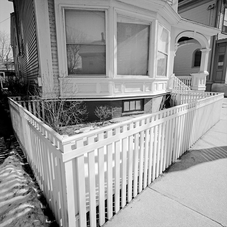 This one, with its white fence making a clear triangle, establishes another way in which I photograph. Pointing down with a wide angle lens makes a sort of "reverse convergence" in that the top of the frame bows out. In this case it ends up making quite a radical picture. Almost incidental but something we will see again soon, there is snow in the lower left. This places the photograph in the time of year it was made, late March. Also, I wanted to slide the viewer's eye to the right, up along the fence into the intricacy of the banister on the steps, then to the back railing on the porch and then to the boxed-in section of the side of the next door neighbor's house. And finally, on the opposite edge, there is a slight escape out of the frame to the sky behind that is rendered a middle gray, sliding down the clapboards on the side of the house that never looked like that in reality.
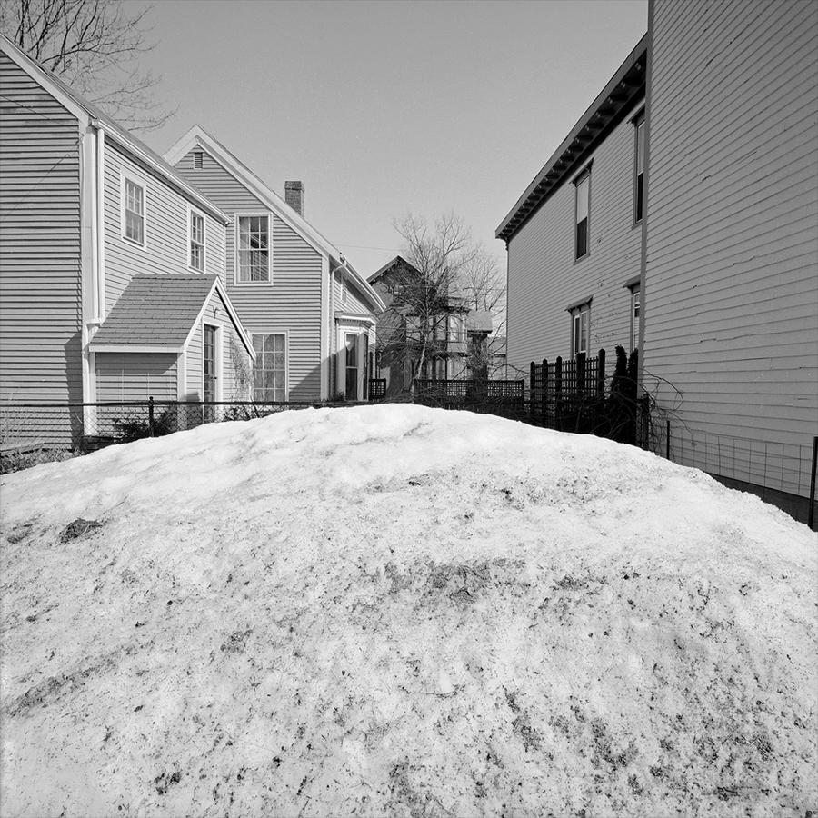 Here's much more snow, in the next photograph. Why? I liked being able to use the snow mound here, although this in no way is a core picture. It is simply an unusual and different form than I would normally have to work with so I used it. If I break down these two and the next one it is clear I was interested in depth, not so much parallel plane pictures in these three.
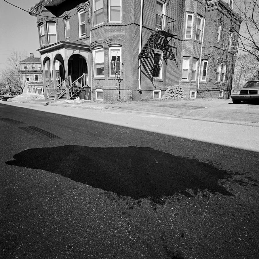 In this group of three, this is the last and reaffirms the previous triangle picture at the start with the white fence, in a reverse priority of placement, putting the shadow in the foreground to accentuate the building and its new rendition, never intended by any archtitect, however long ago. I am using the lens to convey the building here as a caricature of itself. The dark form on the pavement inside the large shadow speaks to something a little more ominous or foreboding, at least to me. It's difficult not to think of it as some big stain and blood looks black in black and white photography. It's actually a patched repair in the street. I have, once again, as I did in the first photograph, used vehicles to edge the photograph on the left and right. This is a tactic to contain the picture, to end it definitively rather thean just let the picture slide off at the edges. But also they are there as a kind of visual aid, as we know how big cars are and they are ubiquitous in our present day world. I like how large the one on the right is and how very small the one on the left. This is that wide angle lens doing its thing again.
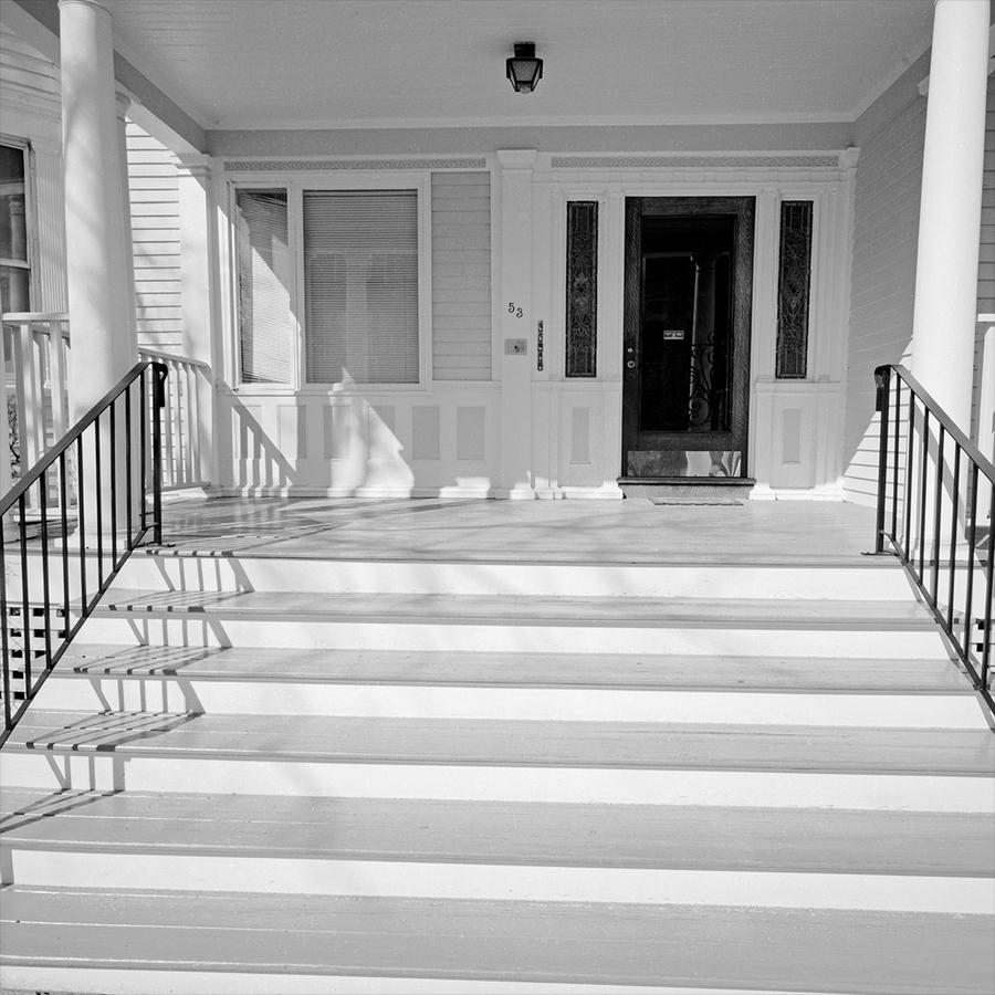 This picture brings us back to rough planality (don't know if this is a word. Planalness maybe? The characteristic of the camera being in the same plane as the subject). We are also brought back to the sheer quantity and brilliance of light present that day. There's a little ambiguity too about doorways here. The entrance appears to have been to a duplex of some sort in a former life, with what had been another door now being replaced by a window on the left. We will get to another somewhat enigmatic doorway again in a few more pictures.
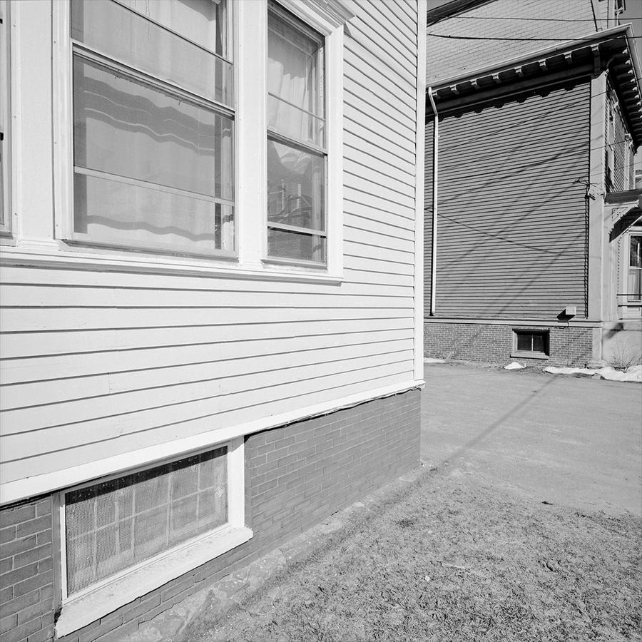 This is a core picture in the series. A road to nowhere? A pathway to a wall? Forgive me, but this was just really fun, to be able to do this. Shooting this way, walking along a street in a city or a town is a challenge in answering the question: "what else can you do?" In order for this to work in the context of being able to line this up, to slide the picture from foreground left to background right, to contain it so, to keep the camera level, to print it tonally light and mostly flat was simply a rarity and a pleasure. How something so modest looking can be such a simple and complex thing at the same time, with its shadow lines of the wires criss crossing the picture like a dance, is simply one of the reasons I keep photographing. I regard this picture as a gift.
Remember earlier I wrote about how the square would do things not only to the edges of the frame that are to the left and right but also up and down? Take a look at the top edge of the picture and notice what the wide angle lens does to the building. Like the bow of a ship and very sharp.
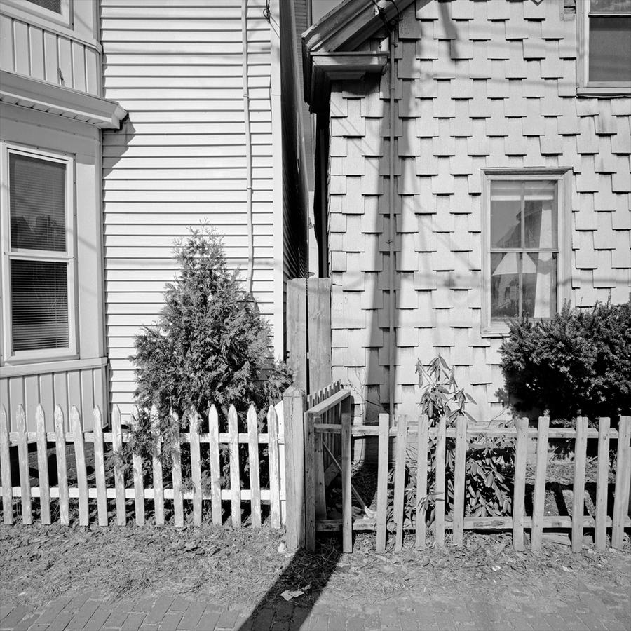 Flat, planal and deceptively simple looking. Two buildings pressed close together but not necessarily getting along too well. Some serious work done to keep them separated from each other too. Different taste as well, one grounded in tradition and one not. But also on the left things are kept up far better. The big slash of a shadow from the telephone pole right over my left shoulder reinforces all this.
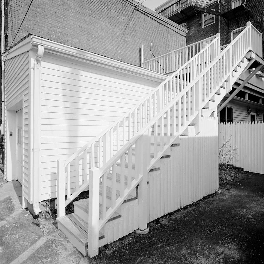 As you may have been able to tell we're in the substantive center of the series here, with each picture having real weight, perhaps being referenced by something that came before it, as this one is, but making its own statement as well. Clearly this stairway refers back to the other fence picture but I've worked to keep the camera level which limits convergence more. Have you ever seen stairs go higher or be bathed in more gorgeous light than this? The stairs lead from shadow to light and I feel lighter as I climb up them. Then there is the simple rectangular box of the garage. Not so simple, actually, as the lines formed by the edges of the clapboards are zinging all over the place, shooting at us, several going over my right shoulder like laser beams. Can you tell if I love this picture? I do and am proud of being its author. But I would categorize this picture as a success mostly due to being aware of its inherent possibilities and being in the right place at the right time. Very few photographers know how to use a wide angle lens well and the lenses are often referred to as being "for experts only" as if handled badly or haphazardly, the results can be a disaster. I know, I've made my fair share. But this one works for me. Why did I place this one next to the one preceding it? Because the first is flat and this one is about depth and distance. Also the shadow from a telephone pole is repeated here, used again, although less emphatically, to allude to things going on outside the frame. Finally, I regard this picture as a study in perspective.
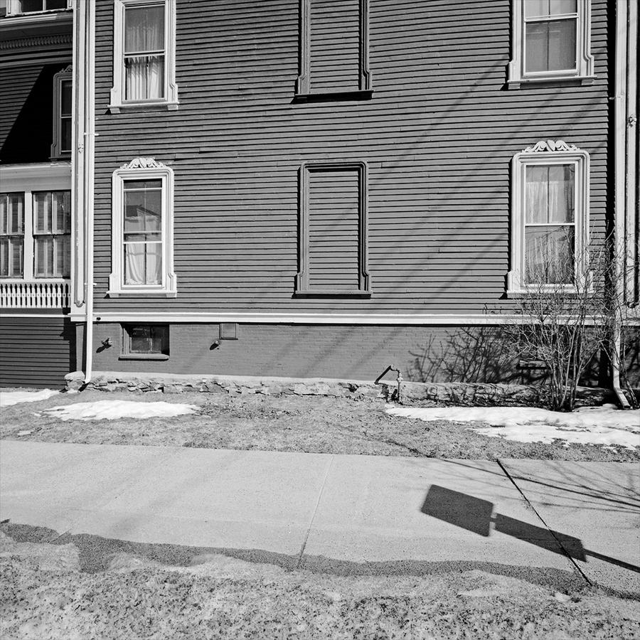 Were these stacked prints in a portfolio we'd know the stack is getting smaller by the time we get to this picture and so I am going to close this section after this image but want to draw attention to a few things about it.
The obvious reason for the picture is the closed off windows in the center. Makes you wonder a little. Opening up an older house with smaller rooms? Or making more rooms on those two floors, so there's a wall there now? I have no idea. But there are other things going on too. First, snow makes another appearance, there's the shadow of a sign on the right leaning into the frame and this picture too is planal but not square on at all, as I am turned to the left to make the picture. Snow makes a reappearance, with a band of melting snow in the foreground too.
What's next? The last section in the blog series on this series. There are only three more to go. Portland 4 is: here
I hesitate to remind you, but you may respond to this post or any other by emailing me at: Neal Rantoul
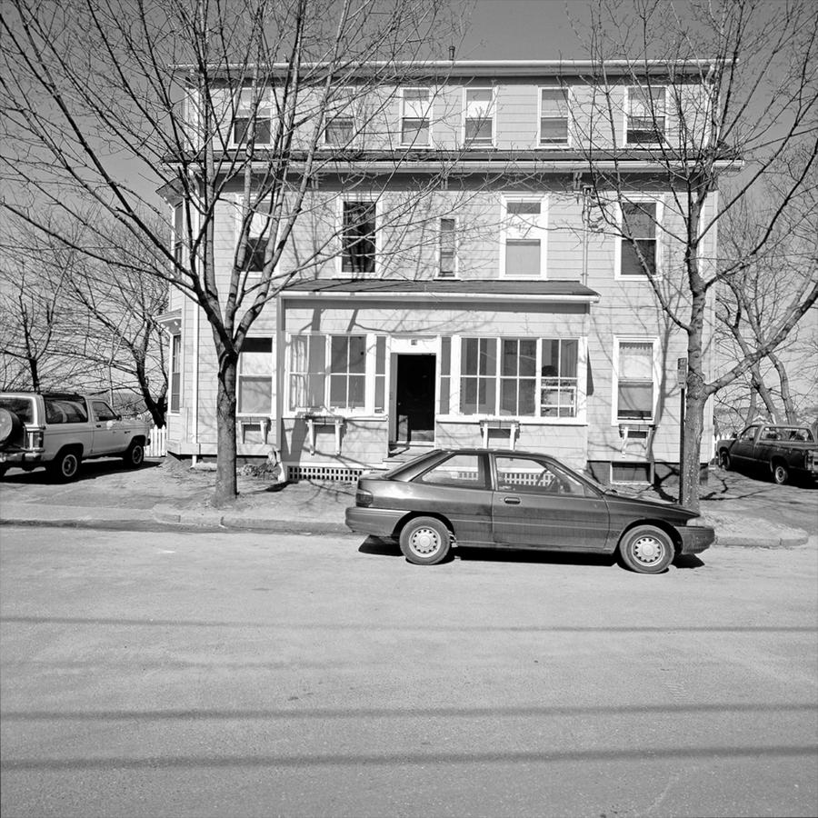 Because it can. This is straight out and flat out an affront on the viewer's eyes. A symphonic blast from the brass instruments proclaiming that this is different, new and brash. A slap in the face saying "wake up". Bright and glowing but contained by the perimeters of the trucks both left and right and further by the car in the front as well as the telephone wire shadows, the picture is my way of saying that I am working in a new way. It is frontal, confrontational and loud.
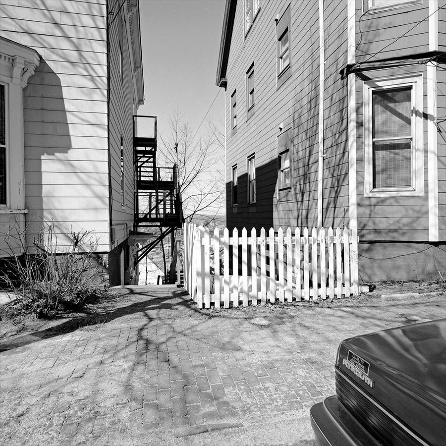
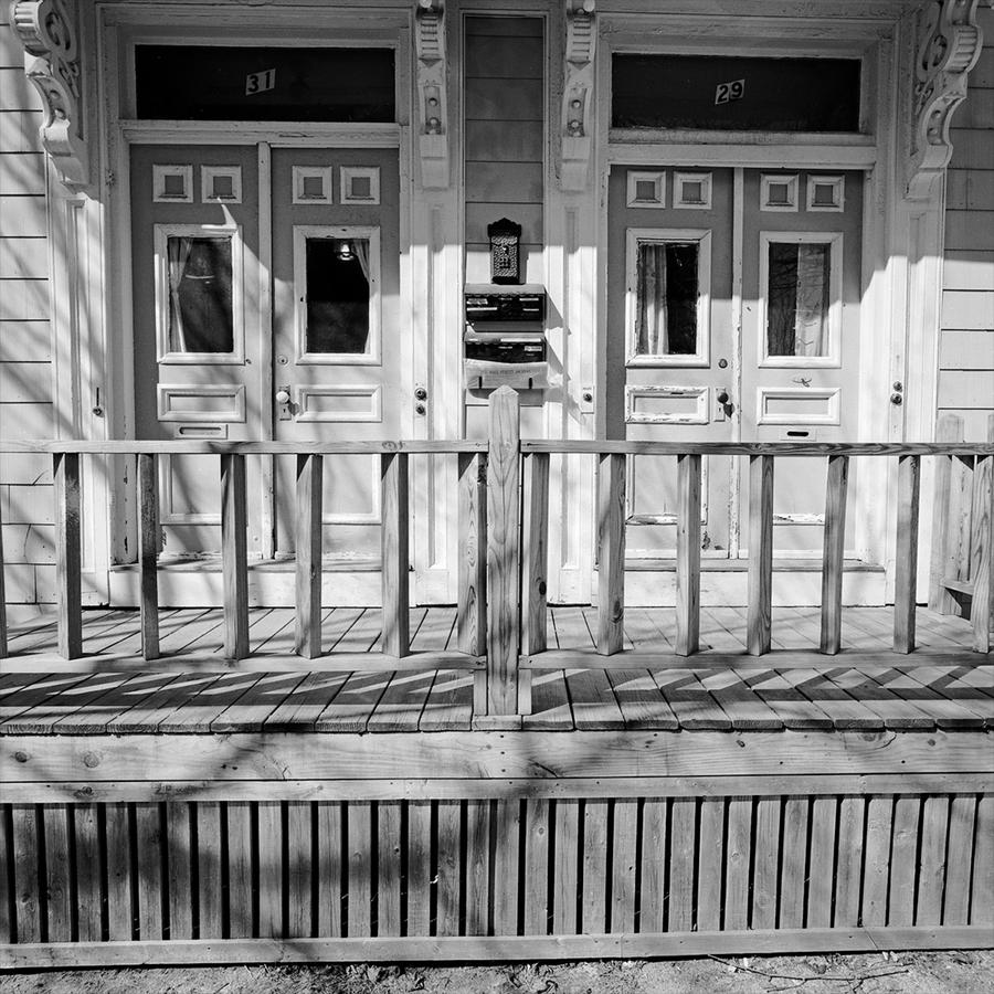 I wrote about this one in the first Portland post, but suffice it to say that it grounds the two others in the group in a complex and intricate way of looking. It is also planal in that the subject sits roughly parallel to the camera. This is important, as you will see.
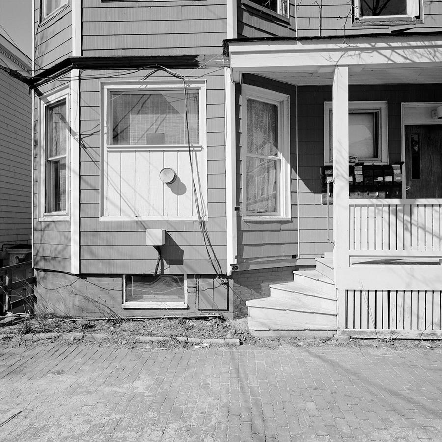


 I was working here with a Rollei SL66, 80mm Planer f2.8 lens and a tripod. The 120mm format Rollei was unique in that it allowed 6 degrees of tilt up and down. This increased sharpness in depth and I used this feature in this series.
 I remember I liked working with the 45 degree "buttresses" that were stuck onto the corners occasionally to break up the relentlessness of the buildings. I wonder if they helped hold them up too.
  This one (above) is a good example of the how the tilting of the lens allows a different picture as it is sharp from the extreme foreground to the horizon.
 I've written before about how


 I photographed the site over several seasons so that the project took about a year.
 It is a fairly common thing for me to do, for the last picture to relate back to something earlier in the series, and in this case this is the same wall shown first in the second picture in the series