Triple Play Thompson, CT
Being an artist photographer can certainly feel like gambling at times. Throw some pictures out there and you take your chances. I did promise a look at and analysis of three black and white, film-based series I made. This is the third gamble of looking at a body of work now posted on the site but never written about before. Actually, Thompson's only been shown once, in a one man show at Panopticon Gallery in 2006 when the gallery was in Waltham, MA.
First up was Billings, MT, then Vignole, Italy and now Thompson, a northern Connecticut rural town with a housing development smack dab in the center. This one has a mid-eighties feel to it, and clearly was a refresh of housing which was much older.
Here is the part of Thomspon that I photographed:

You can see three rows of buildings in the center of the frame, with a river snaking by to the left and some open land which might be a baseball field at the bottom of the frame. Clearly this had been mill housing in a former life.
My pictures begin at the top, where mail is delivered and there seemed to be a common room used for meetings:

The above circle is spread out as I am standing very close and making the picture with a very wide lens. More on this farther down.

We'll see the circle again as I photographed the housing development in a loop so that I finished where I started from.
(As usual, I am not gong to go though each photograph here but ask you to take a look at the full series on the site: Thompson, CT.)
For the most part this was classic row housing:

The series is as much about detail within a larger framework as anything else. The Hasselblad Superwide (SWC) is once again the camera, a fixed focal length camera with a 38 mm Biogon lens, which is very wide for the format. Notice here the front of the building looks relatively normally rendered, straight lines are straight and so on. But then look up to the two small dormers on the top. All hell is breaking loose with these as they are spread apart and we are no longer looking at them head on. Of course, this is the wide lens doing this. The SWC is a camera that can be very sneaky in the way that it images for, kept level, it can look deceptively "straight" . Hasselblad knew this all too well, as they provided a bubble level mounted right into the top of the camera with a prism on the finder so that you could see the level as you shot. I am a little biased here, but this is probably the coolest camera of all time.

You can see the level and the small prism in the illustration above.
I thought it might help you understand the pictures better if you knew what a unique tool I used to make them with.
Back to Thompson:

Each building had a gap between it, used as a car park. A tree in the middle of the frame? Of course. Used as a visual tool or device to split the square frame to make, in effect, two pictures, one planal and rigorous and one open and spatial. Notice again how "fast" the lens is - meaning how much space is rendered here from foreground to background. Look at the concrete walkway as it pulls back in space. Fast.

Another classic device being used here by me, the photographer. Photographing the space between the forms, not the forms themselves. Why? To comment on how the buildings occupy the site and to draw attention to the unique rendering of the lens once again. I learned this from my teacher Harry Callahan who did some wonderful things with buildings later in his career in Peru. Buildings as book ends on an almost empty shelf. Notice the screen of the foreground tree branches. Deliberate, and I could not have made this series with leaves on the trees.
As I walked down the row of housing on this early spring day with bright sunshine, I saw many cases of "individualization" (I have no idea if that is an actual word but it fits).

Much of this series is about making a statement only to reiterate it later in the same series. Notice the parallel structure of these two photographs.These very black doors always seemed a little ominous to me.
 Individualized or just junk? This one directly above just slays me as the birdhouse floats in space, the smiling cow and the American flag on the lower right. Who needs fiction when reality provides richness like this.
So, as I went down the front of the first row things begin to open out and, as I wrote in the beginning about these three series, Billings, MT, Vignole, Ialy and now Thompson, CT, these are late career, mature, flat-out series, loaded with everything I know how to put in them. In car buying lingo, this series is fully optioned out.

Here is the door idea moved to the other side and in white instead of black. Where am I headed? Around that corner and out, way out.

Bang on! Standing square in the middle, pointing up a little, no correcting for converging parallel lines; what you see is what you get. Excuse my enthusiasm here for my own picture but: love that! Also, what the hell is going on with no window in the bottom left row? A kitchen in back with cabinets along that interior wall? We'll never know.
With that small mystery unsolved it would seem to be a good time, yes, it's true, to stop Thomspson, CT in mid stride, so to speak.
What's next in part two? I will leave all this behind and walk into another world right next to this, of trees and flowing water, that seemed at the time like a parallel universe and something I had never done in a series before, then come back to the the second and third row of housing to finish up.
Will it be as good as this was? You'll have to wait and see.
BTW: I thank those of you that are new for subscribing. The list is getting longer and longer. I hope you enjoy the blog.
Yes, if you are reading this, you may subscribe and will get all my posts as I publish them. That way you won't miss even one. Finally, don't be timid about responding via email. It helps me to hear from you as writing this in complete isolation is just plain weird, like sending out a signal on the radio never knowing if there are listeners out there.
Neal's email: Contact Neal

 Get your ticket and get on the water bus called a Vapporetto, and ride it a ways in the lagoon that surrounds Venice and you might end up on Vignole. Right away Vignole is different, not like Murano or Burano, but agricultural, with few tourists and sparsely populated. When teaching for three summers in the mid 2000's in Venice it is where I went when off on weekends to get away, to take pictures by myself, to grab a few hours of serenity before going back into the maelstrom that is Venice in high tourist season.


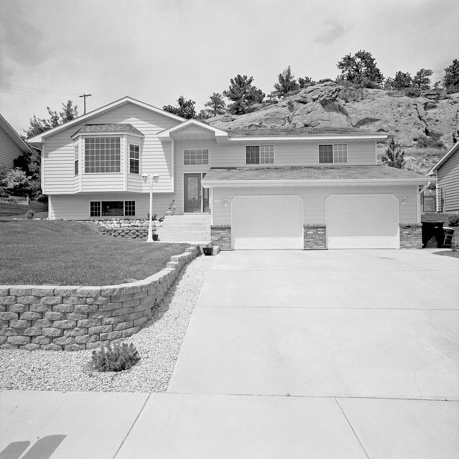
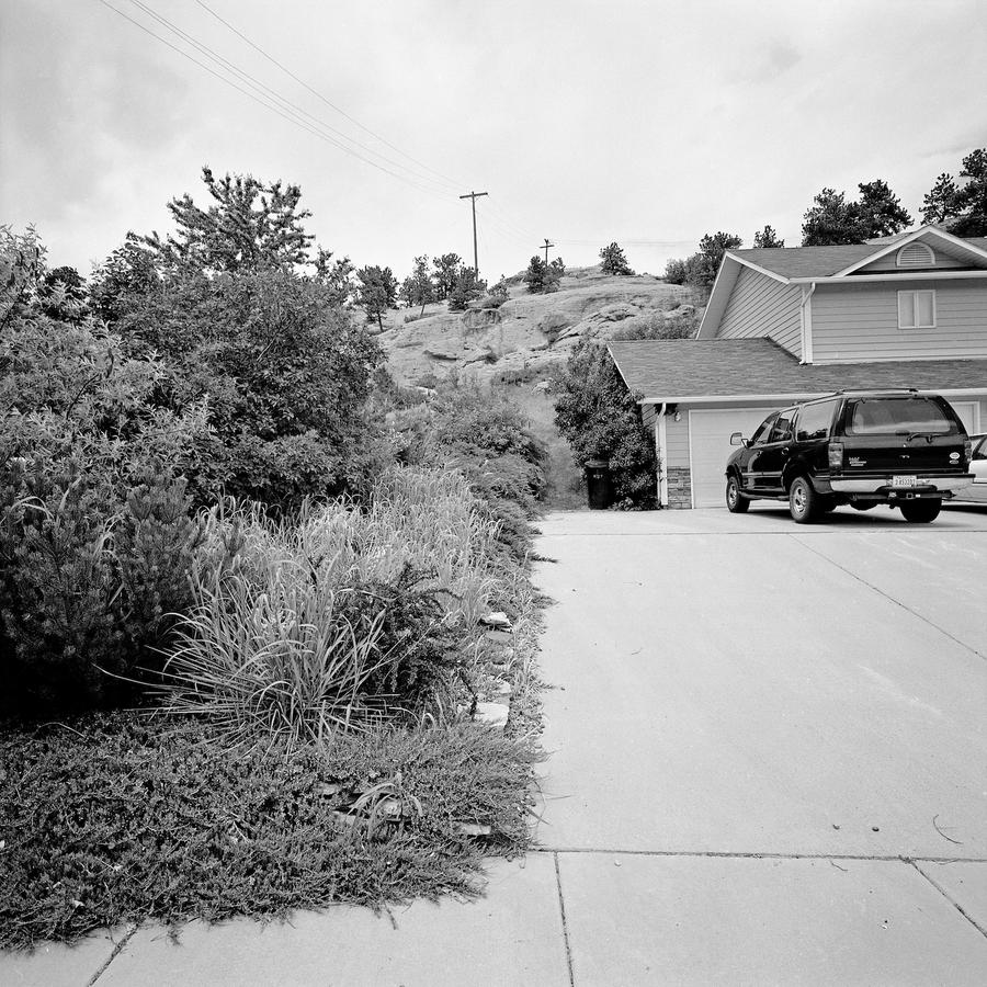
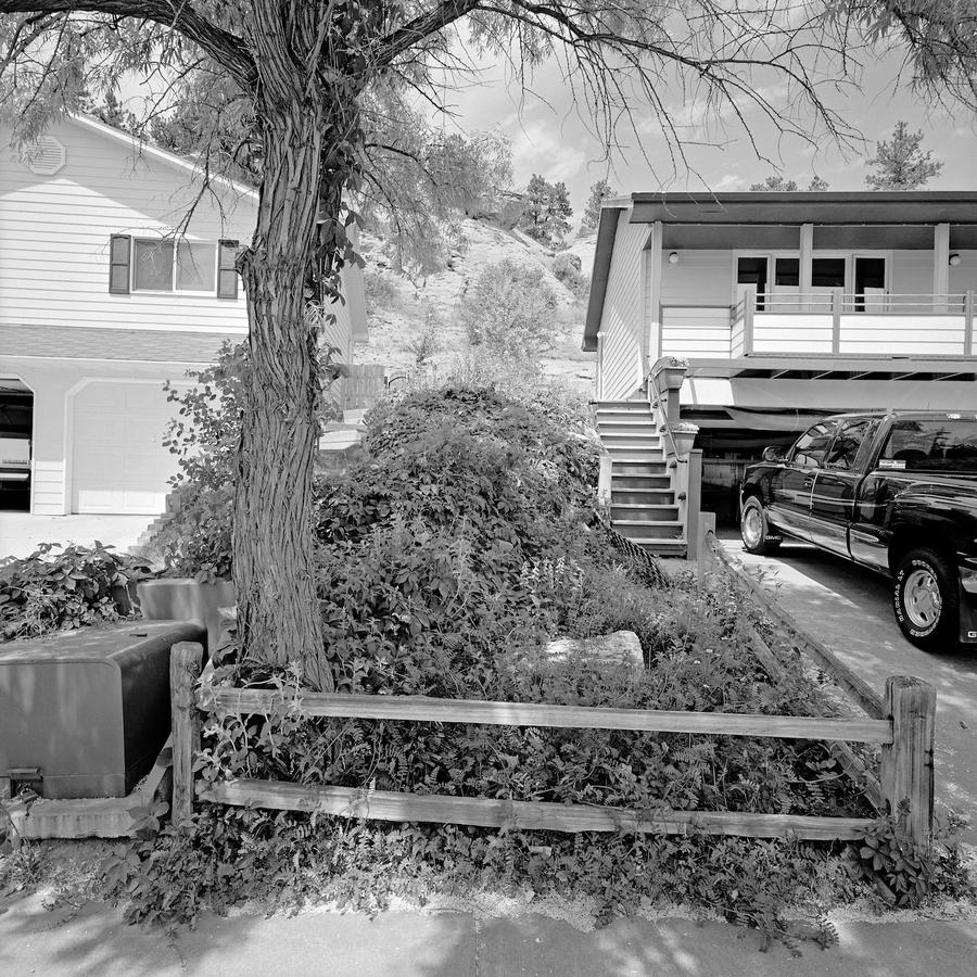
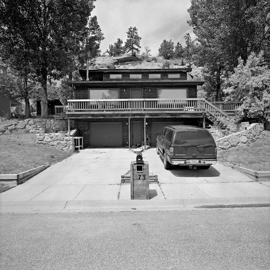 The next photograph, which is # 73 on this street, brings us back to the house itself having prominence in the frame. To my eye the small amount of rock behind this house seems to be there to support or compliment the really brutal face of the house with its two garage doors, two big windows above these and four windows above that. This is such an "in your face" house compared to the other ones that are far more standard. This house also seems to be built into the hill more than the others preceding it.
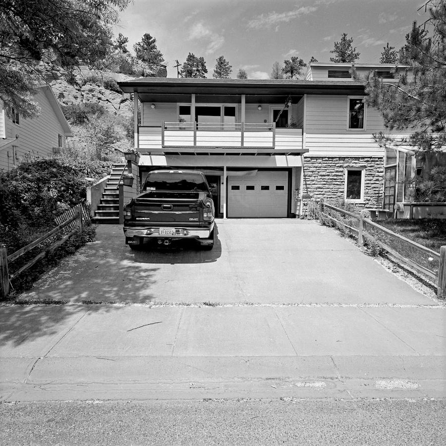
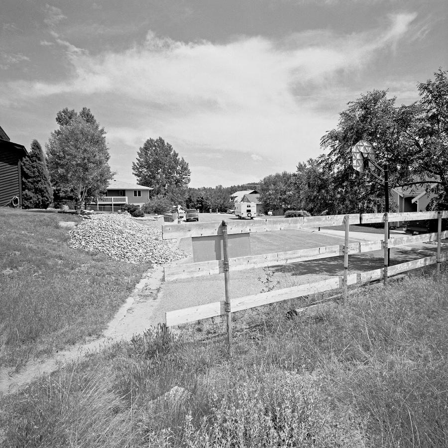 where I turned 180 degrees and photographed where I'd just come from, also to show that I had gotten to a dead end but not why the street ends there.
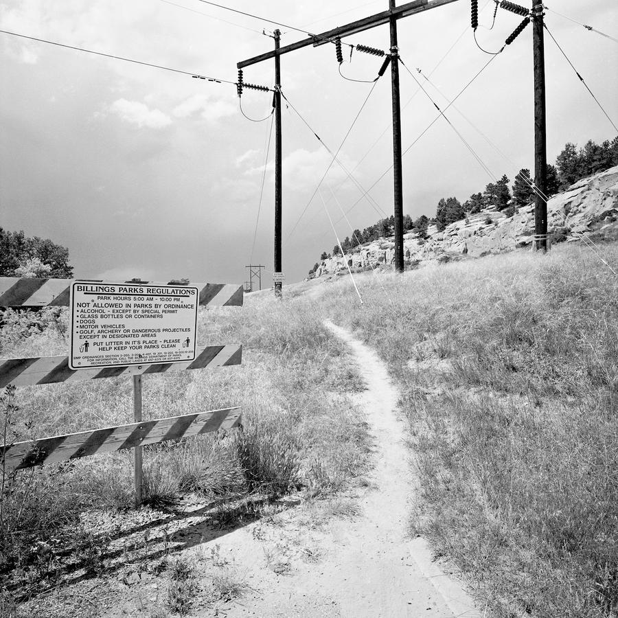
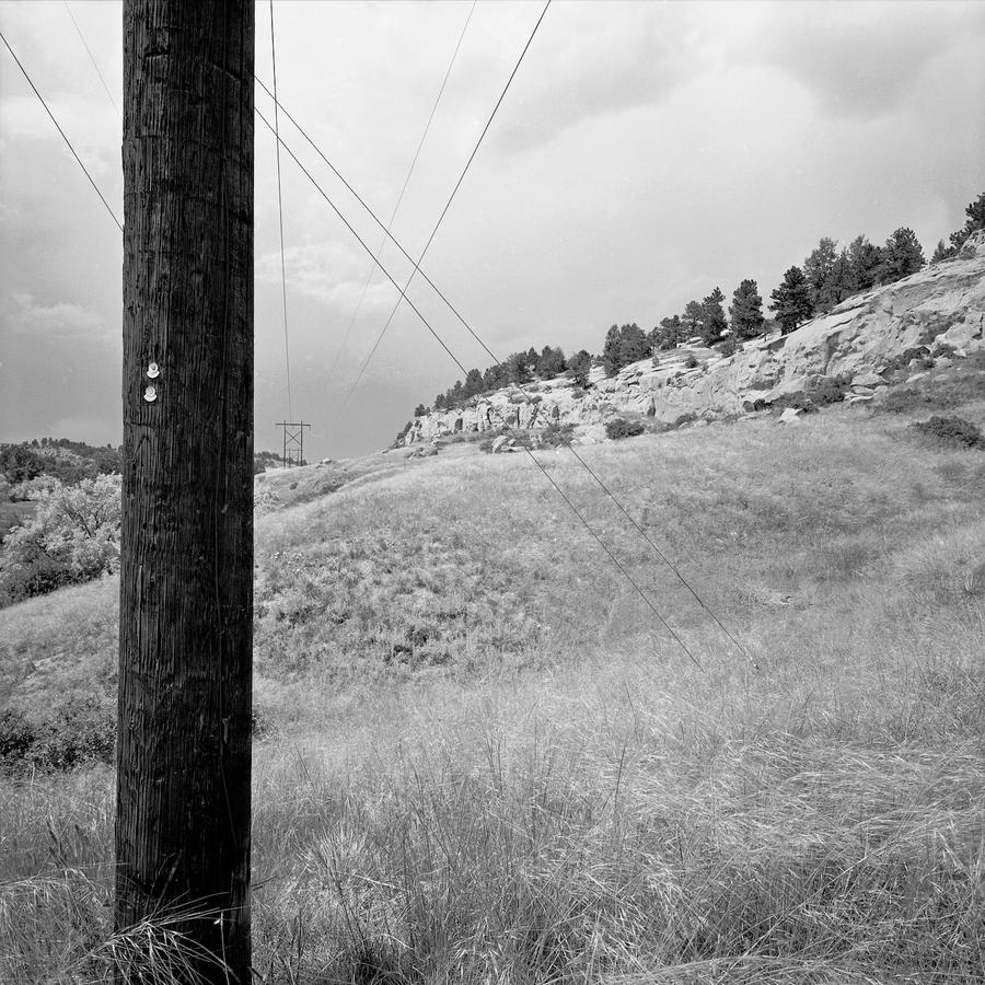
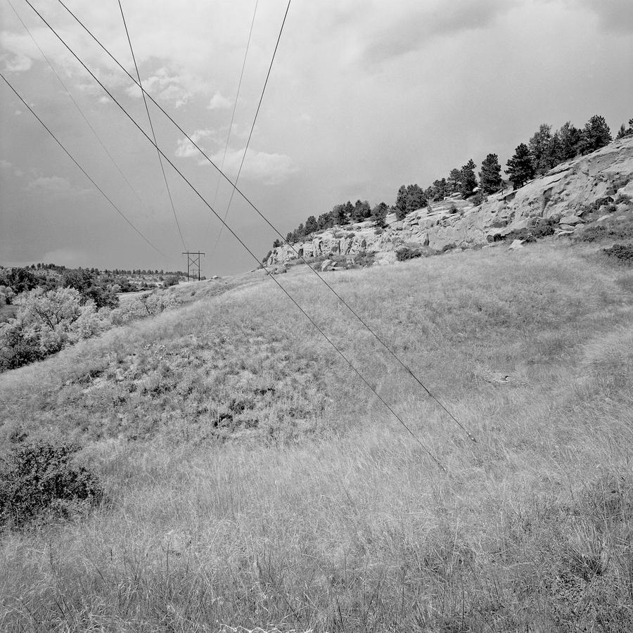
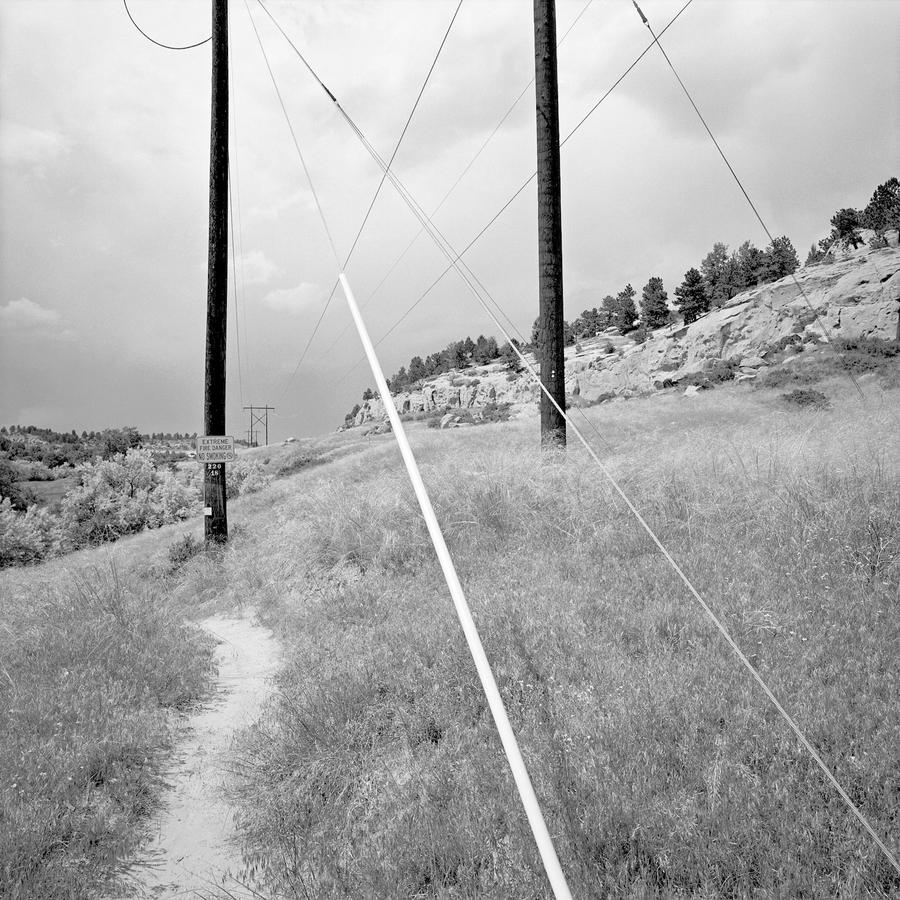 Ironic, at least to me, as there was actually far less confinement in the earlier pictures of the houses but here things were very much restricted by all the wires in the way. At the same time, an approaching thunderstorm was darkening the sky, over shadowing the area with a sense of something big coming.
 Billings, MT
 Vignole, Italy
 Thompson, CT
 And now for a change, the second to last photograph in the series. For the first time we are looking over a fence into a backyard, and one that is chaotic. There is still some containment and convergence too, notice the fence on the left and the steps on the right. There is also a filthy snow bank, lots of junk and a difficult path to the building in the mid background which is being threatened into obscurity by the tree branches. Imagine leaves on those trees in mid summer. They might block the house from view completely. What else? Rather than moving in close to eliminate the fence in the foreground I chose to leave it, with its sharp points looking like spikes that would gouge you if you tried to jump it.
 So here we are at the last picture in the series, this one showing real depth as we skim along several backyards. This is the first time we've seen a picture like this in the series. There are some obstructions to our release out of the picture, some junk in our way, but for the most part the path is easy. If you've looked at other series of mine you'll know that very often there is either an opening out to the rest of the world in the last picture or a barrier to that leaving. Take a look at the last image in