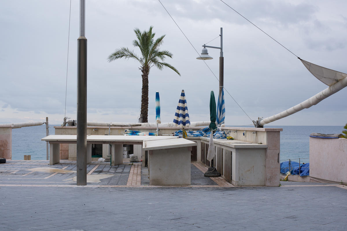
Salton Sea 2 Part 2
Continuing and finishing a look at the Salton Sea 2 series made in 2012.
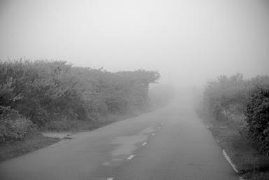
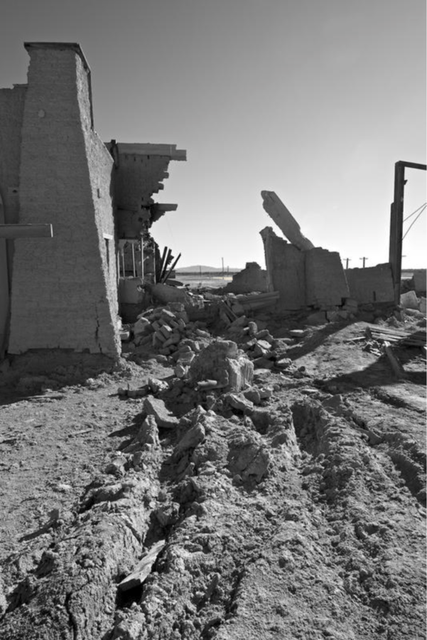
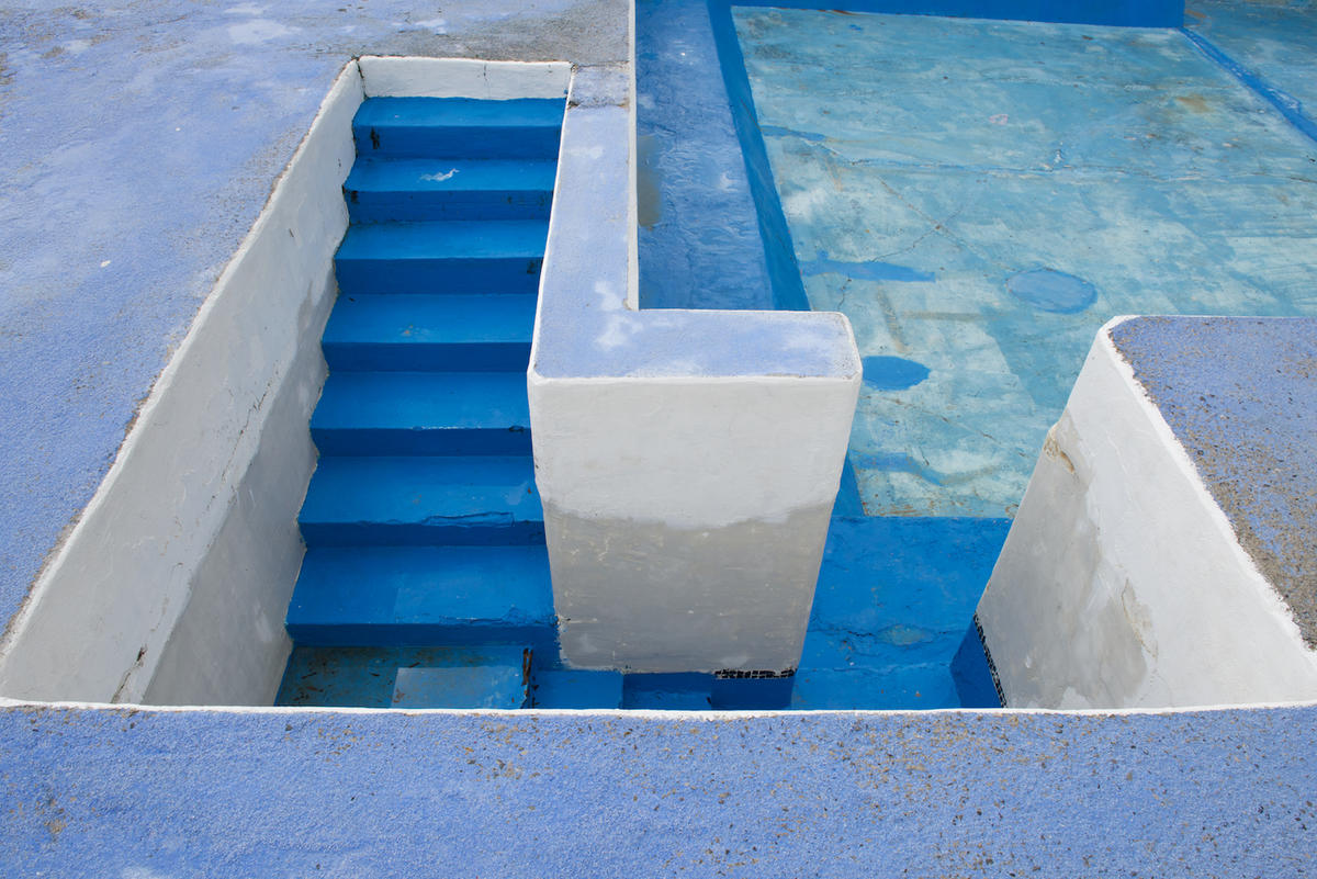
The Salton Sea, a simply incredible place, as if from another planet. The soil crunching under my feet and turning to powder at my step.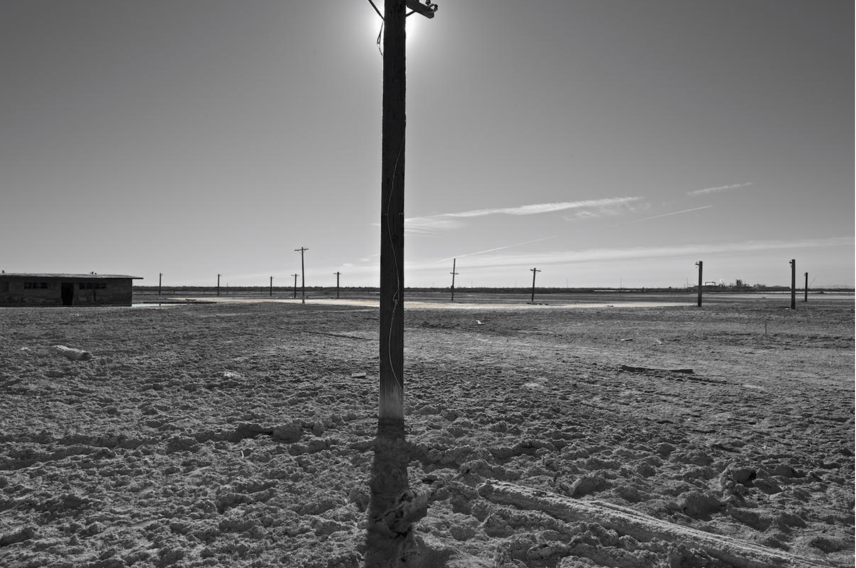
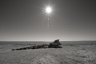
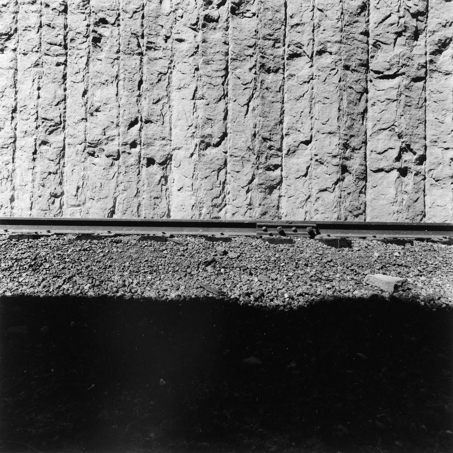
The "sun behind the pole" trick used here with some slight band of color where there's water in the background.

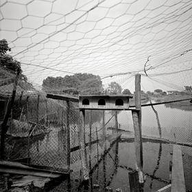
The first photograph in the series with a preponderance of color, some kind of fetid and polluted pond that stunk. The lens is now taking a larger role here. Push a wide angle lens down and verticals bow out.
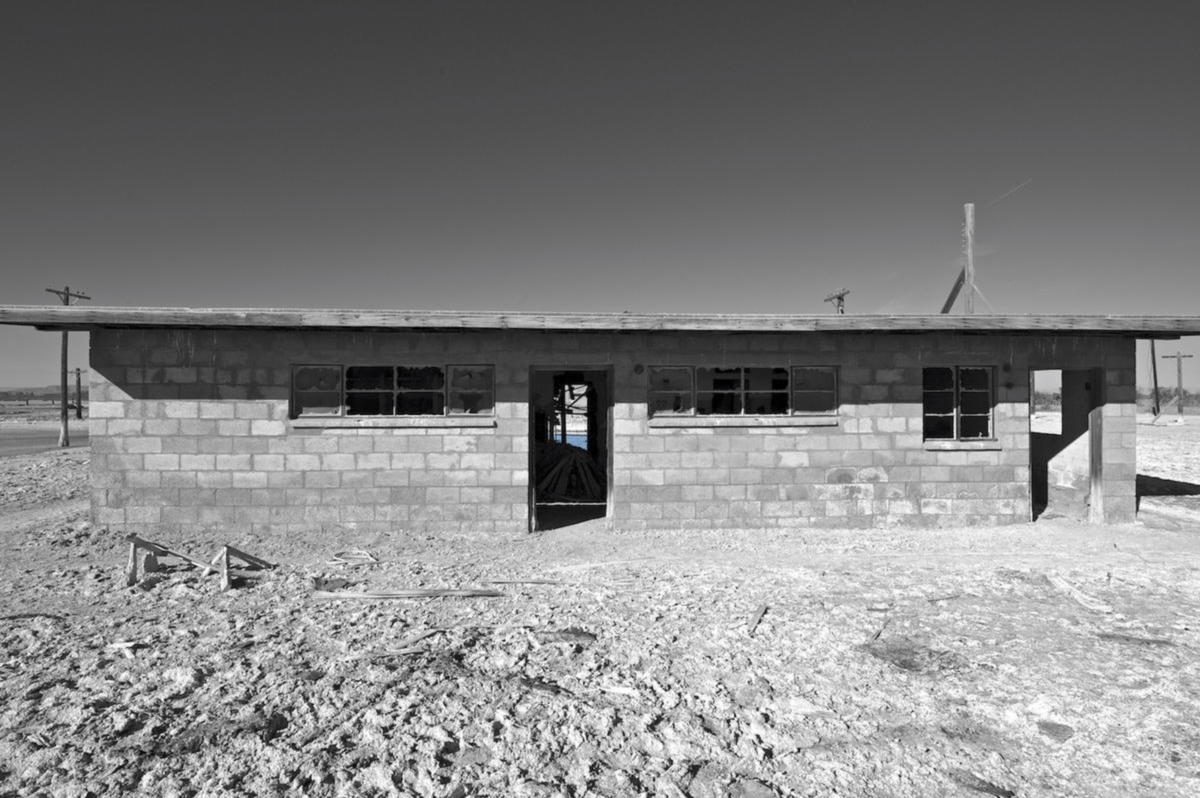
Back to our original structural device... long, blacked-out rectangular windows and here just a hint of the pond through the building, in color. This is one of those where the actual the print (at 22 inches across) makes a huge difference. Everything is probably too small here to see the subtlety.
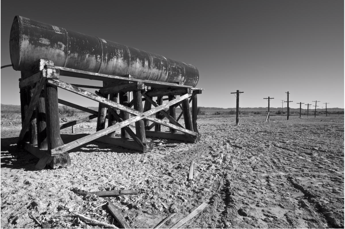
Moving on we turn to the right and find another expanse of what looks like devastation:
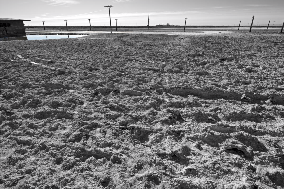
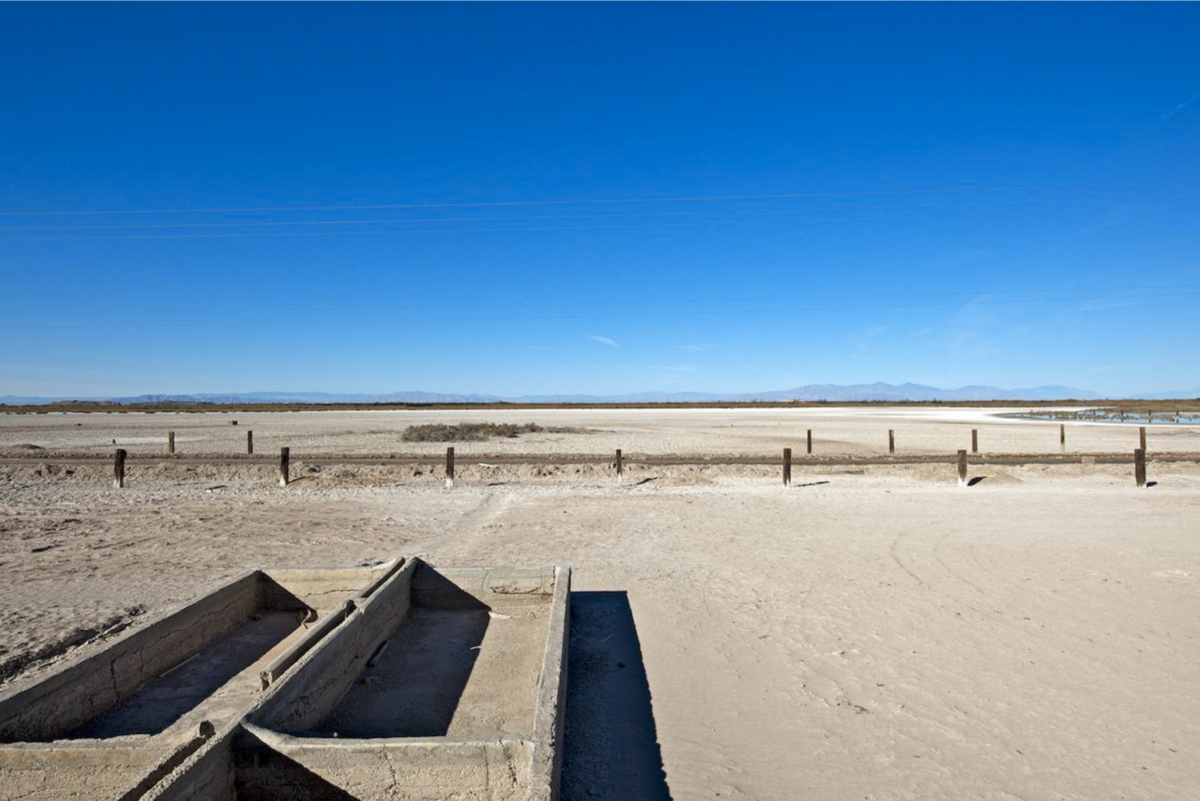
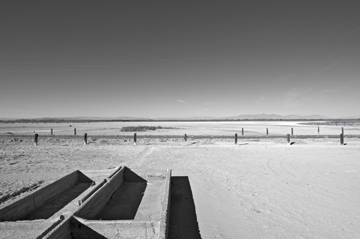
and 180 degrees:
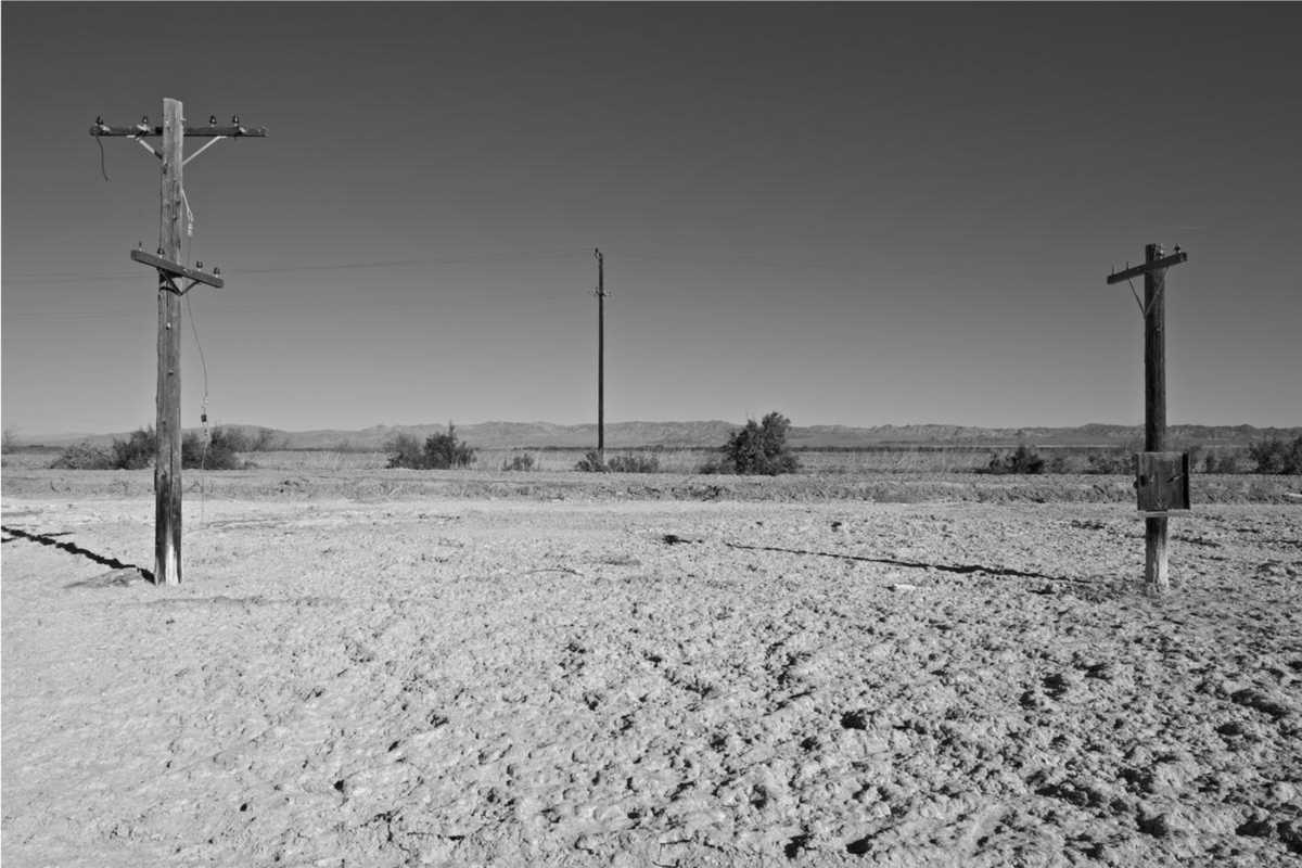
showing the mountains in the far distance.
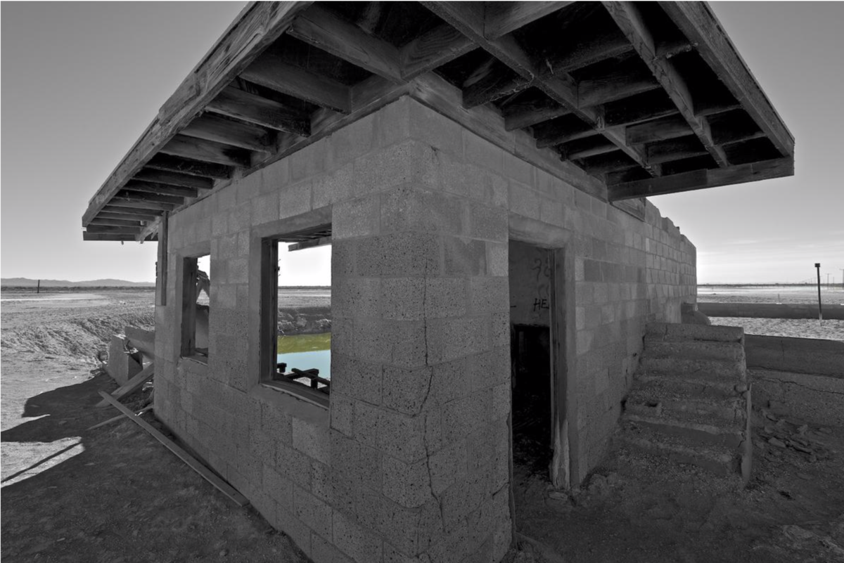
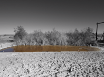
This photograph brings us to another abandoned structure, shot square onto the pointed edge of the building, a clear divergence from all the others which were made as parallel plane photographs. Another pond coming up, seen through the window, is shown full frame next.
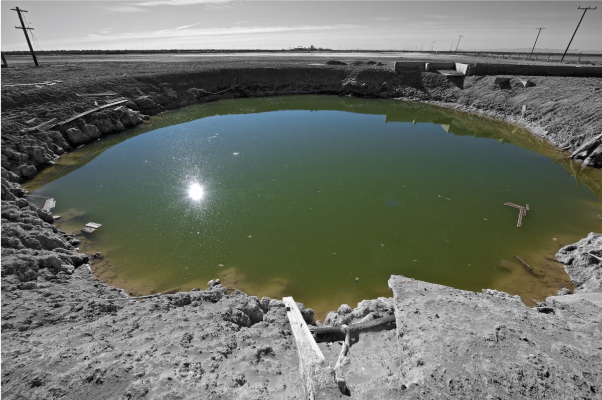
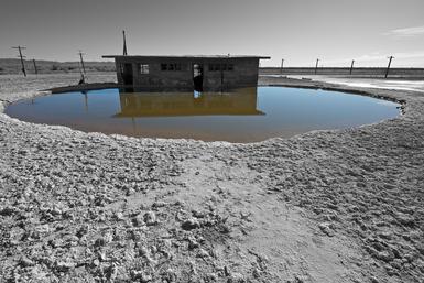
I think of this image as being the most brutal, as this pond filled with some unimaginable liquid that looks viscous, fills the frame.
Then next to the series only vertical, back to where we started from
Then to the last two images in the series, when exhibited put side by side to each other, the same file printed twice:
with the black and white image conforming to the rule that says water is color, over there on the far right of the frame, a judgement call on my part and not without controversy as some feel the print should be all black and white.
I didn't so much mind breaking my own convention as I wanted to try to prove the efficacy of the device I used.
By showing these two in this way I wanted to present the series as yes, from the otherworldy Salton Sea and its altered reality but also to drive the point home that I was using this work as a vehicle to make a statement about contemporary photography and how the rules ordering the use of color and black and white are no longer in effect. Photography has advanced in maturity to a "no rules" system where anything goes, much as all art has. So much of present-day photography either ignores precedent or its maker is unaware of what was made before or doesn't care.
On a more personal level, although often thought of as a conventional landscape photographer, I am not. In this case, I sought to use this place as a canvas. My palette is black and white and color. I've chosen to make my painting."Take em or make em", we say. Let your photographs come out the way the tools and technology choose or impose your own ideas and construct in your work. Salton Sea is not a conventional landscape series of photographs for I am using where I was as a vehicle or platform for what I chose to do to it.
Related series
Salton Sea, CA 2012
I made these pictures in the winter of 2012. Although the use of color in this way isn’t new I wanted to emphasize the bizarre color of the bodies of water near the edge of the lake. The Salton Sea is a man made disaster of epic proportions and I felt an unconventional approach was appropriate here.
The prints are 21 x 14 inches
Salton Sea, CA 2013
The world's shortest series? Cerntainly my shortest series. These six come from a trip to the Salton Sea in February, 2013.
Color files turned into black and white with a little warmth added in. This is the second body of work to come out of the Salton Sea as I made the group http://www.nealrantoul.com/projects/salton-sea-ca-2012 last year.
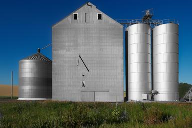
Grain Silo, Washington 2012
These photographs were made while in Washington photographing Wheat. This series continues a way of working begun with the Salton Sea, CA photographs made the winter of 2012. This method combines black and white and color.
The prints in this portfolio are 21 x 14 inches
Related blog posts
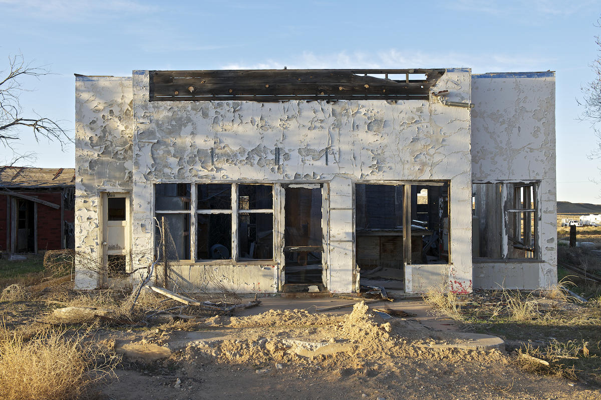
 I was told by a neighbor the roof caved in and the town deemed it a safety hazard so tore it down.
 I made this in the 80's.