Facades
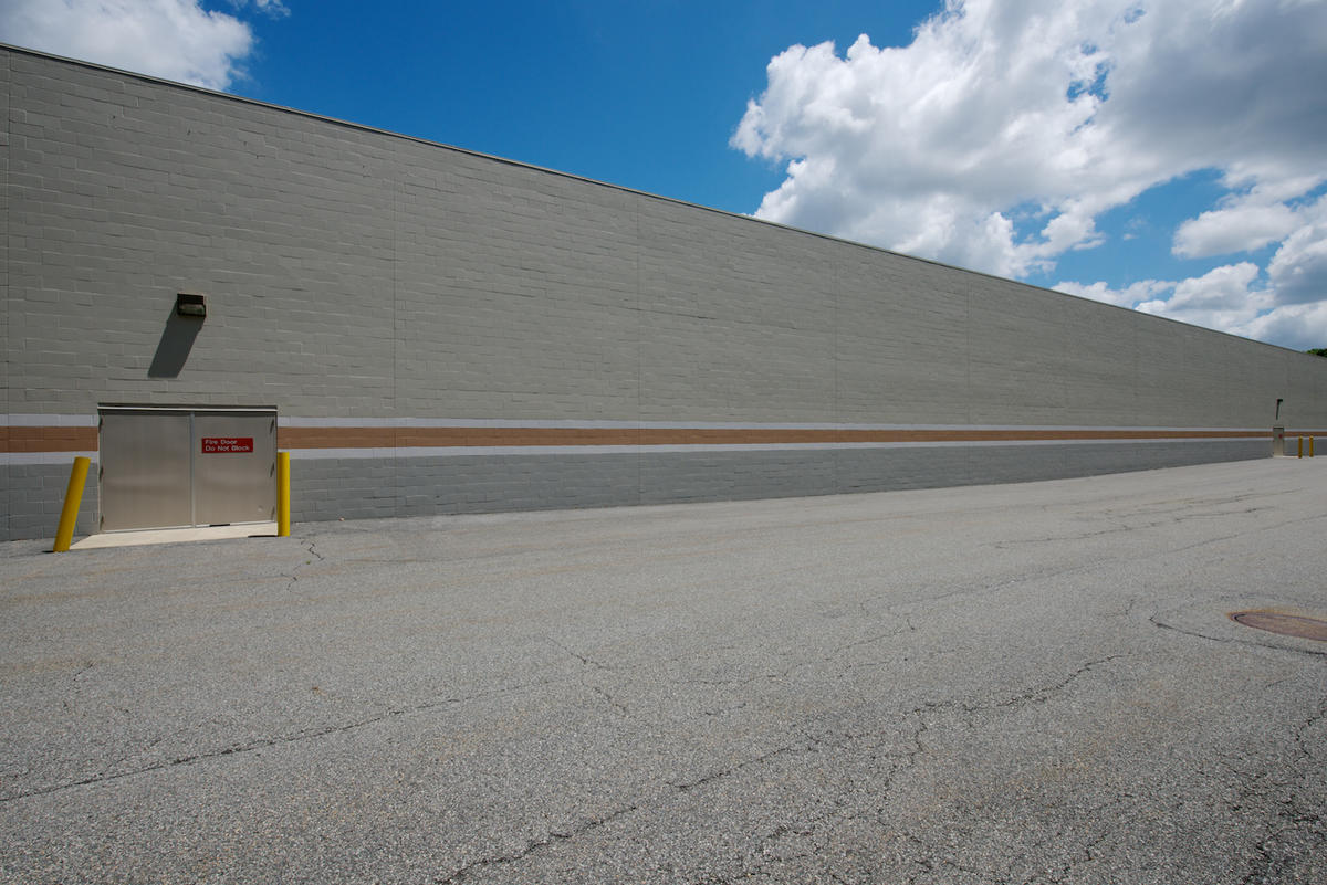
I have had a preoccupation with facades, which, for me, includes fences and walls, for a very long time. In fact, in 1979 I made a series of pictures called Fences and Walls that was my first cohesive group of pictures after finishing graduate school in 1973. Fences and Walls was the body of work that formed the foundation for this way of seeing.
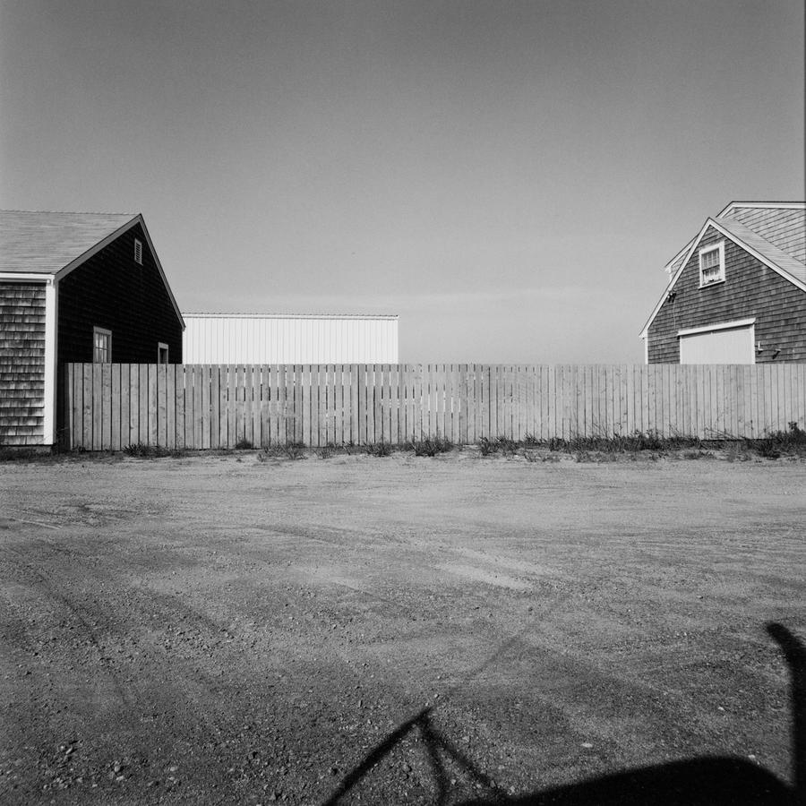 From Fences and Walls 1979
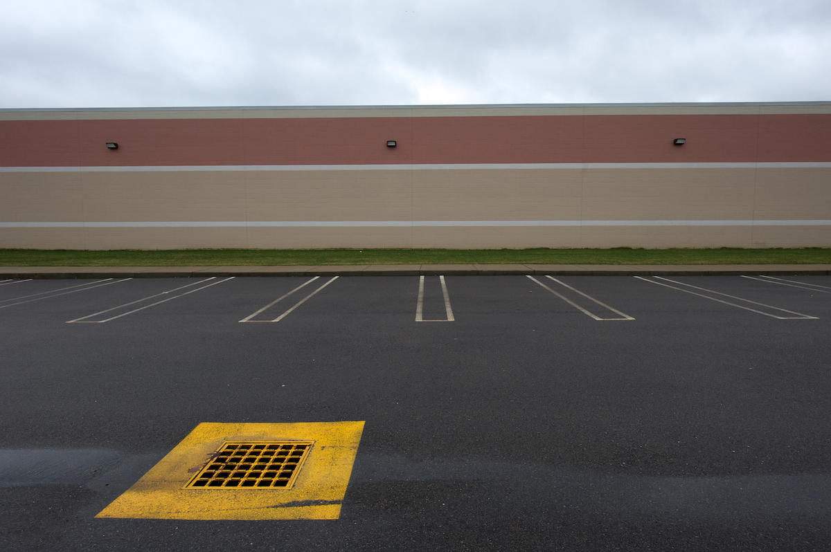
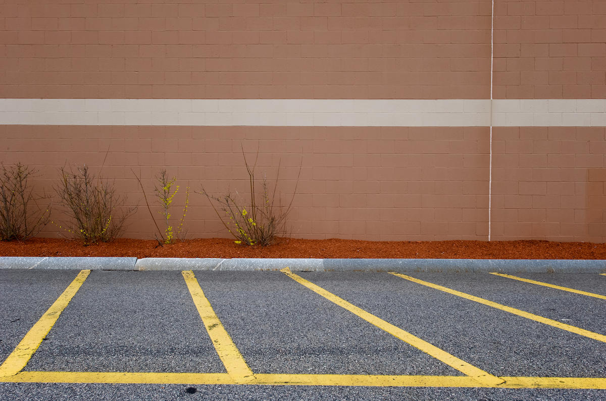
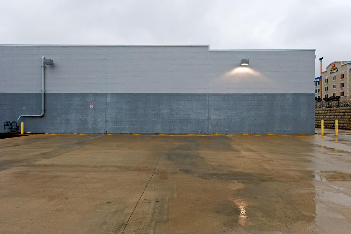
This same approach carried through to some of the mall work I did in 2009-2012.That series was called Mallchitecture and looked at buildings designed for a purpose and function practically devoid of an aesthetic.
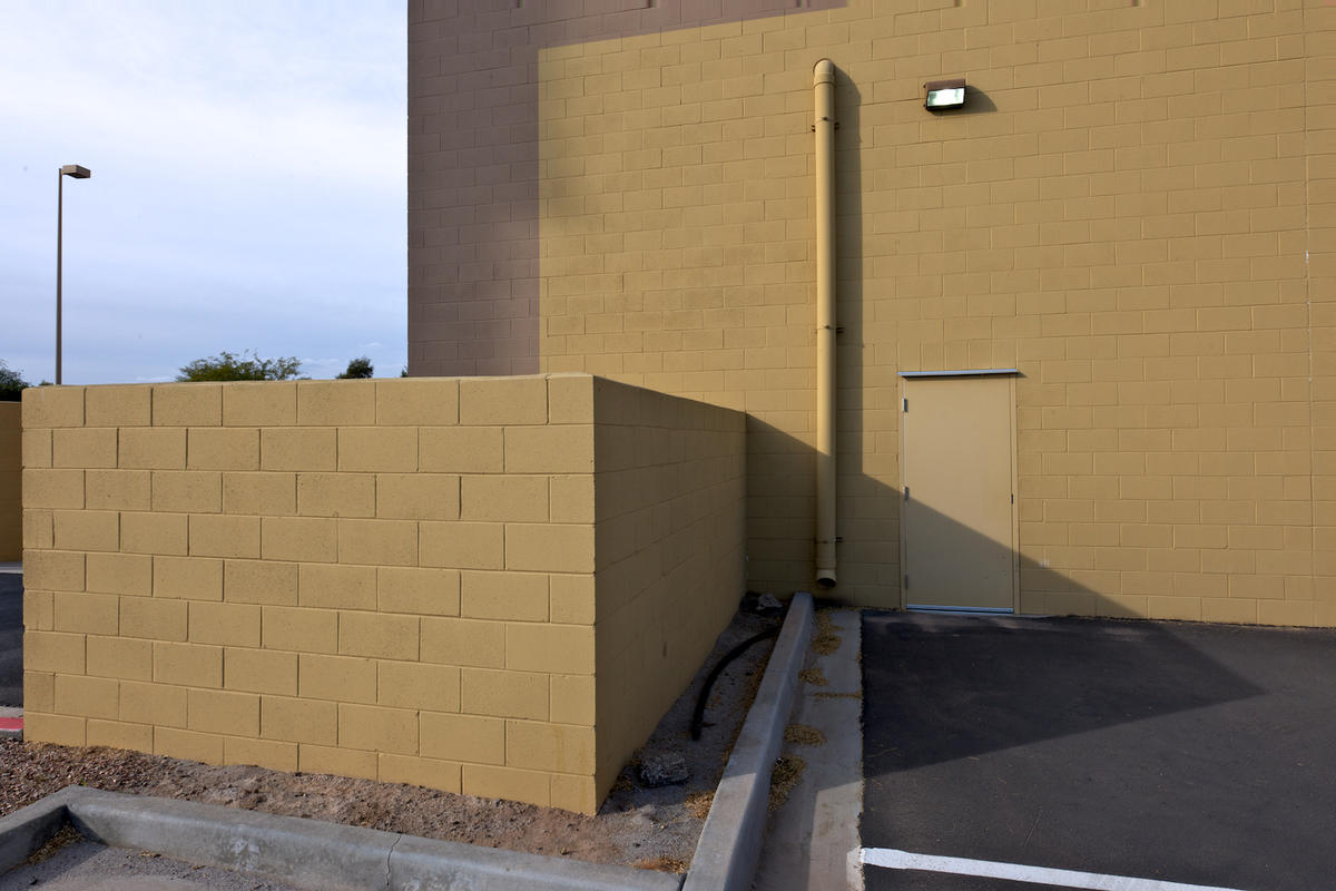
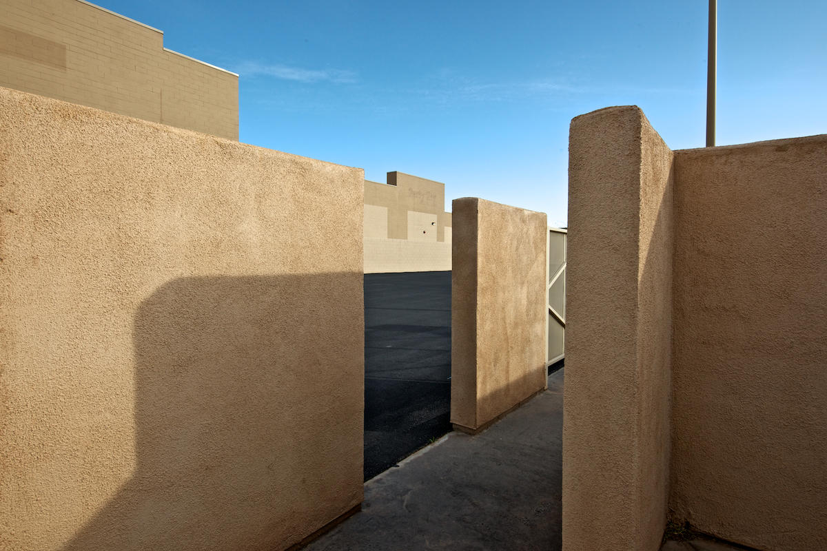
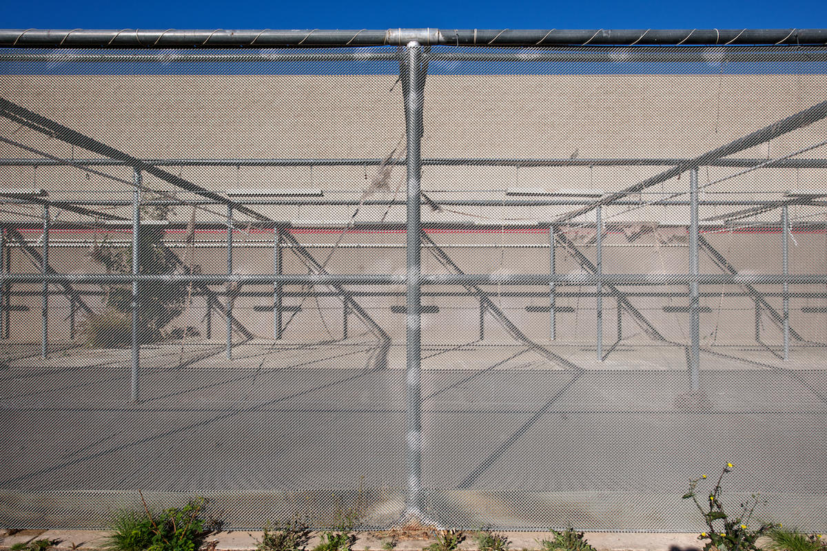
Facades played a key role here. My earliest awareness of this interest was a show my work was in at MIT called, oddly enough, "Facades", about 1977. This was when Minor White was still alive. I met the white haired photographer and guru a couple of times and was in awe of his reputation and the depth of his approach. The fact that he had deigned my photograph worthy seemed as if from the hand of God at the time. In those days White curated a concept show every year or so with titles like Light (to the 7th power), Octave of Prayer, Be-ing Without Clothes.
Photographs of facades, surfaces, fences and walls have been part of my photographic agenda for a very long time. Was I aware in these early career years I was looking at the world through this specific lens? That I was consumed by an agenda not on everyone else's list? No, I was not. I wonder how many people new to the arts are so self aware they know their stock in trade or can access the uniqueness of their point of view in those earlier years? Few, I believe. I also believe this then becomes one of the primary roles teaching needs to play. To acquaint the student with just what it is they are doing, how their work fits into the overall scheme, what precedents there are and the relevance of the premise.
There is another prevailing aesthetic I can track over my career and that is what I call: "Planetality". I know, I've even made a word for it. This is the need, desire or prevailing characteristic of making pictures that exist in planes, most prominently in parallel planes. Stand in front of a building or flat surface, preparing to make a picture of it. Will you make the picture at an oblique angle or point up or down? What drives this in you? Do you not care care that lines converge or that one edge of the building will bow out or in? Or do you wish your pictures to reside in the relative neutrality of not having imposed a specific directionality to them? Again, stand in front of the building, keep your camera level and center yourself so the left and right sides are equidistant and parallel to you holding the camera and you have a picture that is far more neutral, thus allowing the building to dominate, not the signature of the picture of it. Imagine in current times this being a concern! But how you do this affects the outcome. If the building is too tall or there is too much foreground in your picture? Well, that's what a view camera is for or, in these days in the digital world, "lens corrections" in Photoshop or, last, a PC lens. The principle is to keep the camera parallel to the surface and shift the lens to raise, lower or slide left or right.
At any rate plane to plane is important to me, not always, but often.
