Washed Out
This one is to introduce the new group of pictures on the site called Washed Out (here). And to explain my rationale.
Can wrong be right, can ugly be beautiful, can accuracy be exchanged for interpretation? Something hovering around the question of attempted objectivity versus the purely subjective.
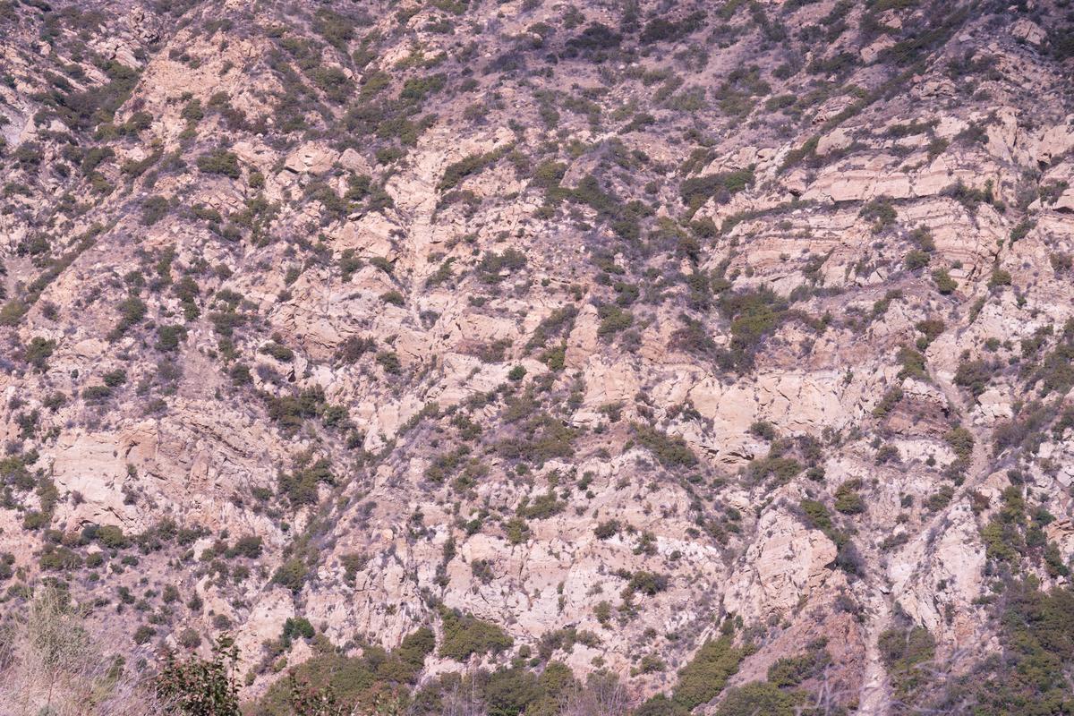
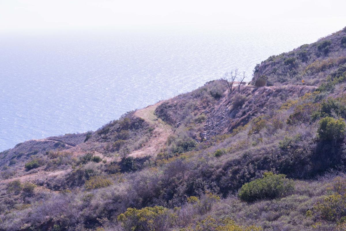
These washed out and somewhat pink landscapes of the mountains behind Malibu, California are this photographer's effort to describe what it feels like to be driving through the canyons on a midday in midweek, with the sun at full force, no wind, the ground cover bleached out, the soil dusty and like chalk; a somewhat apocalyptic view of a place no doubt influenced by my aerially photographing wildfire damage a few days earlier up the coast in Ventura.
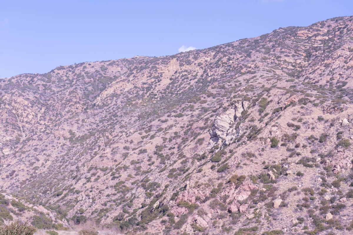 These are, of course, the Santa Monica Mountains.
In initially rendering these in normal colors and tonality I was struck by how they conveyed nothing of the intensity of the light and the dryness.
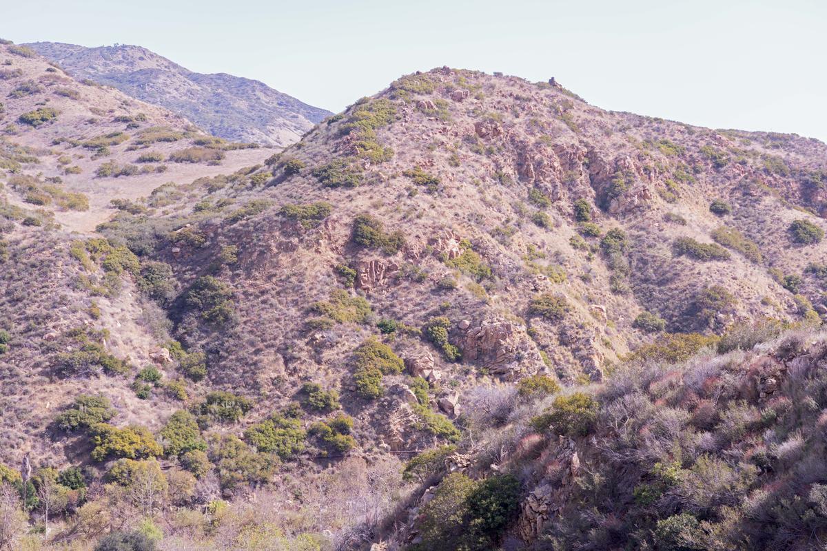 I was thinking of how our eyes react when faced with going from someplace dark into a landscape blindingly bright. How the colors are bleached out and monochromatic.
But think about this for a moment. Think about how photography has changed, how its use as an art form has been so drastically redefined in recent years. How the investigation into how it sees and we see has been pushed to new boundaries. Somehow, although I still make them, the straight landscape is over, done to death and how, if the drive must be to see things new, there is nothing new. How the prevailing discipline would need to be an interpretation of surroundings, a molding of the combination of the mediums' use and the content serving the photographer's wishes. This then leads me to the photographer's intention.
One train of thought would appear that we are no longer, in higher levels of art, allowed to leave that up to the viewer to work out. That it would be necessary to drive the outcome more specifically. Hence "Washed Out".
The last point, imagine I made these into a small book, with about 25 pages of images all in this same bleached out tonality. Sit down with a glass of that nice merlot you found in Italy last year, comfortable in your favorite recliner, to look through these pictures, to study them. How fulfilling and rewarding an experience would that be? Would you become invested in the subtlety and nuance of the different images? Feel there is a rhythm, a narrative? Doubtful. But you might believe that you are looking at a concept, a conceptual rendering, a deliberate distortion of the actual into something made for looking then thinking about what you saw to understand intention. This does get perilously close to a personal politic, doesn't it? For the quality has been sucked out of these images, denied the very basis for our determination of what is a good photograph. Of course, we see this all the time, either by ignorance or by deliberation.
Is this simply devil's advocacy? Placing these pictures in a place of contrary perspective? This is for you to decide, for I am simply the maker. You are the determiner.
Washed Out:
Comments always welcome: nrantoul@comcast.net
