Does Anybody?
Does anybody print well anymore? Does anybody know the long tradition of tonal separation, effective use of contrast, burning and dodging (whether analog or digital), and control of contrast through altering exposure and developing times?
I am talking specifically about black-and-white printing but this mostly pertains to color printing as well. Throughout photography's almost 200-year history there has been a tradition of making really beautiful monochromatic prints. I know this as the years from 1969-2005 were only black-and-white years for me. I cared about my prints and slaved in the darkroom making them as best I could.
Look at Gene Smith's work, using potassium ferricyanide to bleach back specific areas of his photographs in, for instance, the Minamata work. Or Ansel Adams, of course, making masterful orchestrations of landscape prints, miracles of craftsmanship. Or Fred Sommer, making one print a month with his live-in assistant, tailoring chemical concentrations and color dye masking his 8 x 10 negatives to balance and align his pictures to be exactly as he wanted them to be.
Now, thinking of taking your color files and outputting them into black and white? How about just throwing out the color info and going from there? Think again.
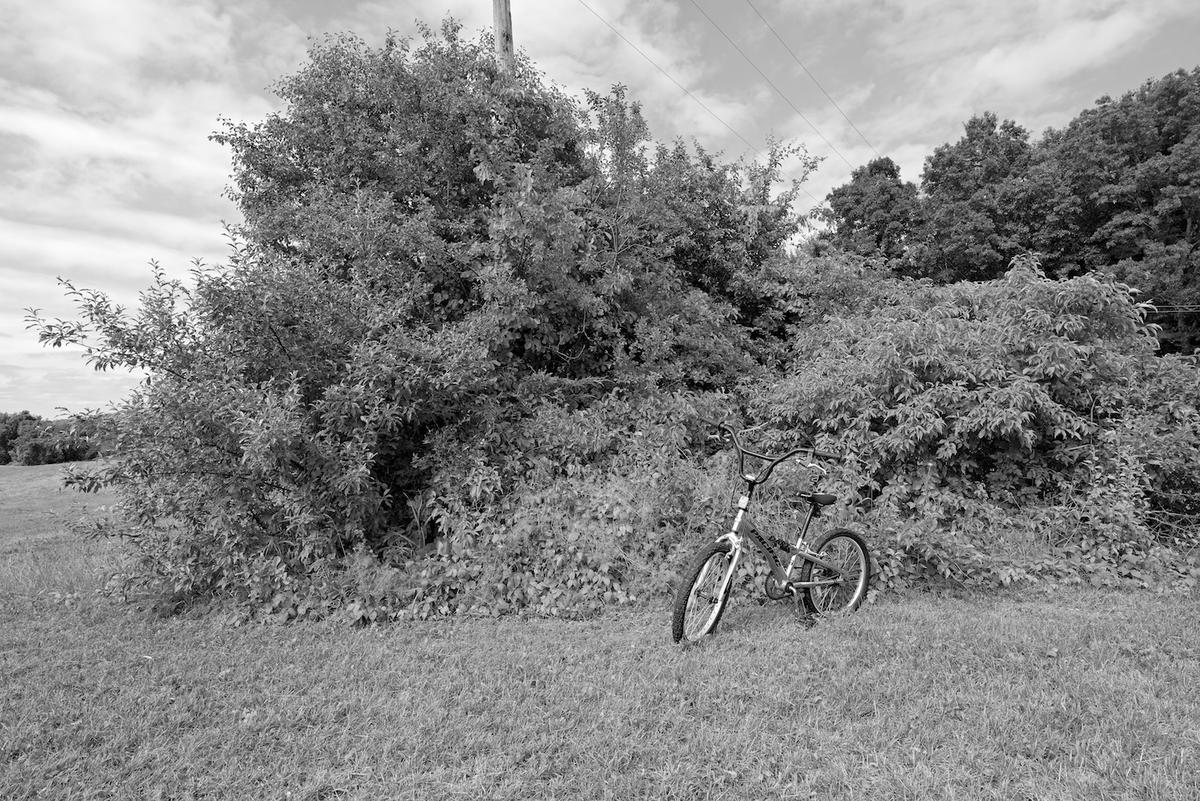 From "The Field" Medfield, MA ©2016 Neal Rantoul
Sorry to sound hard-assed but practice your craft, learn the medium's history and traditions and work on your imagery.Want to get better? Take control of all the variations possible these days. Don't let the computer make the decisions for you. Accept responsibility for all areas of your photographs, use the adjustments provided to drive them to look the way you want them. Study the precedents that came before you, that established benchmarks of quality and work towards prints of unsurpassed luminosity and presence.
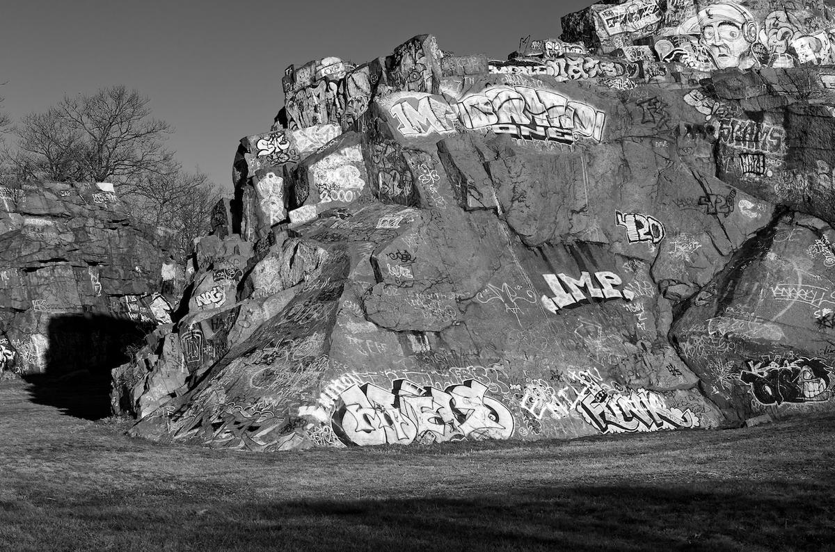
I recently looked at some black-and-white photographs that were well-seen and edited, where the photographer had made some very distinct decisions about placement, framing, and focus, and clearly had a point of view that was smart and provocative. But the printing was awful, muddy, and inconsistent, one print too contrasty, the next too flat, and so on. I cannot get past that.
In class, I often used this analogy: Take a symphony, say Beethoven's 6th, played back on CD or vinyl, on a good system. Sit still and listen carefully. If all is well you will be transported to the music itself, swept up in the movements, perhaps the individual musicians' performances, and so on. But, now do that same thing with a hairline crack in one of the woofer's paper cones. One that makes a grating scratching noise every time the base drum hits a certain note. Now what are you listening for? That defect, that aberration. This is no longer fun and basically the experience is ruined.
Now, apply that to a body of photographs. Same thing. Good work can be ruined by one bad print, simple enough. Don't do it. Don't allow your audience to question your judgment or skill, to find fault in anything you make.
Last, it is all too easy these days, with incredible software and controls, to make prints that are generic. Yours the same as anyone else's.To allow the various algorithms to make your prints, in effect, for you. Don't do that. Take control and make them the way you want them.
