Border/No Border
Decades ago I had a show at Northeastern University, where I taught, that included large pieces from a trip to the American southwest made while on sabbatical leave. This was my "tenure" show, designed to display my work to the NU community while applying for tenure.
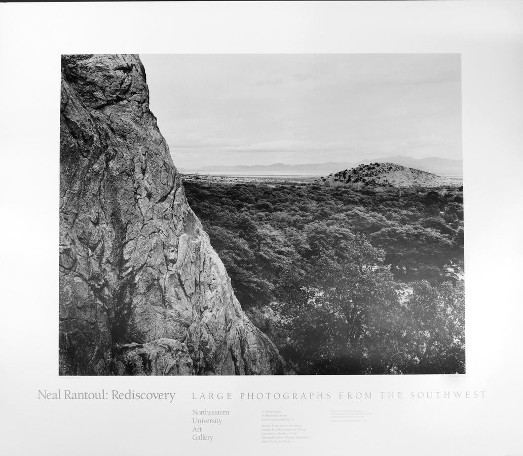
The pictures were all made with the 8 x 10 view camera, which allowed large prints.While the main body of the show was prints that were made on 20" x 24" paper, there were several that were 40" x50".
The large ones were framed like this:
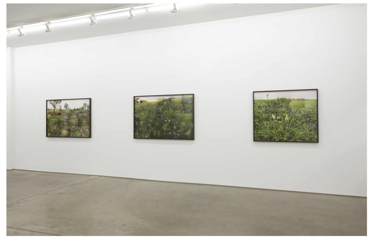 These aren't mine, btw. They are by Terry Evans from a show at Yancey Richardson Gallery in NYC this past winter.
Mine had no white mat around the print and were flush edge with black metal frames, just like those above. I didn't like the look of mine, feeling it trivialized the images and didn't properly offset them from whatever wall they were hanging on. I came up with a rule, "Neal, don't do that again."
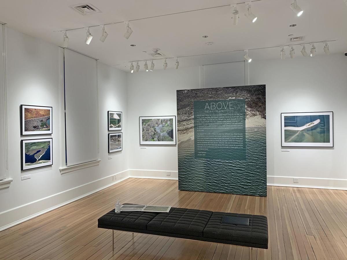
So, for the decades since then no large works of mine have been framed and hung in shows that don't have a white border of some kind around them. Like this:
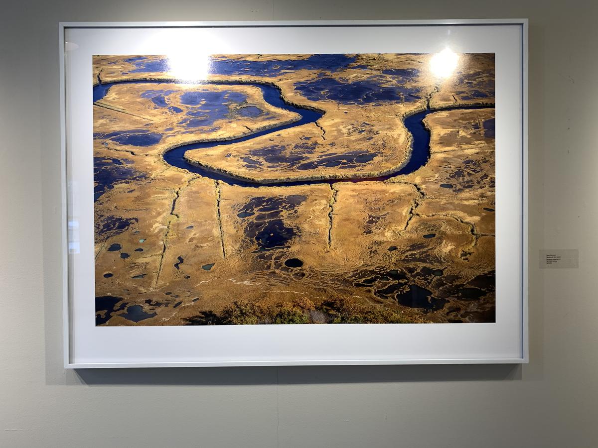 From last winter's group show at the Concord (MA) Art Association.
This and most of my large pieces are over printed with a several inch white boarder, mounted to foam core and installed in the frame with the photo paper exposed, as you can see. Occasionally I've done the same using an overmat, but rarely.
Obviously, what is already a big print gets bigger with this system.
Pros: the white border system formalizes the print, off sets it from the wall behind it and conforms to small prints in the show that also have white borders around them. Should the print be taken out of the frame, it is protected with a several inch white border around it.
Last point: with a white border, a white on the edge of the frame of your pictures fades right out into the border. For me, this means a white sky has no edge seperating it from the border around it. Not good. Having no border would solve this, of course.
Time for me to relax my rule? Maybe. I liked the look of the Evans show and think it might really work to minimalize the work, to reduce it down to the image on the wall and that's it. I also think it might be best if all the prints in a show are the same size.
Let me know if this was helpful. Neal's Email
