Baldwinville, MA 2015
(Note: these were photographs authored by me, Neal Rantoul, but assigned the pseudonym, Marc Meyer.)
This is the second time we've shown work on the site by the young photographer Marc S. Meyer. Marc lives near Baltimore but photographs frequently in New England. To read more about him and his work go here.

Marc writes about the photographs:
I’d seen this abandoned building from the road earlier in the fall and marked it on the car’s GPS so I could return. I picked a day in early January where the cloud cover was heavy and there was snow in the forecast. When I arrived the air was still and electric with the coming storm. I worked for several hours in the cold, returning to the car to warm up and look over the pictures on the back of my camera that I’d just made. There wasn’t a soul in sight, only the occasional sound of a car going by on the two-lane road nearby.
The sky was important as it would serve as the drama needed for the pictures but I also wanted it to have visual weight. This was tripod work, as I would combine several frames of the same scene into one image later on in post processing.
Of course, no artist knows if he will be successful if an image or a few of his images will be seen as important in a larger context. One can only hope. But these few large photographs are intended to represent the first half of the equation or analogy, if you will. Man made structures decay if left on their own outdoors. Fact. This large warehouse made to take care of a region’s municipal needs outside the small town of Baldwinville is also a fact. But we seem to have no problem making something, using it and then discarding it when we no longer need it. We do it every week when we take out the trash.
As a large issue this building sitting empty and forlorn outside a small town in rural Massachusetts serves for me as an example of skewed priorities. Used and thrown away.
On a smaller issue and on a more personal scale, I have always found photography’s ability to beautify fascinating. I would doubt if “beauty” came up much when the architects and/or engineers were designing this building. But there it sits; empty, discarded, dismissed and beautiful.
This work is deceptively simple, almost minimal. The prints are large, at 30 x 24 inches and unusual in their depth and tonal range.


 Assigning such nobility to what is, in effect, a piece of junk is of course Marc's point.
But then he takes us inside the structure, almost as though we're headed into a tomb.


 and ends with:

That's it. The series seems to end even though it just got started. No frills here. I've said this before but: get in, get it done and get out. That's what Marc did here and the reduction serves the overall purpose of the group of pictures: the force of their impact, their remarkable color palette, their emphasis on containing information both within and without the building.
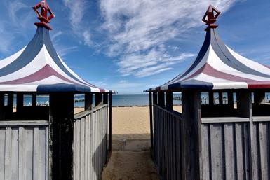
Marc Meyer seems to be moving on from his rather straight representation of the small world of the Beach Club pictures to a more interpretive and subjectified manner of expression. It's as though he is using the warehouse building in these pictures as a springboard to reflect his changing views and perhaps, to flex his muscles.
Does it work? Do you find these photographs compelling? Let us know at: Neal's Email
Marc's work is now available for viewing at 555 Gallery in Boston. The Beach Club portfolio and this one (Baldwinville, MA) are in the gallery's flat files. I urge you to take a look at the prints in these two portfolios as this is very strong work. A blog is a wonderful thing but used as a vehicle to look at art? It is is just perhaps the first step. Prints are king.

