Topic: Review (10 posts) Page 2 of 2

Lia Rothstein

Back in July a friend and I took most of a day to drive to Meriden, NH to see a show of photographically derived art by friend and colleague Lia Rothstein at the Aidron Duckworth Museum. (BTW: The Duckworth is a fascinating place, well worth seeing.) Some of you may know Lia from the days she had a photo gallery in White River Junction, VT called PhotoStop. 

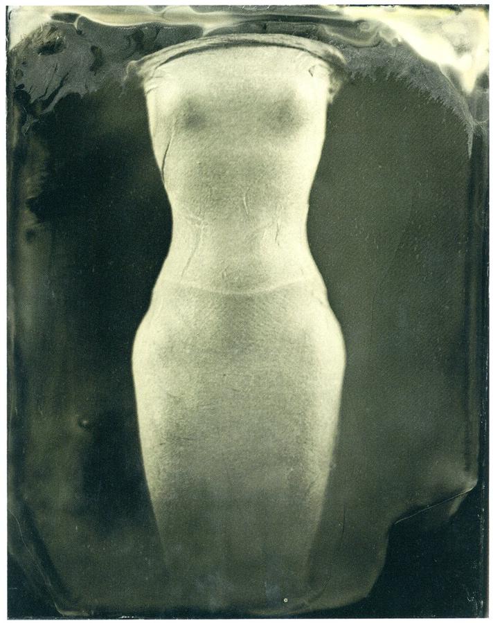
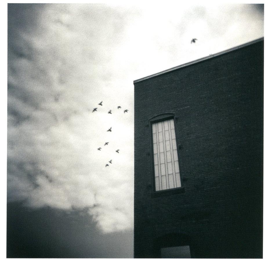
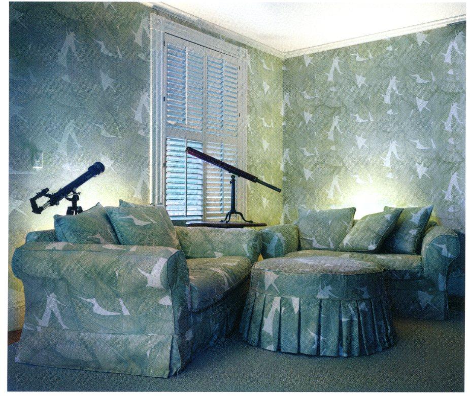
On seeing this work you could be forgiven for thinking the  show wasn't so much a "photography" show as the wonderful art looked more like paintings and drawings. 

There's something to be said for being in this process for forty years or so. Lia's quiet sensibility and acute intelligence come through here loud and clear. This show had me questioning my own definition of what photography was as it used photography as its foundation but went on from there. Here's a brief description from the review of the show in ArtScope Magazine:

Working with light projections, digital and hand drawing, encaustic waxes, oil paints and other media, Lia Rothstein is transforming her photographs into highly abstracted, texturally nuanced, intriguing works on handmade Japanese and other fine art papers.

Lia's spent a lot of her career in the service of others: bringing up two kids, being the wife to a high powered husband, running a gallery, etc. I know first hand how hard she worked for me as I showed my work at her gallery twice. For this show she took a year off for herself to work, to experiment, to create. She rented a studio space just to work on these pieces. It was time well spent for she labored to extend her own definition of what photography is. This resulted in us questioning ours. I found myself thinking that this work is a confirmation of what it is to be an artist. The exhibition was a serious look at just what possibilities are imbedded in materials and tools used with an open mind,  an experimenter's curiosity to see "what if?"

With this new work, never shown before, it was hard to tell what was fixed. This piece seemed to float outside of its own fasteners on the wall, partly  transparent, partly photograph, partly painting.

The next six sat off the wall, elegantly fixed with magnets on the heads of nails, with small lights behind the encaustic treated paper.


The prevailing theme was water, its surface, transparency and its fluidity. 

These three, some of the most structured, were made from table top forms, warped with software, printed, then worked on the surface to blend, build, scrape, smooth and color. 

Although the show was not large Lia took on several kinds of explorations:

with a couple of large panels, highly abstract and yet somehow familiar, loosely interpretable as landscapes but also hitting a more emotional note.

Much of the work stemmed off an experience of a month-long residency in Iceland in 2012, where Lia began to work with different ways of making photographs and indeed, some of the initial images in this show came from Iceland.

Highly abstract, yet some of the pieces had wonderful form as they had an underlying structure.

# 1: Since the show is down how do you get to see this amazing work? Contact the artist: http://liarothstein.com and, if you have any ability to influence a curator or gallery owner, urge them to take a look too as this work needs to be seen more.

#2: I can't resist the urge to editorialize about this work. Remember those early days of Photoshop? At school we used to call the work "hamburgers in the sky" because that's what people were doing. Compositing things randomly in the frame, like hamburgers, simply because they could. We have come a long way since then. Spending some time with Lia at the show, hearing her describe her process and rational behind her work, it occurred to me that this breaking down of barriers between photography and really all other visual art forms has reached a level of maturity, sophistication and confidence as to be seamless. Lia's process comes from a base of photography, as does her experience and training, but this work moves very far beyond that and we are the richer for it.

The show was amazing. Thank you, Lia, for sharing it with us.

Topics: Review

Permalink | Posted August 23, 2015

When is a Show Better?

We've all been to exhibitions that didn't live up to their hype. For instance, the Herb Ritts solo exhibition at the Boston MFA in 1996 (touted by the museum as one of its most popular) comes to mind as a major debacle to this photographer. Way too much hype with way too little substance. Much more fulfilling is the show that's a "sleeper", when the location isn't particularly prestigious or when there isn't so much built up about it, but when the work transcends the venue. Especially if you discover it, when if you go you realize this is the real deal, that the work hanging on the walls is exceptional and that the show is far more than the exhibition's composite parts, when there is a curatorial whole and that you finish provoked, stimulated, maybe a little awed and wishing there was more.

[Photo]gogues: New England, a show that opened this week downtown in Boston at Lafayette Center along a hallway connecting Macy's to a hotel, is just that. This is a show that takes your breath away with its richness, diversity and sheer beauty. The show is the third time curators Paula Tognarelli and Frances Jakubek from the Griffin Museum have pulled together works by regional teachers of photography and it is a stunning testimony to the vibrancy of the discipline. They have done a commendable job in the face of a wealth of riches.

I wish I had room here to highlight each artist but perhaps I can provide you with enough to convince you to go see this show. Disclaimer: I have three pieces in the show. My modest contribution are aerial photographs taken above Martha's Vineyard in 2012. It is an honor to have my work alongside such wonderful art.

The artists whose works are represented in [Photo]gogues are: 

 Lindsay Beal, RI College:

   Lindsay Beal

Jesseca Ferguson, School of the Museum of Fine Arts

Bill Franson, NE School of Photography:

 Bill Franson

Daniel Mosher Long, Manchester Community College

Sarah Malakoff, U. of Massachuesetts, Dartmouth:

Sarah Malakoff

S. Billie Mandle, Hampshire College

Neal Rantoul, Northeastern University

Thad Russell, RI School of Art and Design

Matthew Swarts, Communit College of RI:

Matthew Swarts

Mara Trachtenberg, Community College of RI


The exhibition is part of this year's Flash Forward Festival.

Descriptive terms for the work in the show? 

Diverse, moving, eclectic, elegiac, abstract, forceful, tender, iconic, strong, straight, figurative, disturbing, etc. I wish I was better with language as this list could go on and on.

I also loved the catalog. I assume you can track it down through the Griffin Museum. It is $20 and worth it.

The way to do this is to head for the downtown Macy's. There is a parking garage underneath but watch out as it is expensive. Once in Macy's head for men's shoes (when was the last time you got directions to a show and it involved going to men's shoes in a department store?) and look for the ramp. Go up it and you are at the show.

The exhibition is up through May 15 so go soon as, before you know it, it will be gone. 

It may a take little more effort to get to [Photo]gogues than some other shows but I promise it'll be worth it.

Topics: Review

Permalink | Posted May 1, 2015

Paris Photo 1

I've been back from Europe and Paris Photo a little less than a week and it is time to move into the festival and show what was there that I liked, and perhaps a few I didn't.

Note: I will attribute the works where I can.

Day one I spent walking endlessly around,  quickly overwhelmed by the sheer size and scale of the show. At one point I stopped, got an overpriced sandwich and sat on the steps and told myself to focus, Neal, make some sense out of this.

Overall impressions: Much good work. A great deal of work striving to be seen, noticed, purchased. Major parts of photography neglected, missed or not deemed worthy. At times, the back story was important, such as in David Graham's work:

Graham uses America as his canvas and is from England. Each photograph is a symbol of larger issues brought about by his research and his study of, well, us.

These are by local artist Nick Nixon of his wife's sisters over 40 years. Perhaps you saw the same work on view at the Boston Museum of Fine arts last year. I studied the interest in these. It was steady and people were really looking. These prints were larger than the MFA ones and were the centerpiece of what the gallery was showing. Sales? I saw no red dots but this could be just because the gallery chose not to show them. Would you buy just one of these? Buy one at time seeking to obtain all them?And then this issue of an artist being known for something he/she did as a sort of yearly sideline interests me. I am sure Nick has mixed feeling about this work. I wonder if he would have rather been represented at Paris Photo with some of his other work?

This marble quarry picture illustrates how things reappear.  Although quite lovely it certainly isn't anything new. I was doing these in 8 x 10 in the early nineties from marble quarries in northern Italy and Ed Burtansky practically established his  career with the ones he did of  the quarries in Barre, VT. This one's by Pannos Kokinas.

While some galleries showed very large pieces there were other efforts to show work that would impress from a distance such as this gallery showing grids of photographs.

Arno Minkkinen had a couple of very nice pieces:

Notice that when I took this the first day, the left smaller piece had sold and the larger more iconic image by Arno had not. Arno was there at the show.

This photograph seemed to be positioned to be seen as a blockbuster and it was impressive but also left me a little underwhelmed:

It probably was about 80 inches across.

Stephen Shore's work was there:

Looking solid and Richard Misrach, looking very unimpressive in small prints:

This got me thinking that perhaps the public's appetite for the new is voracious and galleries don't think that by showing established artists they will do as well. Maybe someone like Misrach is already represented everywhere.

I found these fascinating:


and

which weren't made so much by the photographer as "reassembled" using NASA pictures from satellite views of the Grand Canyon. They were a little cold feeling and by a German photographer.

You'd think these French gallery guys would want to engage with the public a little more:

And this was telling: older dude, presumably with the fat checkbook, there with his young lover or possibly daughter choosing which one they wanted to buy.

Finally, for this post, we'll finish with these which were a little bizarre but fun to look at and see how the artist worked:

They have the characteristic of an artist run amok with the cloning tool in Photoshop

The show for me? Overwhelming, frustrating, enjoyable, educational, informative,  helpful (as an artist), made me angry, made me laugh, made me proud to be a photographer, impressive, depressing. Go again? Absolutely. 

Next post will finish my review of Paris Photo 2014.

Topics: Paris Photo,Commentary,Review

Permalink | Posted November 21, 2014

Paris Photo 1 Innovations

It's been a few days since you've heard from me.  I was at Paris Photo at the Grand Palaise in Paris for three days.

I've only been home for a few hours after a day and night of planes and airports that scrambled my mind but I will post this quick one to get us started. Over the next several days the posts here will be about Paris Photo.

First of all: Paris Photo is a mind blower! More contemporary photography in one place than I have ever seen and a real game changer in terms of understanding what is hot and what is not. Paris Photo tests the world wide market for photography and puts work right up there to be sold. I can report here that interest in photography is huge, probably at an all time high. Remarkable and completely overwhelming. Do not try to assimilate Paris Photo in just one day. Finally,  while easy to get numb and dismissive of much bad work, there was simply stunning work at the show too. I left encouraged for the medium and awed at the beauty and brilliance of some of the work. No longer does photography look new or cutting edge, for the medium as an expressive form has entered into a maturity and parity with other visual arts that is impressive and not to be ignored. Walking endlessly through the show for two days, I left proud to call myself a photographer.

Innovations

If you go to Paris Photo and to AIPAD (Association of Independent Photography Art Dealers) in Manhattan each spring there always are a few artists showing trying to move photography forward. 

The way the show is organized each gallery has a booth or a display  space. These are galleries from all over the world. Paris Photo gives you a unique  take on contemporary art photography on an international scale. 

The only moving image photograph I saw at Paris Photo was this one at Pace MacGill Gallery:

which was three vertical video screens butted together that combined stills (the scene) with a video running in a loop of the figures moving. It was quite beautiful. It was about 70 inches across and was by Michael Rovner.

Another effort at innovation was this one with cut out figures in a plexiglass box made in an effort to provide actual three dimensionality to the piece:

And finally, this one isn't really "innovative" but it uses contemporary tools in a way that is exciting and quite amazing:

(sorry for reflection) by Andrew Moore at Yancy Richardson Gallery and going for a cool $28,000. This is a low angle aerial, I thought most likely from a helicopter, but the gallery wasn't sure, thinking  it was from a crop duster. Whatever, it was 78 inches across and called "Yellow Porch". I thought it was wonderful. This one, although it was very large and therefore not something you could take using a GoPro camera, forecasts some of the future of photography with more imagery now beginning to come from the use of drones. I predict quick saturation of aerial landscape work (both urban and rural) in the next few years. Take note: we will see more aerial work in the art market as well.  

Next up? More of Paris Photo 2014. Stay tuned.

Topics: Paris Photo,Review

Permalink | Posted November 18, 2014

Brian Kaplan Review

A few weeks ago I was asked by Elin Spring if I would write a review of a show to post on her blog. I have done that, with pleasure, as her blog is wonderful and the show of photographs by Brian Kaplan is too.

The link to the review is:


Elin Spring Photography Blog


Topics: Review,Commentary

Permalink | Posted September 16, 2014