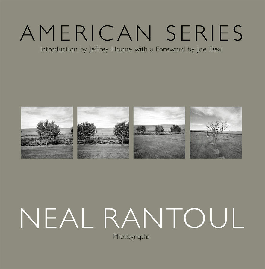
Newtown, CT 3
This is the last in a three part essay on the series called Newtown, CT, a portfolio of photographs I made in 1998.
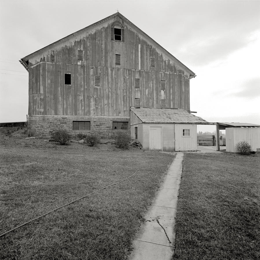
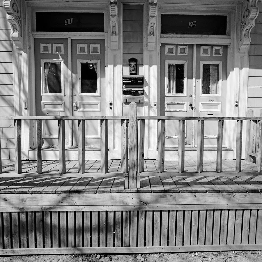
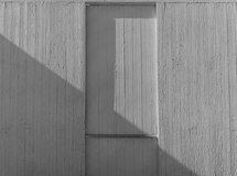
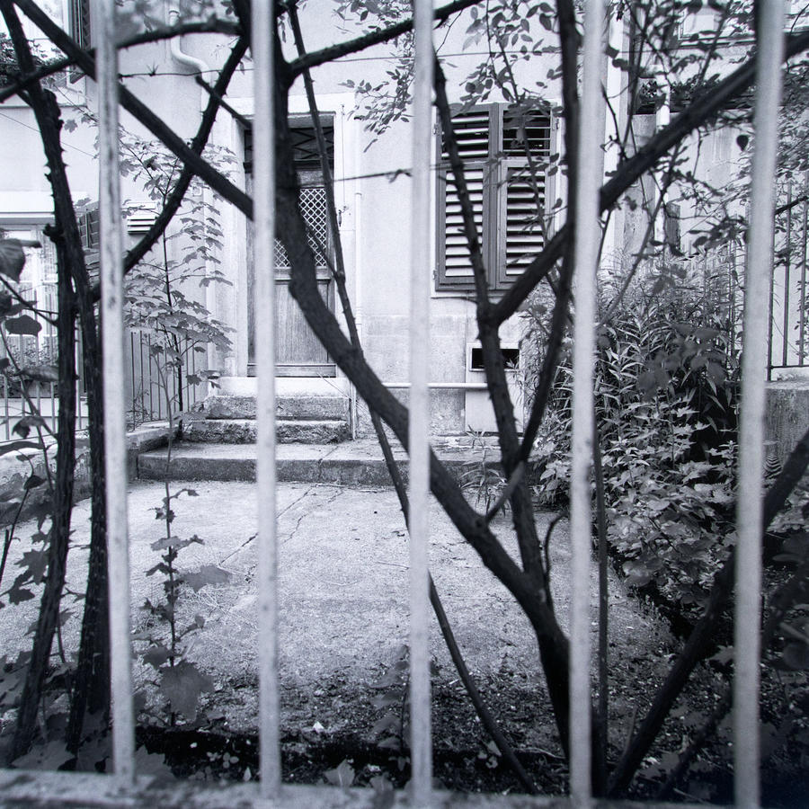
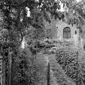
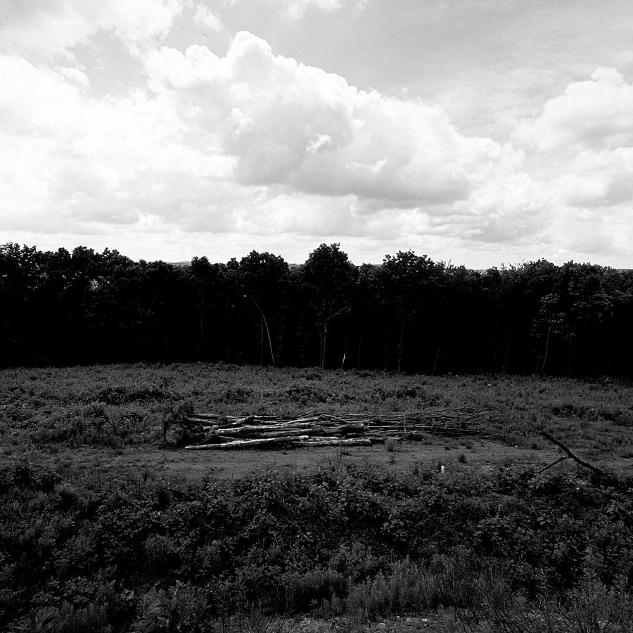
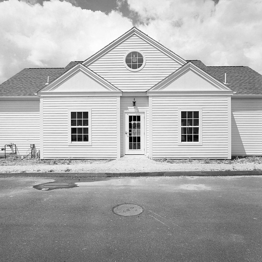
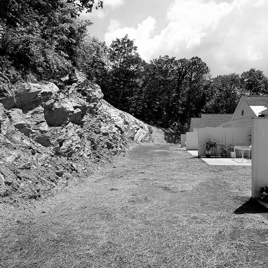
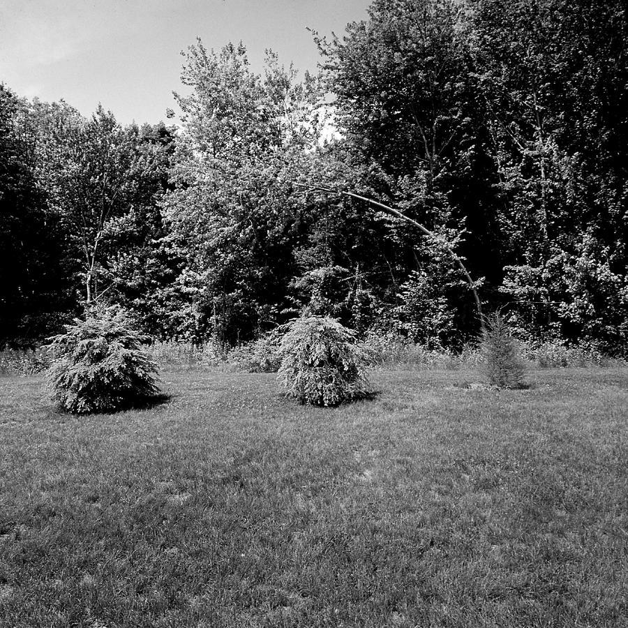
In Newtown 2 (here), the last picture we looked at was this.
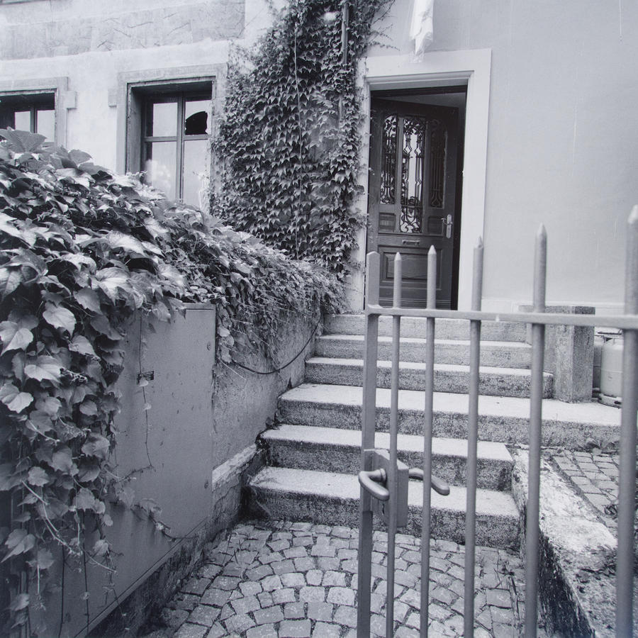
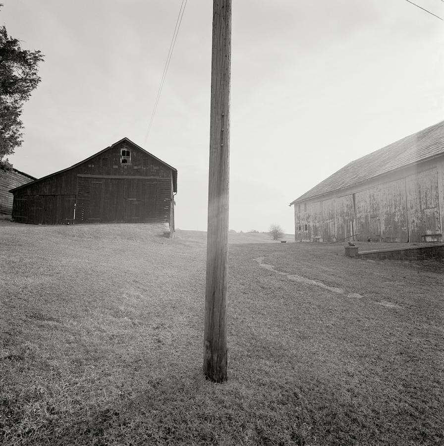
It is a transition or hinge picture in that it is used to get us to the next one, or two really. Before we go there I need to write about the structure as it becomes important as we move on to the next them. Its make up is that it is three horizontal bands, the pavement, the building and the sky one. Yes, it is very simple.
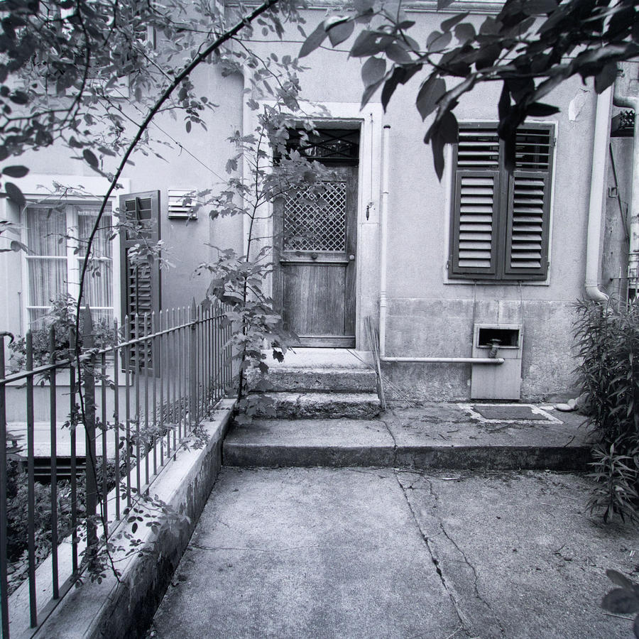
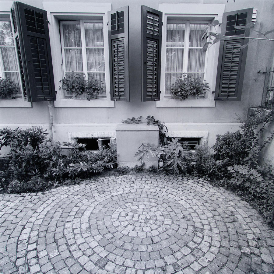
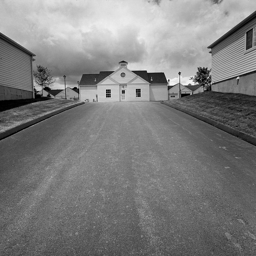
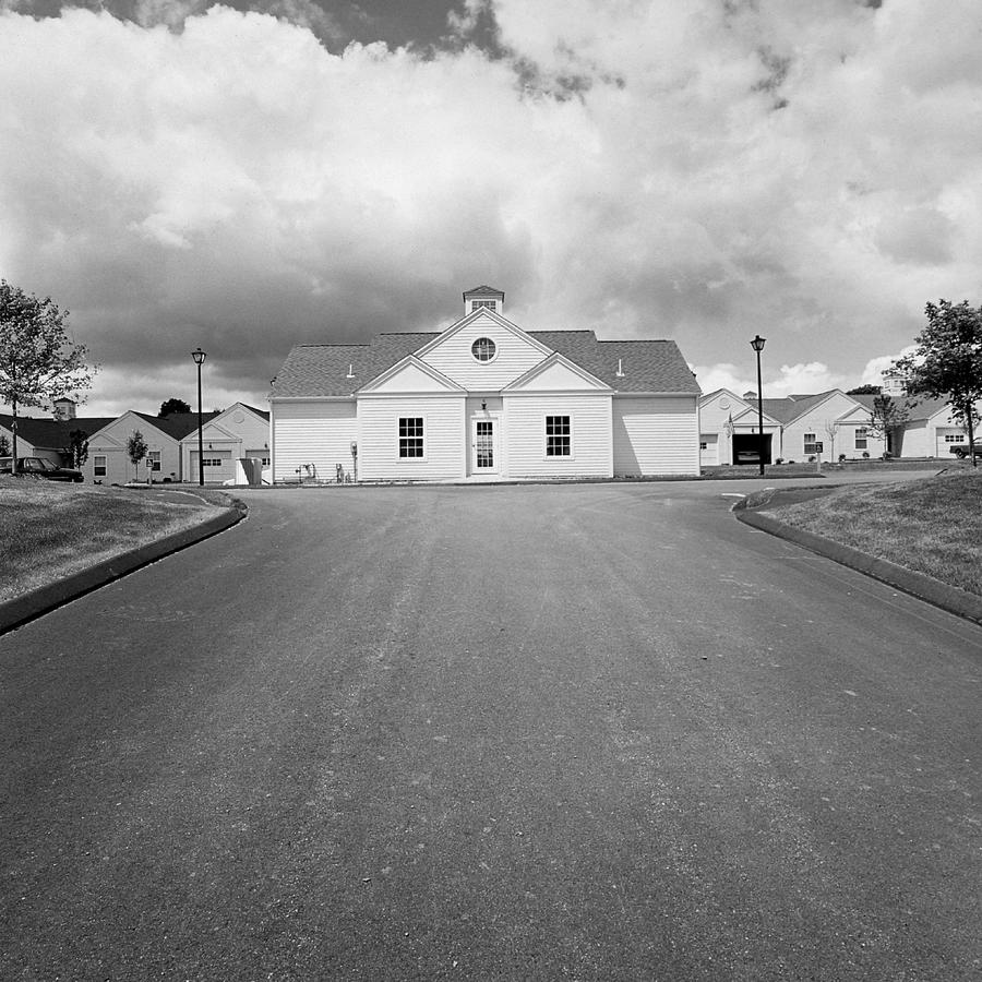
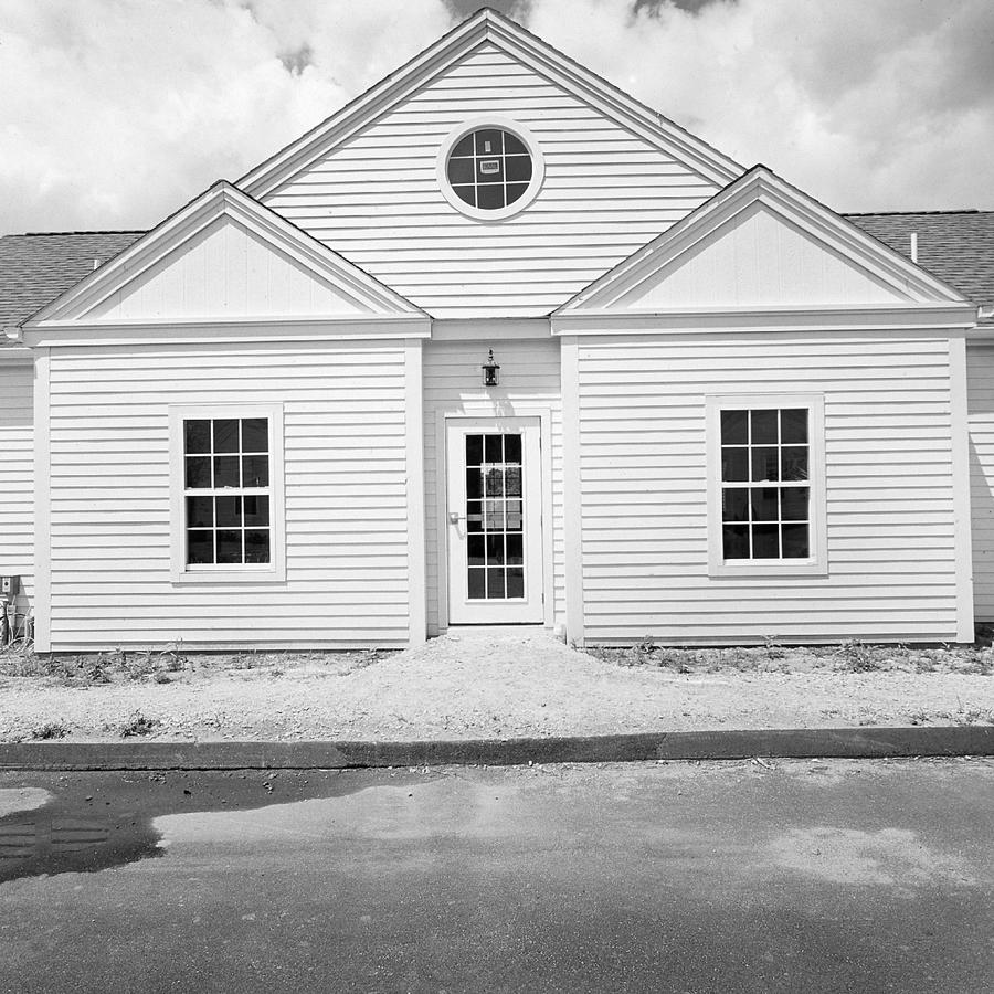
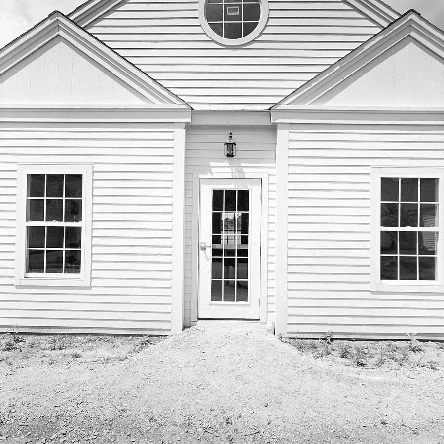
It also is the same way the next pictures are structured:
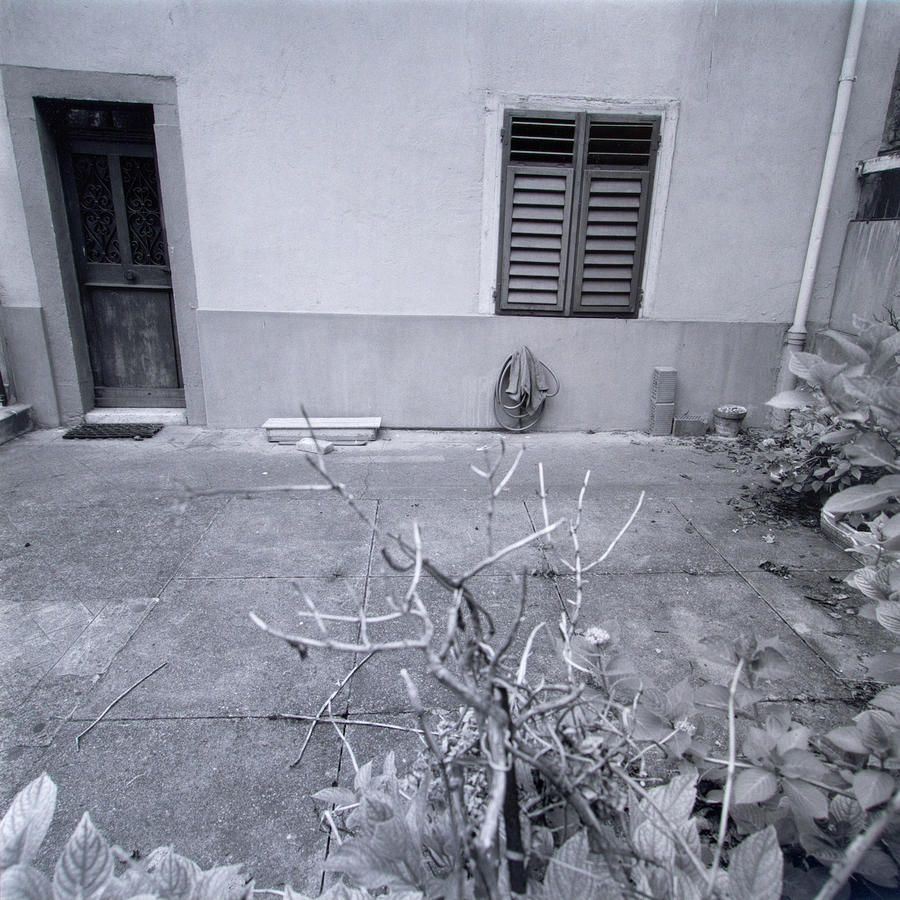
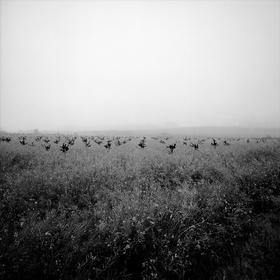
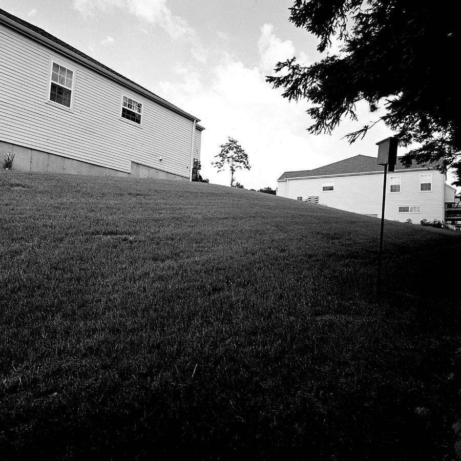
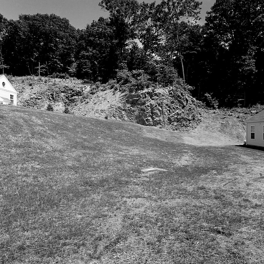
 The same scene made first in sunlight and then with the sun behind a cloud. Also simple.This happened as I was standing there making the first one. A landscaping crew came in, probably before construction started, and clear cut the woods. This pair reinforce that all is not right in this assisted living facility in Newtown, CT. Personally, this was a big event for me as this was, I believe, the first time I did this, to place two pictures like this in a series. I believe it focuses attention on the choice I made and is an effort to draw attention not only to the fact that I stood there, camera in hand, and made a clear choice to make pictures of both sunny and cloud covered. Finally, for more on my thinking during this time it might be helpful to go back to the Lebanon, NH series, which are here. There are also three blog posts on the series, which start here.
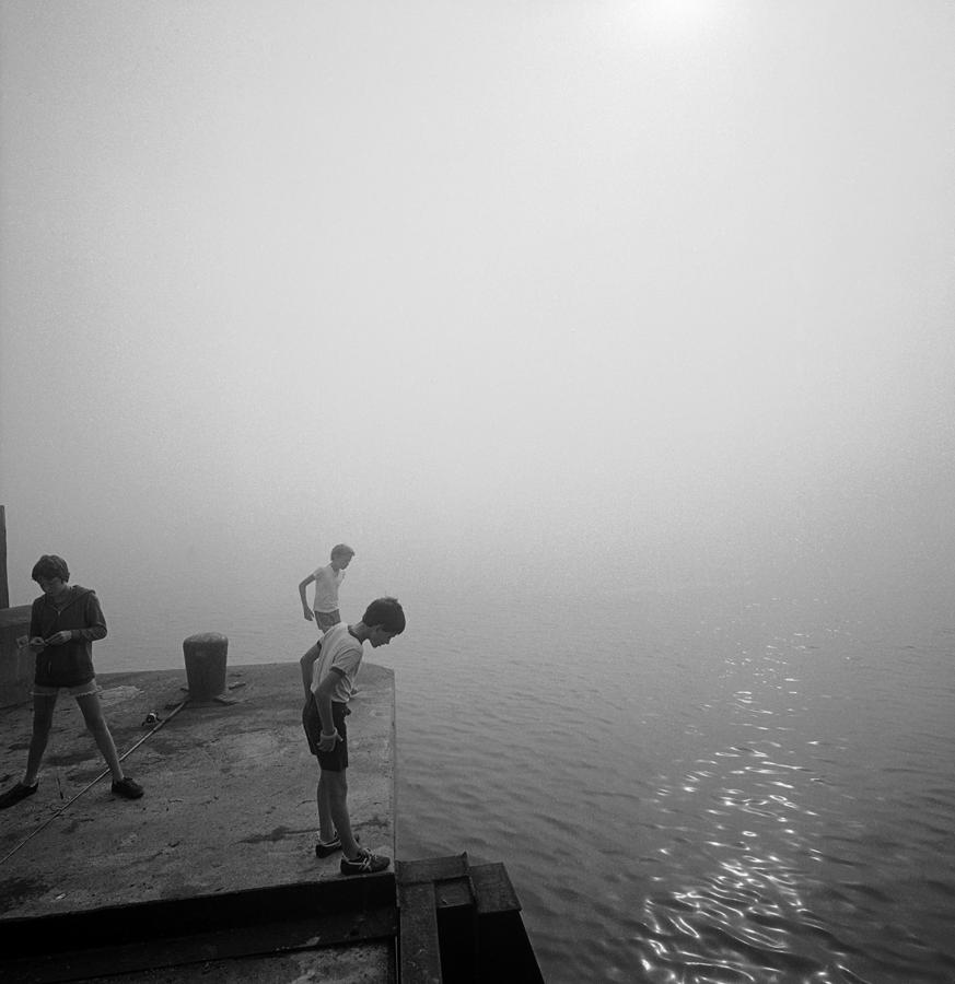
 Here we go. A new subset and another new way for me to photograph.
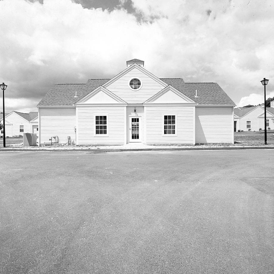
 What was I thinking?
Why did I do this?
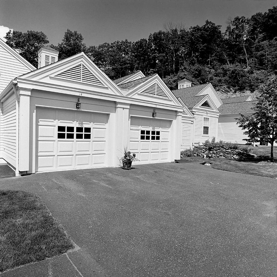
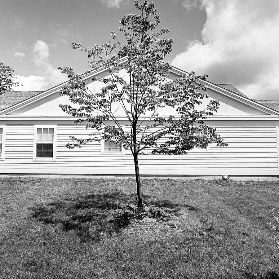
These make the core or foundation of the Newtown, CT series.
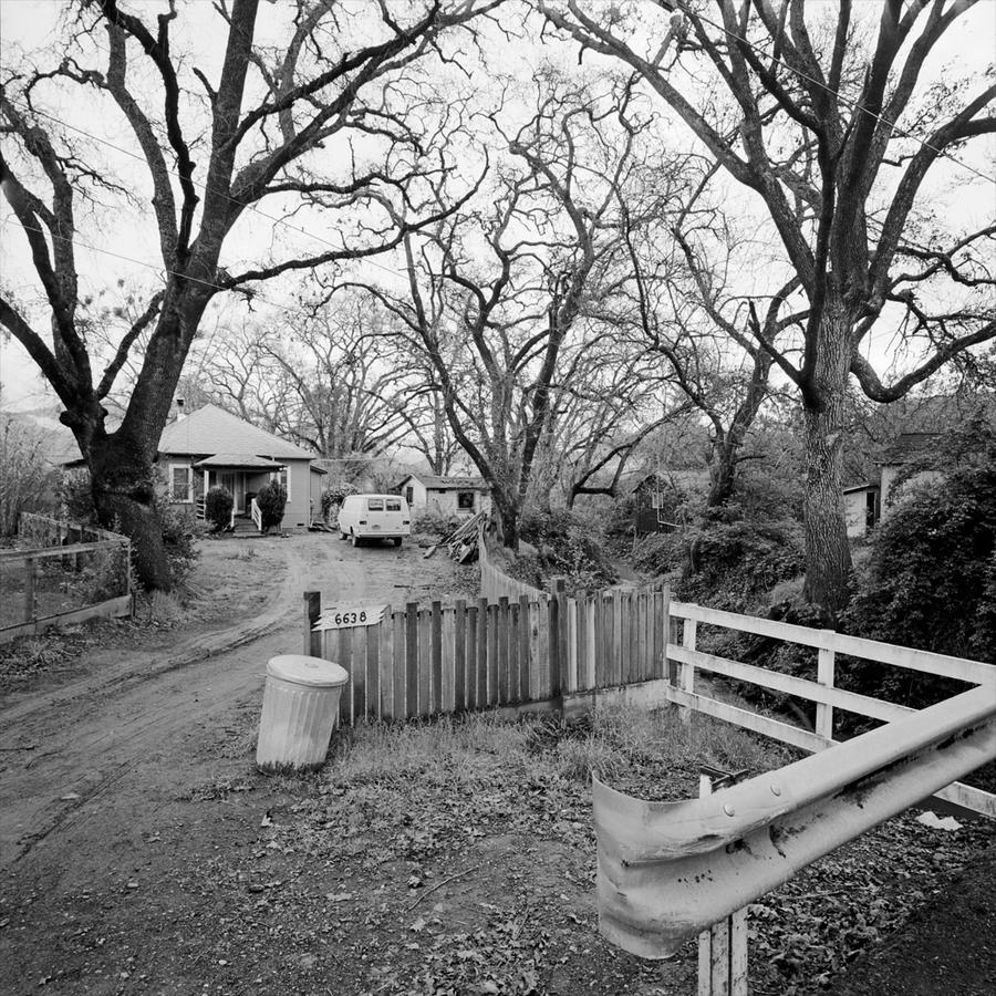
First of all let me give you some inside information. These are made with a fixed lens camera, so I either cropped to make these or I just walked up the hill to make them in succession. I did the latter. I also printed them lighter as I made them to emphasize the increasing white in the frames. Finally, I made this subset completely intuitively, having no idea that I would use them in the final body of work. They were an experiment and completely out of the norm for me.
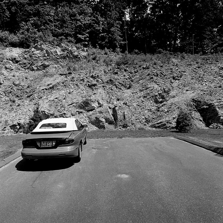
This is the next to last in this long series and is there to allow us to begin to leave, showing us where we've been to some extent but also to contrast the bright white of the former set.
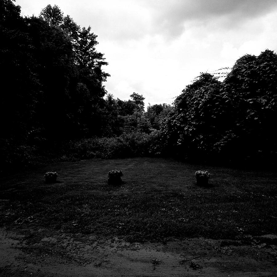 And this is the last. Remember the picture with the three bushes planted in the grass? Here we are again with three, this time with flowers in pots. But look how dark this one is. We are consumed with black here, so deep we don't really know what is in there. This is a very specific print, pushed way down to make a point and not residing in anyone's definition of a "good print".
We are now done with Newtown, CT. Before I close, let me give you some perspective as I look at these now 18 years later (I am writing this in the spring of 2016). Brutal and severe. That's what these pictures are. With the photographs wrapped in a deceptively conventional package of black and white photography and a late spring sunny day, the underlying message is harsh, critical and angry. I was angry at the inhumanity of the place, the sloppy design and lack of aesthetic that pervaded. This isn't a cost thing, it is a "care" thing. It doesn't cost more to think things through, to design based upon a care for our human condition and what it means to live in a place like this. The designers of this place did not have that concern. Not caring pervades throughout our contemporary times and culture and is a pet peeve of mine.
The methodology I used to make these pictures was both conventional and different for me. Remember that the way pictures like these are usually viewed is in a portfolio and they are seen one at a time, as in pages in a book. This means the sequence I made over several photographs of the unfinished building is unveiled one at a time in a subset of pictures that seem endless and increasingly microscopic as though we are analyzing something very far away with great detail. Exactly my point, like a scapel and yes, brutal. There is also an insider view being expressed here. Part of what we can do as artist photographers is move in on the mundane to analyze in minute detail allowing analogy to larger issues. I was trying to draw attention not only to the place and the living conditions but also to my own way of seeing. As such there is a personal statement contained within the overall structure of the Newtown pictures.This was something of a personal breakthrough for this photographer and I remember being very excited at the time at what I had done, hoping that I could pull it off back in the darkroom when I made the prints.
I hope I've been able to help in understanding these photographs I made. I know they are not pretty and although beauty often plays a large role in my photography, these are something different. I thank you for looking and staying with me through the three posts.
Feel free to let me know what you think. My email address is: nrantoul@comcast.net
Related series
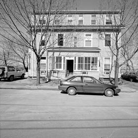
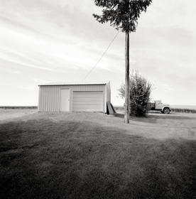
Newtown, CT 1998
The Newtown series were made of an asssisted living community in rural Connecticut. I was interested in making a group from something that was perhaps a little different than most of the other housing series I was doing at the time.
Looking back on Newtown now (late 2012) is as though someone else made them. I remember being very excited with the idea of walking in closer a few feet, shooting a frame, walking in a few feet closer still, shooting a frame and so on. Of course, now I would have stood in one position and used a lens that would zoom in. There also are two frames of the same scene, one with clouds and the other sunny.
Who would have thought that this same community, fifteen years later, would be rocked by a tragedy of unimagineable proportions.
The prints are silver gelatin and are about 12 inches square.
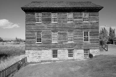
Benson Grist Mill, Utah
Made in September 2015 on a one week trip to Utah principally to photograph the Potash Evaporation Pools from the air at Great Salt Lake Besnon Grist Mill is a series of 17 prints, in black and white, archivally printed on Canson Photographque Baryta paper, 22 x 17 inches.
My work is represented by 555 Gallery in Boston, MA. Please contact the gallery if you would like to see this work, or any pther portfolio of photographs of mine.
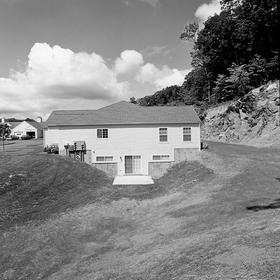
Lebanon, NH 1997-99
Made over a three year period, the series was written about in 2014 in two posts on my blog:
http://www.nealrantoul.com/posts/lebanon-nh-1997-1999
and here:
http://www.nealrantoul.com/posts/lebanon-nh-1997-1999-part-2
 And here we are in one of the key pictures in the series, looking at the
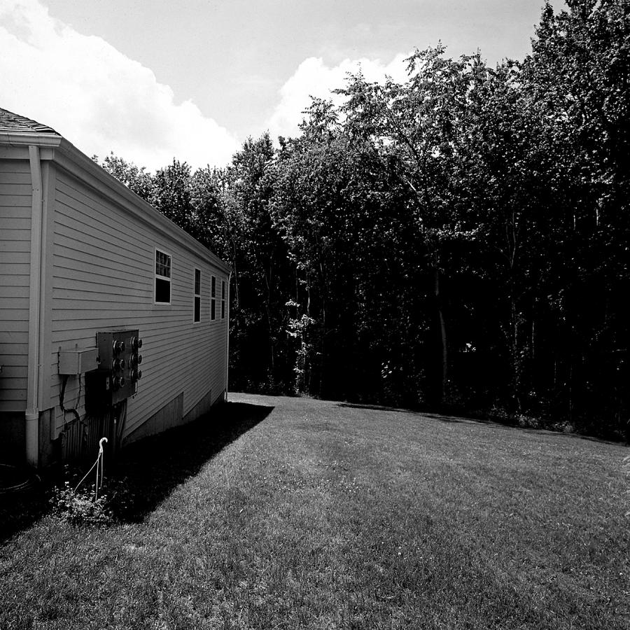
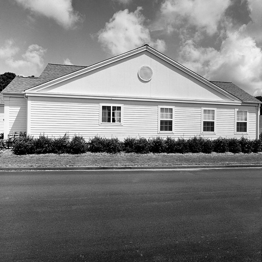
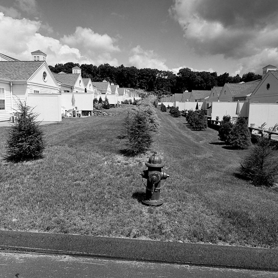 Here it is in all its glory, as this photograph shows how the units are positioned in a long row
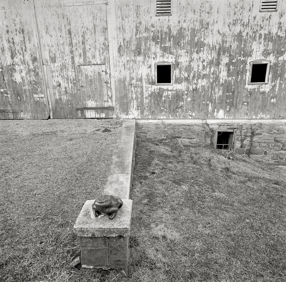 Ribbit.