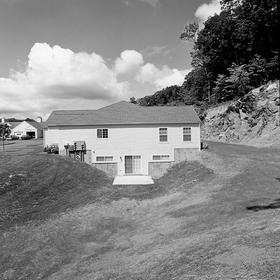
Newtown, CT 2
This post continues to look at the pictures I made in 1998 of an assisted living facility in Newtown, CT.
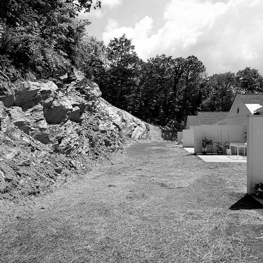 In number 8, the last image in the first post, which is here, we were looking at the backs of the housing units. Here I've walked up to the end of the row of them and turned 180 degrees to view them in the full context of the blasted out rock on the left. This is the third time I did that, turned to face what had been behind me.
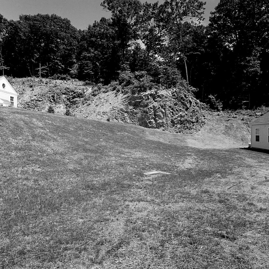
My effort here was to show the rock in the context of the village and move us on to new things while paying homage to where we came from.
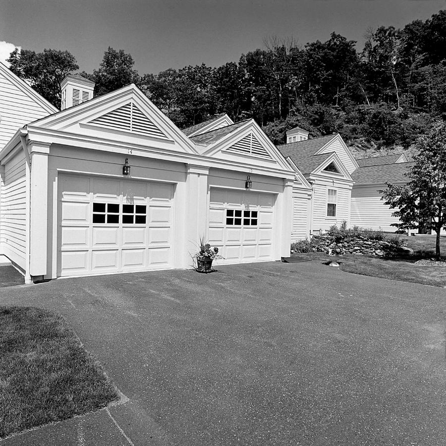
Now we're really going to look at the units or dwellings. In this case they look stacked up on top of each other like building blocks and with garages predominating. Note the one plant out there in the asphalt jungle of the driveway.
Forgive the digression but I need to write about the printing of the Newtown series. If you've read this blog for a while you know about the importance in my work of the Portland, Maine series, made in 1996. Those are here. I wrote several posts about them which start here. They were a group of photographs that brought me back to a fundamental way of working, which was the sequenced series. They also brought me into something very new and that was the making of series work in bright sunlight. I know, not so earth shattering to you, but to me it was a big concept. So here we are in 1998 two years after Portland, making a series in very bright sunlight. My point is, that the printing of Newtown reflects this: bright whites and deep blacks. Number 11 above does just that, with very bright whites in particular.
Let's move on, to # 12:
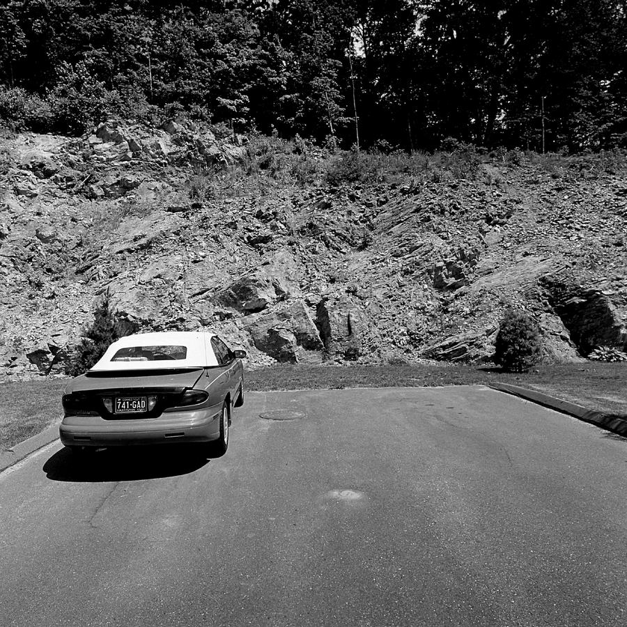 Yes, the rock again but with this car parked in front of it. Can we draw conclusions here? Can we use the juxtaposition to associate the timelessness of the rock against something so in the present as a car parked there at the end of the 20th century? Is that too much?
 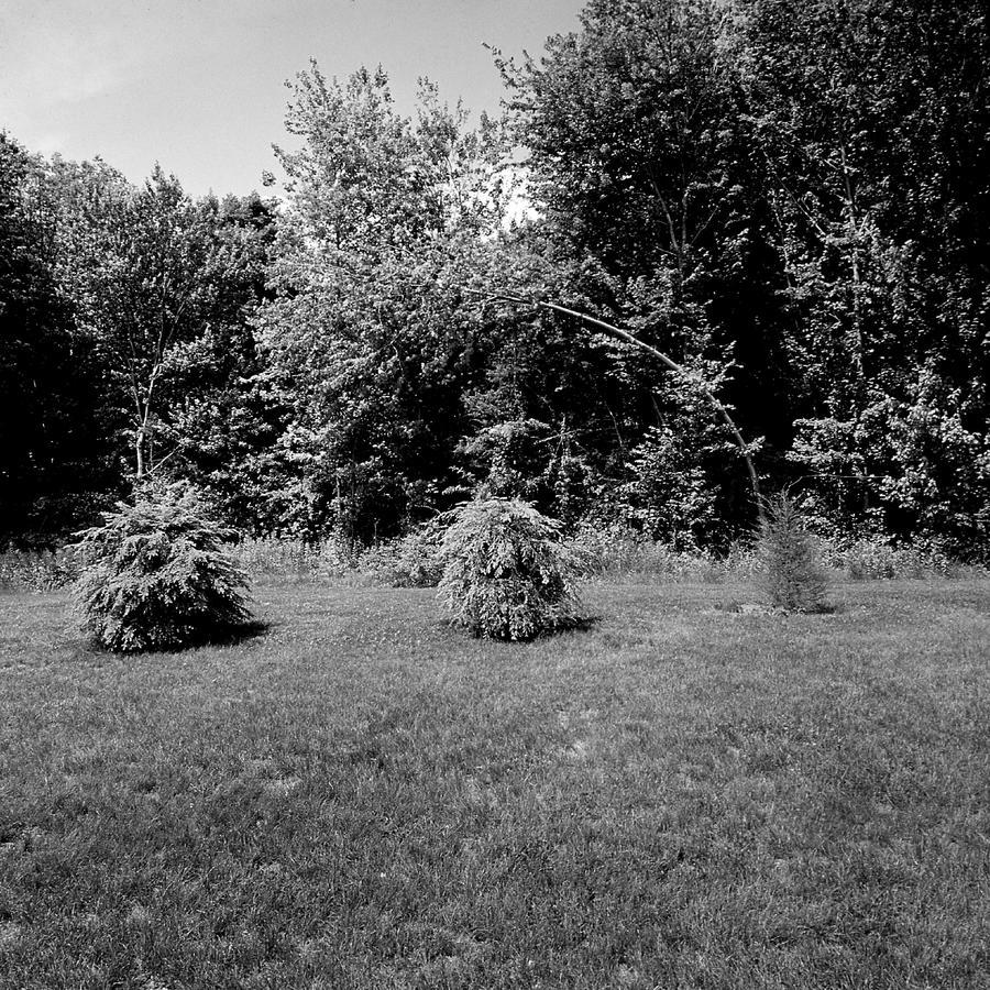 And here we are in one of the key pictures in the series, looking at the absolute banality of three recently planted bushes, some rather rough looking grass and some trees, with a light gray sky. Remember the picture of just that rock, number 6? This is the plant-based equivalent and speaks to how caged in this place is. This one also establishes the subset topic for the next few pictures: the planting and surrounding trees.
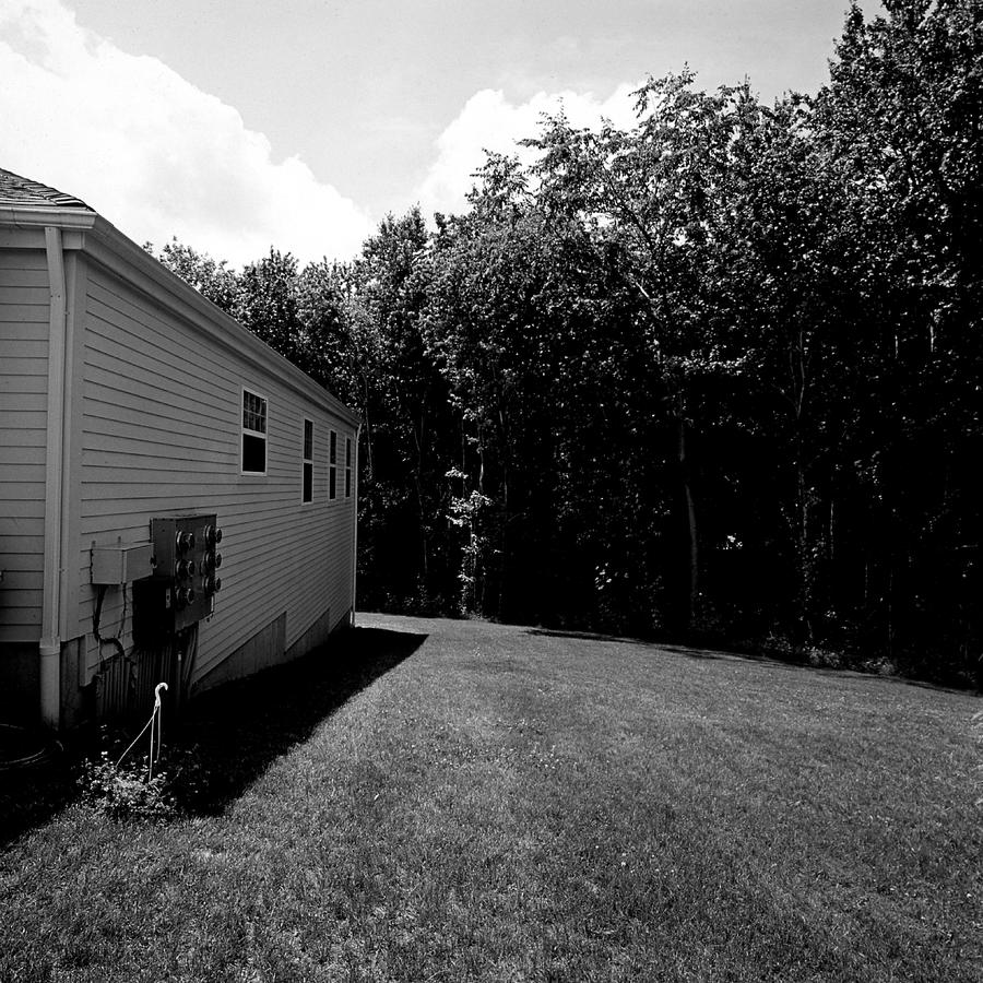 Here again I've worked to contextualize the photographs, to place the very black perimeter so that we see it as a fence or a barrier.
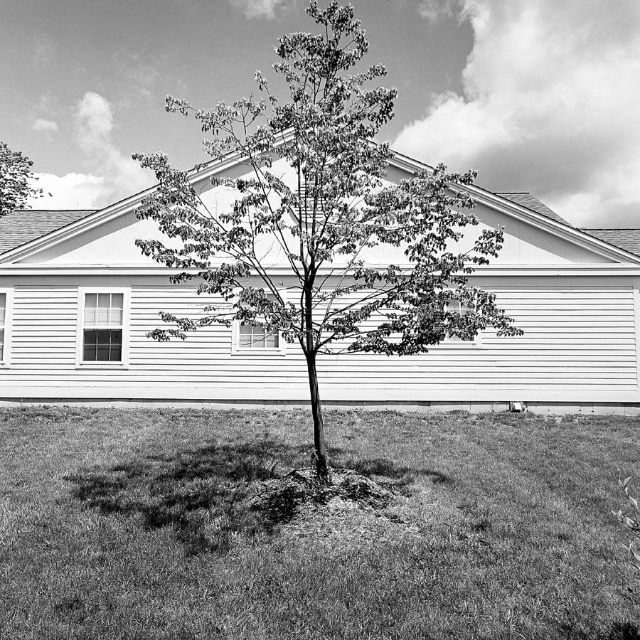 This one, number 15,is a study in contrast from the previous picture, that one being so very dark to this one being so very light. Funny to think that white in photography, as in a gesso'd canvas, is simply the substrate itself. It is the grays and the blacks around it that convey a sense of brightness. This one looks almost bleached to me and blindingly bright.
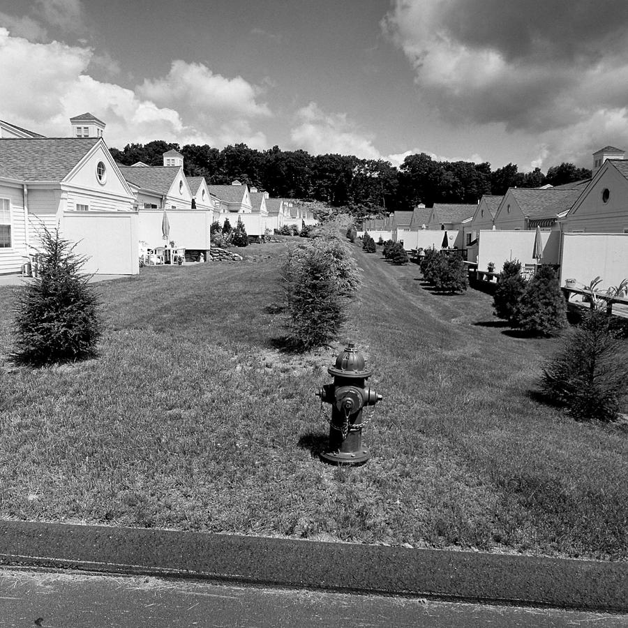 Here it is in all its glory, as this photograph shows how the units are positioned in a long row opposite each other, little patio facing little patio, with our rock wall way in the back topped by, again, black trees, bushes planted somewhat haphazardly and an almost out of scale fire hydrant in the foreground. Finally, our puffy clouds again. I'm sure the importance of this photographs hasn't escaped you as this one really does lay it all out.
 This will end this second post in the critique of the Newtown series work.
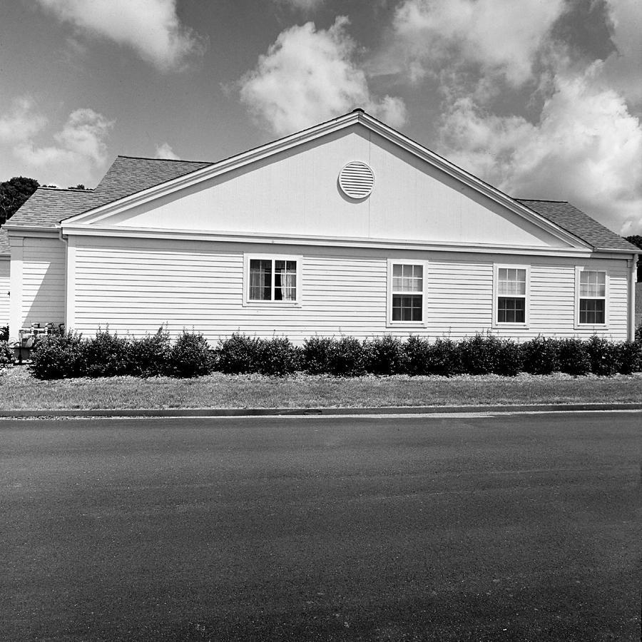
I remember having some reservations about including this (which is #17) in the 28 print series but kept it in as it brought us back into an emphasis on pavement, at almost half the frame, and the row of bushes planted to ease the bottom of this rigorous structure as a sort of a "skirt". It also repeats number (#15) the light one with the single tree, but time no longer moderated by anything in front of it.
Newtown, CT 3 coming up, and the last.
Stay tuned.
