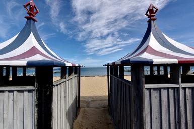
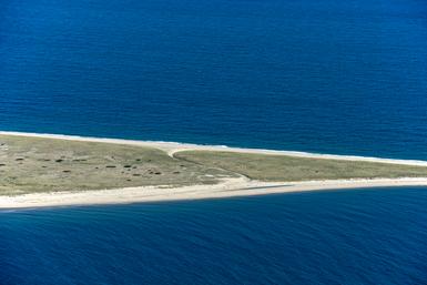
Topic: Series (29 posts) Page 3 of 6

Baldwinville, MA 2015

This is the second time we've shown work on the site by the young photographer Marc S. Meyer. Marc lives near Baltimore but photographs frequently in New England. To read more about him and his work go here.

Marc writes about the photographs:

I’d seen this abandoned building from the road earlier in the fall and marked it on the car’s GPS so I could return. I picked a day in early January where the cloud cover was heavy and there was snow in the forecast. When I arrived the air was still and electric with the coming storm. I worked for several hours in the cold, returning to the car to warm up and look over the pictures on the back of my camera that I’d just made. There wasn’t a soul in sight, only the occasional sound of a car going by on the two-lane road nearby.


The sky was important as it would serve as the drama needed for the pictures but I also wanted it to have visual weight. This was tripod work, as I would combine several frames of the same scene into one image later on in post processing.

Of course, no artist knows if he will be successful if an image or a few of his images will be seen as important in a larger context. One can only hope. But these few large photographs are intended to represent the first half of the equation or analogy, if you will. Man made structures decay if left on their own outdoors. Fact. This large warehouse made to take care of a region’s municipal needs outside the small town of Baldwinville is also a fact. But we seem to have no problem making something, using it and then discarding it when we no longer need it. We do it every week when we take out the trash.

As a large issue this building sitting empty and forlorn outside a small town in rural Massachusetts serves for me as an example of skewed priorities. Used and thrown away.
On a smaller issue and on a more personal scale, I have always found photography’s ability to beautify fascinating. I would doubt if “beauty” came up much when the architects and/or engineers were designing this building. But there it sits; empty, discarded, dismissed and beautiful.


This work is deceptively simple, almost minimal. The prints are large, at 30 x 24 inches and unusual in their depth and tonal range. 

Assigning such nobility to what is, in effect, a piece of junk is of course Marc's point.

But then he takes us inside the structure, almost as though we're headed into a tomb.

and ends with:

That's it. The series seems to end even though it just got started. No frills here. I've said this before but: get in, get it done and get out. That's what Marc did here and the reduction serves the overall purpose of the group of pictures: the force of their impact, their remarkable color palette, their emphasis on containing information both within and without the building.

Marc Meyer seems to be moving on from his rather straight representation of the small world of the Beach Club pictures to a more interpretive and subjectified manner of expression. It's as though he is using the warehouse building in these pictures as a springboard to reflect his changing views and perhaps, to flex his muscles. 

Does it work? Do you find these photographs compelling? Let us know at: Neal's Email

Marc's work is now available for viewing at 555 Gallery in Boston. The Beach Club portfolio and this one (Baldwinville, MA) are in the gallery's flat files. I urge you to take a look at the prints in these two portfolios as this is very strong work. A blog is a wonderful thing but used as a vehicle to look at art? It is is just perhaps the first step. Prints are king.

Topics: Color,Series,Marc S. Meyer

Permalink | Posted January 22, 2015

Nantucket 1980 Part 4

This post continues and finishes a discussion about the original Nantucket pictures I made in 1980. The other posts, Nantucket 1, 2, and 3 proceed this one, if you haven't read them yet.

In Part 4 we'll take a look at the ending to the Nantucket series and I'll let you in on a little secret.

We left off in Part 3 with a picture that changed things structurally within the series. Let's see where the 11th picture in the set takes us:

Here, we're back to the previous structure with the fence sitting in the foreground. The only thing different and perhaps anomalous with this one is that, while the gate is open as we've seen in others before it, we aren't shown where it leads. To be honest, this is my least favorite picture in the series and were I to do this over I probably wouldn't include it. However, it does serve as an effective hinge to the next one:

which is mostly about geometry, in which I did poorly in school. Maybe this redeems that a little. Triangles and geometric shapes everywhere, even in the sky if you look at the two spaces cut by the roofs. This was fun to make and is still enjoyable to look at.

Here, we're back into barriers and yet with a make up that is far more open than in earlier pictures in the group. Point down with a wide lens and verticals will bow out as you can see on the side of the house on the right. This makes the picture look a little like being made from inside a fishbowl.

This one's another structure changer, stopping the alley I've set up with a street and a Volvo sitting squarely in the way, almost impeding progress completely. The only way out is the driveway to the right, that really isn't very promising as it looks to stop you behind the bush. I often get questions in lectures as to why I include cars in my pictures. Because they provide scale. We all know how large a car is.

Here we are, closing the series out with a picture that is practically fully closed in, that almost obscures everything. Is this some sort of statement about mankind and how, when we are gone, the natural world will reclaim its prominence?  

Or is it about disallowing the structure that constrained the previous pictures and defined them as well? 

Or does this picture refute the ones that came before it? 

Why won't I say what this is, this picture? Because it isn't for me to tell you what it is is, it is for you to tell to decide.

Finally, and in the nature of full disclosure, in the printed series the last picture is this, here poorly reproduced as I have no scan of the negative:

(The two light areas are reflections from the bulbs used to make the slide, not in the print)

The print shows us a street, dark foliage above a driveway pulling back and getting lighter as it reaches the background, indicating some open sky back there. A dark foreboding image but with perhaps a ray of hope? That was my intention.

Over the years, as the series has been shown from time to time I have included this last image probably more times than not, although when I made the Nantucket pictures the last in the series was the one before this one, the one with the growth taking over. Why? I can't exactly say, except that one seemed more dire than the other. 

When I printed the series for the first time I was very excited, as I'd made pictures in a fundamentally new way for me and felt I'd made a breakthrough. In showing them to a close colleague at Harvard, she said that they were very depressing. I liked that as she got their weight and maybe their depth. But to end with a picture that didn't allow you out, to not permit escape from these pictures' weight seemed too much at times so I would include the last one with the driveway to indicate at least a possibility of a positive outcome. I always thought of this series as having different endings as in a film where the director has shot different endings for different audiences or markets. The movie Blade Runner was like that. The director, Ridley Scott, shot different versions of the ending.

This finishes my look at the first series I made. I hope you have enjoyed it. As  always, you may contribute to the conversation by emailing me:

Neal's Email

Topics: Black and White,Series,Analog,Northeast

Permalink | Posted March 5, 2014

Nantucket 1980 Part 2

This blog continues a description and analysis of a series of photographs I made in 1980 on the island of Nantucket in Massachusetts. If you are  just starting, I recommend you begin with Nantucket Part 1.

Here we go: There is something to the feeling you get when you know you are about to do really important work, but haven't done it yet. That's where we left off in the first part.

I knew I was about to make pictures that would be important to me in my career. We're talking of career forming pictures, seminal work that will be poked at and prodded by analysis later, forty years on, as the very foundation of my life's creative output. OMG! I know, once again, hyperbole rears its ugly head and runs amok, but seriously, this was big.

Onwards. We are now headed into the second phase of the series after looking at the first three pictures in Part 1. Very often in my work, there are subsets or, perhaps "chapters", that add up to a full series. We are starting now with the fourth picture in the group and it does just that, starts a new area of interest.

This picture diverges from the first three.

It's angle is very different, as it is taken as an oblique. It is also "straight" in that clearly the camera was held almost level in this one. By the way, the Hasselblad Superwide, being a fixed lens camera, had a 38 mm Biogon lens. This was very wide for the format and the camera was provided with a bubble level and a prism to see it with while you were looking through the viewfinder. Primitive by modern day standards but effective in allowing one to hand hold it and still get straight lines straight. I remember I sweated bullets on this print, wanting it dark but full in rendering the information on the negative. Behind the brick wall, the sun is trying to break through and spreads its light on the sidewalk. This was key to me. I used a chemical called potassium ferricyanide, which acts as a bleach, to lighten this one area. This was the same chemical W. Eugene Smith used famously in his Minimata series in 1972, published by Life Magazine:

(Please, I am not making a direct comparison from my work to this picture of a mother bathing her child who has been ravaged by chemical pollution on the island off of Japan called Minimata. This is one of the greatest photographs of all time. I am just using it as a way to show the effects of chemical bleaching.)

The next one was the darkest in the series:

and puts whatever content is in the picture in front of a large backdrop, as if this bush and tree were on a stage. We are right there, inside the picture, which is part of my point, to push the camera into the picture. Also, what happens at the point of intersection of the two clapboard walls on the right? Does the tree trunk do something there to the space? And finally, we have a large wall that serves as a backdrop to the foreground. But it also serves as a barrier to seeing anything beyond it. I focused the lens on the plant/bush on the lower left and the detail in there is like a whole world. I remember being pleased with the decision.

The third photograph in this subset, actually 6th in the series,

allows a little space to get out and is less closed in but draws us into a kind of conversation with the space. Look at what is going on with the top of the house towards the left side of the frame. The square format combined with the acute width of the lens allows us to be standing in front of something but also to see practically straight up too. This is in itself a lesson in perspective, convergence, divergence and is also pretty twisted if you really look at it. I was very interested in this characteristic, this "photographic seeing", at the time. By photographing something so mundane and ordinary and using the camera progressively, I could draw attention to this dichotomy. It is totally unique to be inside this space but seeing up as well as down without moving our head. This is photographic vision and one of the reasons I love photography. You too, probably, as you are reading this. 

In Nantucket 3 we will continue to seriously freak with reality as we work with the weird and wonderful world of the SWC camera with a lens designed by Carl Zeiss himself, who then brought it to the young Hasselblad company in Sweden in the mid 50's and said "here I've made this lens, care to match it with a camera?" Hence the camera I had nestled in my right hand as I walked around these bizarre back streets. 

Next up: Nantucket 3

Like I said: riveting

Topics: Black and White,Prints,Series,Analog

Permalink | Posted January 29, 2014

Nantucket 1980 Part 1

Nantucket

This is big. This time we will look at the body of work that started me working in series, one of the ways I continue to make photographs today. Note the date: 1980. Nantucket is the first real series I ever made. I am going to devote some time to it here as I look forward to reliving it (and testing if I remember it well) and, although the work looks surprisingly modest today to me and most likely to you, it is a seminal body of work in my career's output and very important as such. 

Here we go.

Let me place the series in context. It is 1980, I am teaching at Harvard, have stopped teaching at the New England School of Photography in Boston and will begin teaching at Northeastern University by 1981. I am single but not for long as I will meet my wife to be in a few months. By this time I have been teaching for a summer or two at Martha's Vineyard in something called the Chilmark Photography Workshops, started by Carol Lazar. In the summer of 1980, I am running the workshop, handling logistics, working with a TA, lecturing, presenting others' work with slide shows and am teaching shooting, camera controls, darkroom and heading the class towards a final project in a three-week workshop. I think I had about 15 students. Field trips were frequent but, by the time we're starting our third week, we were all a little burnt out on shooting on Martha's Vineyard. Islands have their limitations. I found that there was an early morning ferry that would take us from the Vineyard to Nantucket, leave us there for the day and return us to the Vineyard by early evening. We decided to go.

We arrived in Oak Bluffs where we would catch the boat for Nantucket in the early morning in mid-July and it was hot, the air was stagnant and there was thick fog.  I made a few pictures in the fog while we waited to board.

Fog is so wonderfully dislocating and this one of the three boys fishing on the ferry pier has been shown frequently over the years. To me it seems from a different era, clearly coming from a sensibility different than todays. It looks optimistically at the mystery of our world with a sense of wonder and is quite naive, I believe. I am far too jaded to make a picture like this now. By the time we're on the boat, the fog is beginning to burn off. Over an hour later we get to Nantucket and disembark. We mill around for a little bit, then I pull the group together to tell them we are here to photograph, give them a couple of things to work on and set them free, asking them to be back at the boat for the return trip late in the afternoon. Off they go and so do I, with no real thought in my mind as to what I will do. It is hot, the kind of day where you don't really know the direction of the light as it is bright but flat, your shirt sticking to your back and where you'd prefer to be sipping something cool under a tree or maybe be in the ocean riding the waves. I had a pouch on my belt with several rolls of 120mm Kodak's Tri-x and Plus-x film in it, a Hasselblad Superwide in my hand, a Pentax Spotmeter hanging around my neck and a baseball cap on my increasingly bald head. I was 34 years old.

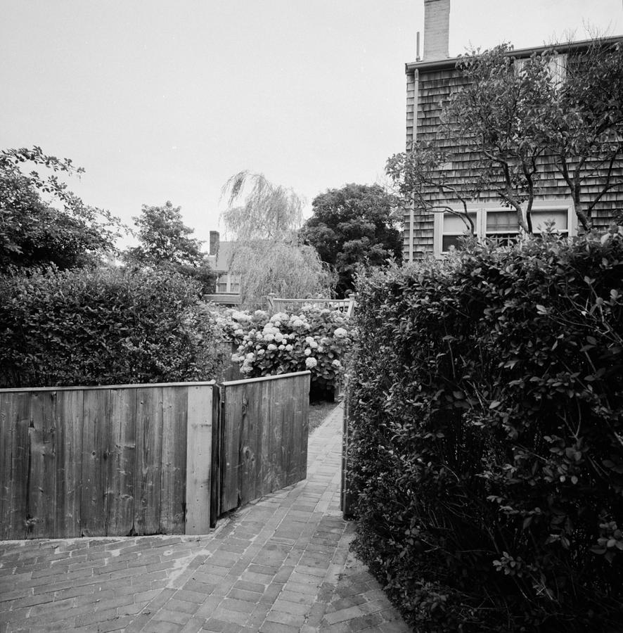
I started to wander around the town, avoiding the main street as it was far too touristy for me. Soon I found myself walking along back streets. It was quiet with an occasional car and few people. I began to see things that looked interesting to photograph. If I go back through the rolls I shot that day 33 years ago I can see a few frames at the start where I was beginning to form an idea about pictures existing next to pictures. I made this one:

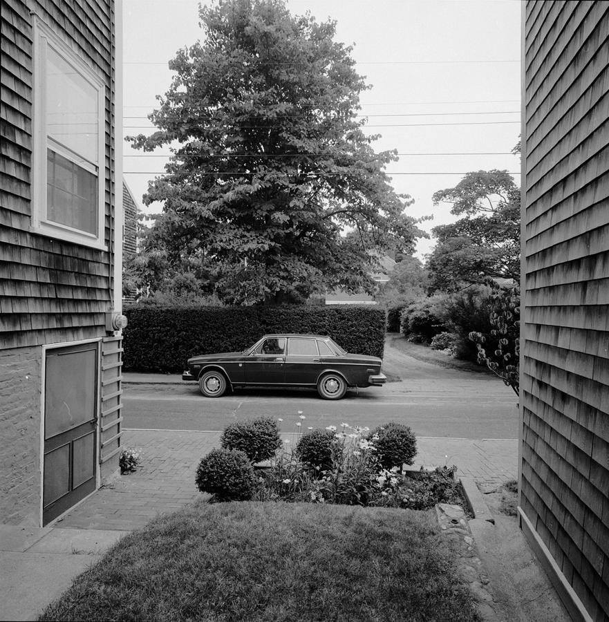
Such a benign looking picture now, but this actually shook my world in a fundamental way back then. Why? What did I care about? The accelerated space of that fence pulling back in the frame, the bifurcated image, sliced in two with the railing receding fast, the triangles of the roofs stacked on top of each other in the mid background, the planal quality of the house with windows on the right compared to the straight-on house in the far background, which is parallel to the foreground fence, the tree on the left with its rough texture, knotted and looking like warts with branches heavy with leaves hanging down into the sky in the center of the frame. This soft flat light so perfect for this work with almost no shadows elevates this picture to the wonderful combination of the outright banal and the supremely sublime at the same time. As far as photographic aspirations go this one hit it out of the park for me.

What freaks me out now so long after is that I knew it. This picture and the next couple got my attention, made me wake up and stay focused and, as has happened so many times since, I found myself saying to myself, "Neal, do not blow this." I didn't. I got serious, stayed on track, held the camera steady and proceeded to go to work. In fact, I had a little help. I was in familiar territory. A couple of years before I had completed a two-year project called "Fences and Walls"  which was of fences and walls (no big surprise) but also dealt with depth, foreground to background relationships and layering. Of course, you never know whether something you've done will provide support for what you are doing now but you hope so. This was one of those times.

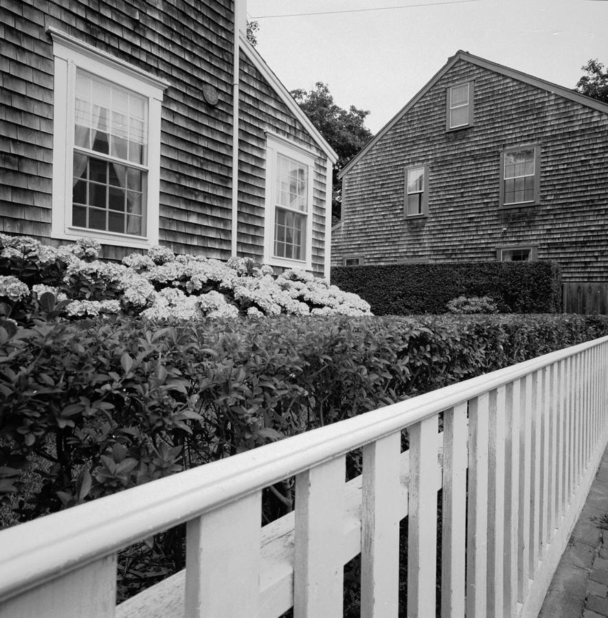
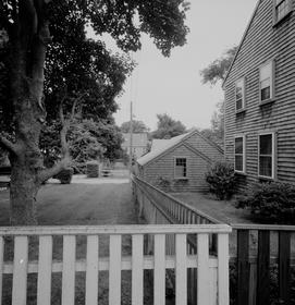
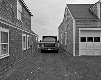
This one, the second in the series, establishes that I am looking in between the homes and also that the angle of view is extreme. Much of this work addresses the photographic seeing involved, the character, which is unique, of the optic and the special and spacial relationships that are formed by the way the lens sees these domestic scenes. By standing on a wall across the street I was able to diminish the street and put the back of the truck in the lower left of the frame while keeping the verticals essentially straight and parallel. I am referring, of course, to convergence, what a lens does when pointed up. Odd that this is so easily corrected now with software. Software? I had no idea any of that was coming when I made these pictures. Finally, there is a strong connection from this picture to the previous one. The centering prevails in both but this one centers in negative space as opposed to positive space. We will see this same thing repeating throughout the series.

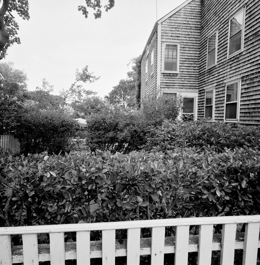
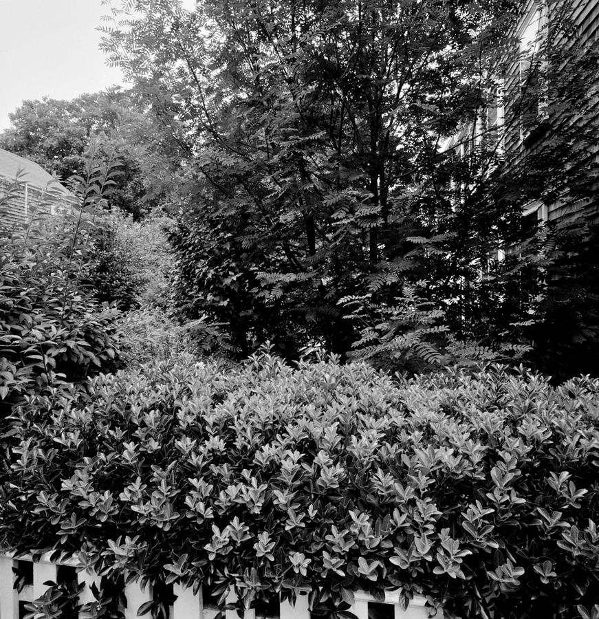
The third in the Nantucket series moves in far tighter but maintains the sense that we are looking down an alley created by two buildings.

It is a study in grays and is an acutely flattened tonal scale. I made very flat and gray negatives by overexposing the film and then underdeveloping it. This limits the contrast and builds density in the shadows. Normally, with flat light like this, working in black and white, you would do just the opposite. It is the primary reason there is some density to the gray sky in these photographs.

Jeffrey Hoone, in his introduction to my book "American Series" writes that I  consciously tilt the camera to skew the perspective and put things a little off center. This picture is a good example of that.

Harry Callahan, who was one of my teachers, said a truly elegant thing and that was that he believed we pretty much always make the same picture. Looking back at these now I see it is true for, despite looking like they are very much made in the past, I find them somehow essential for me.  Of course, they also are developmental in that they were made when I was still learning and growing photographically. 

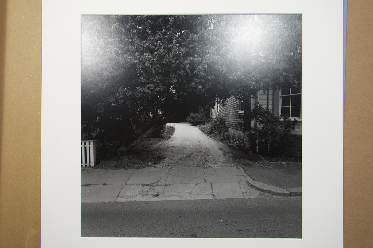
BTW: This work's exhibition lineage is extensive as the series has been shown numerous times. Peter MacGill (now of Pace MacGill) chose to show the full series at Light Gallery in NY the following summer and the work was in a one-man show at the RI School of Design Museum in 1981. Later on, I would show either a few of the series or the whole series in shows to reference the start of the concept of working this way. In the RISD Museum show, I printed the whole series on 16 x 20-inch paper to fit with the other island-based work of mine from Bermuda in the show. The original Nantucket series is printed on Kodak 14 x 17-inch Polymax paper and is toned with selenium. The prints are about 12 inches square. Finally, although I had a few offers over the years to sell individual prints, I never did. The original series is intact and in excellent condition. 

I am going to stop here, three into a series that is 16 prints in all.  But stay tuned as we continue with Nantucket Part 2.

Topics: Series,Black and White,Analog,Prints

Permalink | Posted January 25, 2014

Cabelas Story


Is it true? I've never told the Cabelas story? Yes, it's true.

I am going to now.

Let your mind drift into a "what if?" category. Let it range through the world of no restrictions, no restraints, the "do whatever you like" that you use to go into when you were a kid. This is like daydreaming, of course, and something I did far too much of in Latin class in the 8th grade.

Okay.  Let me set the scene: a friend and I are driving through rural PA on one of those late summer just before going back to teaching trips. It is maybe 2006 or 7. We approach a large billboard announcing that a Cabelas store is coming up. He asks if I'd ever been to one and I respond by saying no, that I'd never heard of it. We stop and go inside and I am confronted with a sports outfitting store built on a huge scale. In the middle is what I can only describe as a taxidermy mountain of animals arranged in situ and several  smaller areas where we are transported to the Serengetti in Africa with lions and elephants and giraffes. The displays are like dioramas. They are over the top wonderful, bizarre, a little twisted and I want to photograph them. I mean really want to photograph them!

I ask at the information counter about photographing and am told to go ahead take all the pictures you want as long as there is no flash and no tripod. Good but not so good. I take some snapshots with a point and shoot digital camera.

I get back home, start teaching again, am in meetings meetings meetings all the time but Cabelas pulls at me. After several false starts I find myself on the phone with a marketing guy at the home office in Nebraska. He's asking me why I want permission to photograph in the stores when they are closed, why I need to work with a tripod and what I want to do with the pictures once made. I am prepared for that and am using my title as a professor at a prominent university to validate my intentions to make pictures that are cultural research that is based in the USA and  that I am really interested in this "museum quality experience" the company promotes about its displays. Oddly enough, he says okay. Just like that. Then he tells me how it'll work.

I am to email him a few days before I want to photograph in a given store, then I am told to arrive about 6 am at the staff entrance, sign in and go about my business until the store opens at 9 am and then clear out.  I try it out first with the closest store to me at the time which is outside Hartford, CT and it works fine. I shoot for three hours while the employees are stocking shelves, sweeping floors and having a sales meeting that is very rah rah rah just before they open.

I am shooting with a Nikon D200 which is a far cry from equipment we use today. I am using the lights that are on in the store and I am way out of my comfort zone, dealing with white balance issues, areas that are too hot due to the floodlights in the ceiling, difficulty in getting access to some of the displays due to not being allowed over the railing, not having the the right lenses, etc. Over the next several months I make some upgrades. I move up to the new Nikon D300, the first digital camera that gave me usable files.

I am now planning the first of two dedicated trips.  My first one is early March while on spring break. I fly to Chicago and work stores in the Illinois, Indiana and lower Wisconsin region. There are about 50 or so stores in the chain. I drive, get close to a store, stay in a motel, arrive at the staff entrance at 6 am the next morning and, well, you know the rest. Each store's employees are wonderful, helping me move stuff and offering me coffee. After I am done at about 9 am I drive most of that day to the next store and repeat the same process. It being early March I hit some weather and have a not my favorite adventure with my rented minivan with no snow tires in a snow storm of epic proportions but I soldier on. In that trip I shot in four stores.

I've written about this before but I am now accruing real work. I am no longer a novice, I am becoming experienced in the topic of my interest and I am making increasingly knowledgeable pictures. All to the good. Each store is the same but different, some on a scale that it is difficult to comprehend; 250,000 square feet of store. Others are far smaller with fewer displays that interest me.

I complete that trip and the following summer fly again to shoot more stores. This time I start out in Boise, ID and hit stores in Nebraska and South Dakota. It is August and it is very hot. In all I photographed in 17 stores and to this day I cannot pass one by without going in with a camera.

We did a book of the pictures: Cabelas

The work's been shown and published quite a bit over the years. 

When I began the Cabellas projet I had no idea what the outcome would be. I didn't really even know why I wanted to do it. I believe we are just as novice as anybody else when we start out. It is important to acknowledge that and to face up to the fact that you will make mistakes and have false starts. But, soldier on and trust your instincts as they're probably the best thing you've got. 

Cabellas is on the site: Cabelas

Topics: Color,Prints,Series,Digital

Permalink | Posted January 20, 2014